Showing posts with label connected. Show all posts
February 15, 2022
How to Create a Barbell Chart
analysis
,
barbell
,
barbell chart
,
charts
,
color
,
comparison
,
connected
,
context
,
data analysis
,
data visualization
,
dot plot
,
dual axis
,
graphs
,
how to
,
line
,
tableau
,
tip
,
tutorial
,
worksheet
No comments
February 8, 2022
How to Create an Enclosed Dot Plot
analysis
,
barbell chart
,
charts
,
color
,
comparison
,
connected
,
context
,
data analysis
,
data visualization
,
dot plot
,
dual axis
,
enclosed
,
graphs
,
how to
,
line
,
size
,
tableau
,
tip
,
tutorial
,
worksheet
No comments
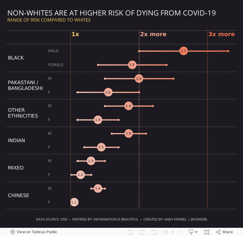
In this tip, I show you how to create an enclosed dot plot, which is essentially a dot plot that is enclosed by a line. It's very similar to a barbell chart except the line connecting the dots surrounds to dots.
July 19, 2021
May 24, 2021
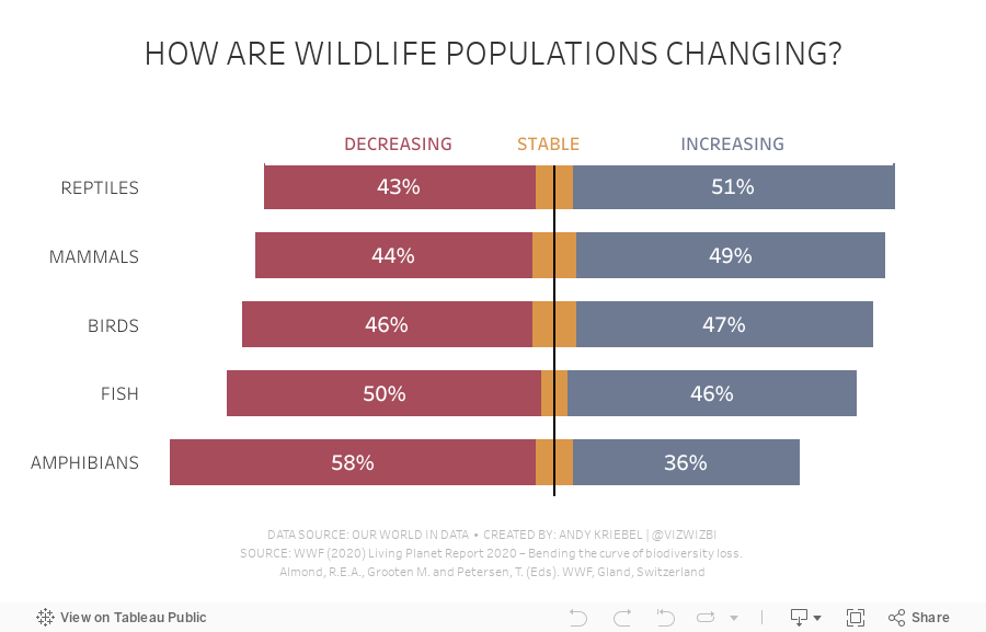
#MakeoverMonday 2021 Week 21 - How are wildlife populations changing?
barbell
,
bullet graph
,
bump chart
,
connected
,
diverging bar chart
,
dot plot
,
Makeover Monday
,
our world in data
,
planet
,
slope graph
,
spine chart
,
WatchMeViz
,
wildlife
No comments
February 8, 2021
#MakeoverMonday Week 6: Why Are Women Perceived to Be Unequal to Men?
bar in bar
,
barbell
,
bump chart
,
butterfly chart
,
comparison
,
connected
,
dot plot
,
gantt
,
gender
,
Makeover Monday
,
parallel coordinates
,
reference line
,
stacked bar chart
,
viz5
,
women
No comments
Wow! What a fun #WatchMeViz that was! I iterated through 16 charts and then when the idea solidified, there was some great conversation and feedback on the chat to help me get to the end. I find survey responses quite difficult to visualize, so instead of getting frustrated, I thought about all of the ways I can compare data to see if anything would work.
Most importantly, thank you to all of your on the live chat. It makes a huge difference to me and I love getting your feedback and questions along the way. You make me better. You can find the final visualization below the video.
June 25, 2015
Tableau Tip: How to Create DNA Charts
barbell
,
Chris Love
,
connected
,
Data School
,
difference
,
DNA
,
dot plot
,
Information Lab
,
Laszlo Zsom
,
learning
,
lines
,
magnitude
,
tableau
,
teaching
,
tip
,
tricks
,
variance
7 comments
The Data School launched this week and on the consultants' second day, we brought them into an all day training class with the rest of the Information Lab team. One of the courses we taught was advanced visualisations. The reason we run these internal training classes is because we have a core belief in continuous learning.
As part of this exercise, we were building a dot plot and Laszlo Zsom asked how to connect two dots on the same row. I hadn't ever done it before, so I used a Gantt chart to connect them. Then Chris Love suggested using lines.
In this week's tip (two days late as it is), I demonstrate both of these methods. Click on the image below to enjoy the video.
As part of this exercise, we were building a dot plot and Laszlo Zsom asked how to connect two dots on the same row. I hadn't ever done it before, so I used a Gantt chart to connect them. Then Chris Love suggested using lines.
In this week's tip (two days late as it is), I demonstrate both of these methods. Click on the image below to enjoy the video.
April 23, 2015
Dear Data Two - Week 2: Transport
connected
,
Dear Data
,
Dear Data Two
,
drawing
,
Jeffrey Schaffer
,
lines
,
nodes
,
steps
,
tableau
No comments
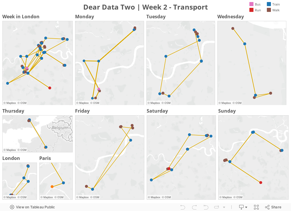
Jeffrey Shaffer and I are two weeks into a year-long weekly hand-drawn data viz project we’re calling Dear Data Two. The project is entirely modeled after the Dear Data project Giorgia Lupi and Stefanie Posavec are doing. Jeffrey and I thought this would be a great way for us to remove ourselves from software and work on being more “artistic”.
The week 2 theme was “Transport”. Jeffrey tracked his step pattern around his office.
While I tracked the places I went all week and how I got to each place. What was different for me this week is that I started with Tableau and then went to hand drawn. Going forward, you can keep up with the project at www.dear-data-two.com, where you can read more about our thoughts and how we created each postcard.
The week 2 theme was “Transport”. Jeffrey tracked his step pattern around his office.
While I tracked the places I went all week and how I got to each place. What was different for me this week is that I started with Tableau and then went to hand drawn. Going forward, you can keep up with the project at www.dear-data-two.com, where you can read more about our thoughts and how we created each postcard.
March 3, 2015
Tableau Tip Tuesday: Creating Connected Scatter Plots in Tableau
Alberto Cairo
,
animation
,
connected
,
dots
,
fertility
,
hans rosling
,
life expectancy
,
line
,
motion
,
scatter plot
,
tableau
,
tip
,
Tuesday
4 comments
I love connected scatter plots, especially when they are animated. Hans Rosling made the scatter plot more famous with his incredible video showing fertility rates vs. life expectancy, and this is the data set that I used in this tip. Also worth checking out is this great blog post by Alberto Cairo.
I previously wrote detailed instructions for creating connected scatter plots here.
You can download the workbook used to create this video here.
I previously wrote detailed instructions for creating connected scatter plots here.
You can download the workbook used to create this video here.
August 12, 2014
Tableau Tip: Creating a Connected Scatterplot
Alberto Cairo
,
connected
,
line
,
Lynn Cherny
,
scatterplot
,
tableau
,
the functional art
,
tips
,
twitter
No comments
Today I had the incredible honor of helping Alberto Cairo create his very first Tableau visualization. Alberto chose to create a connected scatterplot. Shortly thereafter on Twitter, Lynn Cherny asked:
So this post is dedicated to her question. Here you go Lynn:
Step 1: Create the scatterplot
Step 2: Change the Mark type to Line
Step 3: Add a continuous date dimension to the Path shelf
Step 4: Add Markers to the lines via the Color shelf
Step 5: On each axis, uncheck the "Include Zero" option
Step 6: Add a dimension to the Color shelf to create additional lines
That's all there is to it! Super simple! Download the sample workbook here.
Subscribe to:
Posts
(
Atom
)