January 30, 2023
#MakeoverMonday 2023 Week 5 - Where can you find a cheap slice of pizza in New York City?

- Prepare the data: calculations, joins, spatial intersections, and more
- Create maps: hexbin maps, map layers, spatial joins, using maps as shapes
- Create line charts and heat maps that are simple and effective (don't overcomplicate things)
- Build a dashboard using layout containers
July 5, 2022
How to Create a Hexbin Map in Tableau
In this tip, I show you how to create a hexbin map in Tableau. But first, let me explain the purpose, benefits and drawback of a hexbin map.
There are countless times when I have been asked to display way too much data on a map. Sometimes I’ve been asked to display thousands of points on a map..but why? I know no one will understand it.
A hexbin map uses hexagons to divide an area into multiple parts and assign a color gradient to each hexagon. This chart type is used to visualize density, where the hexagons dividing the whole space into discrete units of equal size.
This video is going to help you communicate the concentration of data on maps more effectively and give you another option for visualizing geospatial data. I’ll show you how to create a hexbin map based on both the value and the rank, giving you two options depending on your use case.
If you want to follow along, these are the data sources I used:
1. Austin Bike Accidents - https://bit.ly/AustinBikeAccidents
2. Austin Zip Codes Shapefile - https://bit.ly/AustinZipCodes
3. Price Summary - https://bit.ly/PriceSummary
August 9, 2021
#MakeoverMonday 2021 Week 32 - Mortality Rates in England and Wales

I couldn't find too much to do with this week's data set, so I ended up with some simple BANs and line charts that take the original and reorganize them a bit to make them more clear.
Resources:
- Data set - https://data.world/makeovermonday/2021w32
- Chart Guide - https://chart.guide/
- Final Viz - https://bit.ly/mm2021w32
November 2, 2020
#MakeoverMonday Week 44 - Where do women have more access to the internet and mobile phones than men?
#MakeoverMonday week 44 is another #Viz5 initiative. The topic this week is access to the internet and mobile phones by gender and country.
First, sorry about the video cutting out at the very end. My mistake.
In this video, I first review the initial visualization and talk about what works and what does. In the end, I went with a quadrant chart, which is a scatter plot with broken up into four quadrants. The viz focuses on only two of the quadrants to highlight the significant difference in the number of countries where women have more access to men for both technologies vs. the opposite.
I showed several methods for visualizing the data:
- Side-by-Side Bar
- Bar in bar
- Bar Graph vs. Reference Line
- Barbell
- Peas in a pod
- Floating bar chart
- Slope graph (terrible choice)
- Ranked slope graph (even worse choice)
- Histograms
- Box plot
- Scatter plot
Resources:
- Final workbook - LINK
- Data set - https://data.world/makeovermonday/2020w44
- Country and region information (Be careful joining this as some country names don't match. You'll want to using data blending and alias the country names to match.) - https://data.world/vizwiz/country-region-codes
- Chart Guide - https://chart.guide/
- Interactive chart chooser - https://depictdatastudio.com/charts/

October 20, 2020
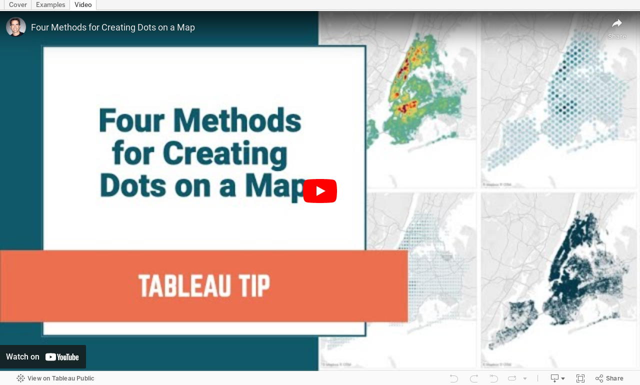
#TableauTipTuesday: Four Methods for Creating Dots on a Map

People love maps. Putting dots on a map gives a sense of precision. There are lots of methods for displaying maps. In this video, I show you four:
- The exact locations
- Density map
- Using the ROUND function to generalize the points
- Using the HEXBIN functions to generalize the points, but at a level controllable by the user
November 25, 2019
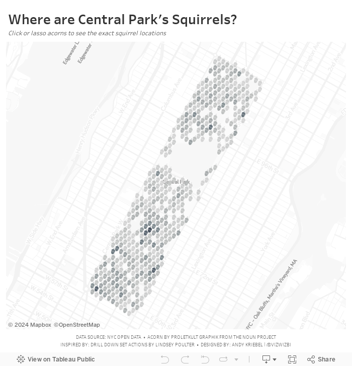
#MakeoverMonday: Where are the squirrels of Central Park?

Let's have a look at the original viz:

What works well?
- A map is a good way to represent the location of the squirrels.
- Showing the details on the map, like the ponds in the park and the roads around the park, help provide context.
- The dots are easy to see against the background.
- The title and description help explain the data.
What could be improved?
- There are some red dots. What do those mean?
- It would be interesting to see when the squirrels are spotted. Are there more in the winter? How do their habits change?