Showing posts with label marginal histogram. Show all posts
June 28, 2021
#MakeoverMonday Week 26 - How Popular Is Your Birthday?
birthday
,
color
,
heat map
,
histogram
,
how to
,
Makeover Monday
,
marginal histogram
,
Matt Stiles
,
preferences
,
WatchMeViz
No comments
The original visualization this week was superb. I don't think what I created was better, but I did come up with a slightly different take and I showed how to build a marginal histogram. I also failed trying to create a starburst chart (I'm going to give it another go).
Resources:

May 25, 2021
How to Create a Marginal Histogram
aggregation
,
analysis
,
bar chart
,
color
,
column chart
,
containers
,
context
,
dashboard
,
data visualization
,
distribution
,
format
,
frequency
,
heatmap
,
how to
,
layout
,
marginal histogram
,
tableau
,
tip
,
tutorial
,
worksheet
No comments

You can think of a marginal histogram as a heatmap with a histogram to the side and the top of the heatmap. Each graph provides a frequency distribution.
In this example, I'm going to show you how to create a marginal histogram that displays a frequency distribution of the number of taxi rides by weekday and hour for January 2020 in NYC.

March 11, 2019
#MakeoverMonday: Has Philadelphia recovered from the Great Recession?
Makeover Monday
,
marginal histogram
,
mortgage
,
open data
,
philadelphia
,
real estate
No comments


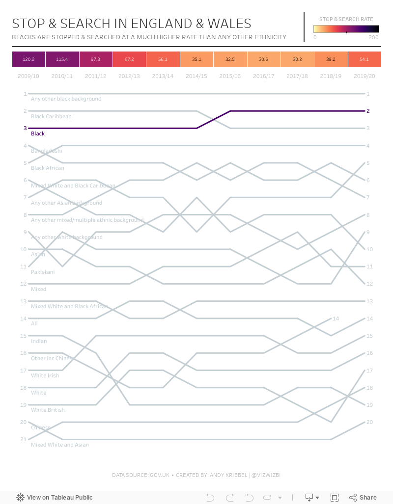
What works well?
- Consistency of colors
- Simple design
- Using an area chart with a bold line at the top
- Bar chart is sorted
- Interactive actions
- Automatic proportional brushing
What could be improved?
- Reduce the outline of the zip codes on the map
- Remove the background from the map
- Add a dashboard title
- Change the chart titles to be more meaningful
And here's my makeover. Click to interact.
January 23, 2018
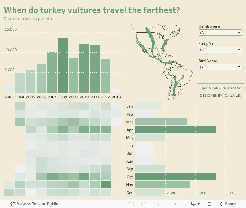
Makeover Monday: Distance Traveled by Turkey Vultures (Power BI Edition)
My goal was to recreate my Tableau viz from week 4 in Power BI. Here are ten thoughts about the process:

- I had to install a custom chart type in order to create the heat map.
- The heat map did not allow me to have year across the top and months down the side.
- I had no control over the colors in the heat map.
- I had to create a separate column for each of the years in the data set so that they were each individual measures that I could then use in the rows. That took way too long!
- I could not create a distance per bird calculation like I did in Tableau that could then be used in the heat map; I went with total distance instead.
- I could not connect the dots on the map to show the paths for each bird.
- I could not make the dots really small on the map nor could I color the dots by the bird name.
- I love how PBI automatically resizes to the screen. The viz I created is about 1300x900 in PBI, yet I can embed it as 800x600 and it rescales perfectly. This is fantastic!
- I love the pixel perfect layout; it's super easy to get everything just right.
- Mapping options are limited and you can't use a custom map (that I could see) so I had to match the dashboard background to the map background as close as I could.
With that, here's my Makeover Monday week 4 2018 created in Power BI.
January 22, 2018
Makeover Monday: When Do Turkey Vultures Travel the Farthest?
Eva posted these maps to makeover:

What works well?
- Using a map helps show the migration patterns.
- Using color to indicate the speed by which the birds travel (FYI, they're FAST!!!)
- Splitting the view between outbound and return migration.
What could be improved?
- Remove the latitude and longitude axes
- Remove the region labels
- Change the red/green colors for the middle two speeds
- Add a title so we know what the viz is about
- Make it interactive so that we can see the patterns of individual birds
What I did
- I focused on the distance the birds traveled. To do this, I exported the data to excel and added a column for distance which was calculated row by row for each bird. This then makes aggregating the distance easier.
- I created a calculation for distance per bird. This is a better measure than the average distance because the denominator is the number of birds, not the number of measurements.
- I create a marginal histogram to show the monthly/yearly patterns.
- I included filters to make it easier for the user to look at a specific bird or birds.
- I include the map for context and it draw a line for the pattern for each bird, whereas the original was a series of dots.
- I created a custom mapbox map that only includes the country borders (for decluttering) and has a background color that matches the dashboard color.
With that, here's my Makeover Monday week 4 2018 visualisation.
July 2, 2017
Makeover Monday: When did Tourism Peak in Berlin?
Berlin
,
black and white
,
Germany
,
heat map
,
Makeover Monday
,
marginal histogram
,
tourism
1 comment
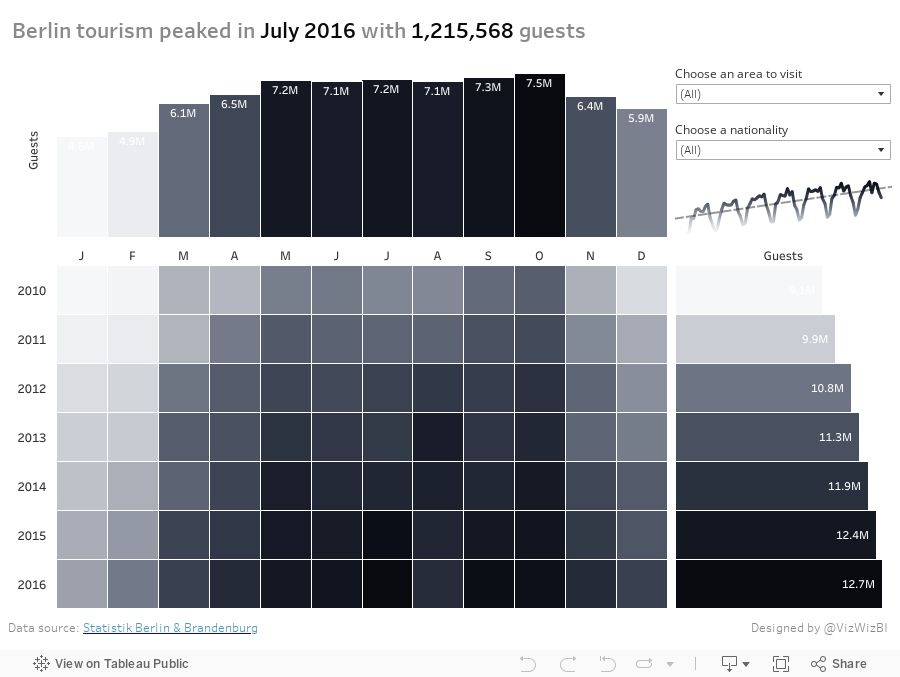
First, let's look at the viz to review:
What works well?
- Using a continuous, single color palette
- Legend is clearly labeled; even though it's in German, I can still understand it.
- Nice interactivity
- Including options to pick the metric
What could be improved?
- The callout for Berlin is confusing since there's no indication that's what was done.
- There's no sense of change over time.
- Need a more informative title.
- The color palette is pretty dull.
What were my goals?
- Think about what would be important to me as a tourist. Things like time of year to visit, places to visit, who visits, all impact my decisions on when to go places.
- Give an overall historical perspective through the use of a marginal histogram. I was definitely influenced by those created by Sarah Bartlett and Rodrigo Calloni last week.
- In only had about 30 minutes to work on it, so I spent about 5 minutes building the viz and another 25 formatting.
- Go with a black and white theme; actually I used the Facebook grey to black palette.
- Since some of the values go below 1 million, display those in thousands (e.g., 123K).
- Include the max values in the title as BANs.
Subscribe to:
Posts
(
Atom
)


