July 2, 2017
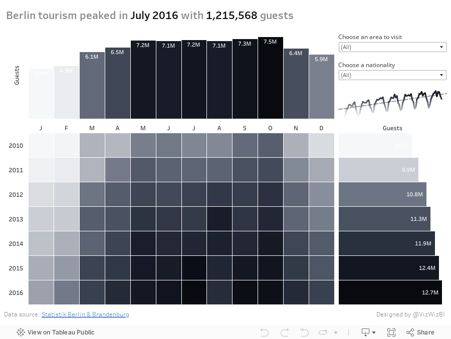
Makeover Monday: When did Tourism Peak in Berlin?
First, let's look at the viz to review:
What works well?
- Using a continuous, single color palette
- Legend is clearly labeled; even though it's in German, I can still understand it.
- Nice interactivity
- Including options to pick the metric
What could be improved?
- The callout for Berlin is confusing since there's no indication that's what was done.
- There's no sense of change over time.
- Need a more informative title.
- The color palette is pretty dull.
What were my goals?
- Think about what would be important to me as a tourist. Things like time of year to visit, places to visit, who visits, all impact my decisions on when to go places.
- Give an overall historical perspective through the use of a marginal histogram. I was definitely influenced by those created by Sarah Bartlett and Rodrigo Calloni last week.
- In only had about 30 minutes to work on it, so I spent about 5 minutes building the viz and another 25 formatting.
- Go with a black and white theme; actually I used the Facebook grey to black palette.
- Since some of the values go below 1 million, display those in thousands (e.g., 123K).
- Include the max values in the title as BANs.
June 26, 2017
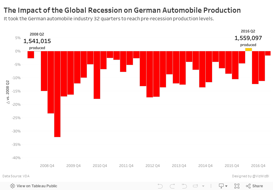
Makeover Monday: The Impact of the Global Recession on German Automobile Production
Life will be hectic these next two weeks. I'm off the Germany for 10 days, helping our German team with Zen Master events in Frankfurt and Hamburg before heading to Exasol Xperience in Berlin next week. This week, we're looking at German car production to make it more relevant for the #MakeoverMonday live sessions we'll be running.

What works well?
- Line charts are generally very easy to understand
- Including a trend line
- Great responsiveness for the tooltips
- Including the Year over Year change in the tooltip
- Including a BAN in the tooltip
- Putting the tooltip into a sentence
What could be improved?
- Needs a better title
- Remove the car icon from the tooltip
- Remove the up and down arrows from the tooltip; they're redundant to the text.
- It's pretty boring. What's the story?
What were my goals?
- Find a story in the data
- Create a more informative visualisation
- Explore the data, particularly with all the ways you can create time series in Tableau
- Keep the viz to a single worksheet in order to keep it simple
- Give the viz a meaningful title
- Use German colors
- Get it all done in an hour; I'm really pressed for time as I type this.
- Keep the idea of the tooltips from the original with the BANs.
February 14, 2011
Money League: See how much the top football clubs make
Let me start by saying I am a HUGE Arsenal fan. I catch every game that’s on TV here in the States.
If you’re living under a rock and don’t watch football, the knockout stages of the UEFA Champions League begin Tuesday with Arsenal hosting Barcelona on Wednesday in the biggest tie of the round. Catch the game on Fox Soccer Channel at 2:30pm ET. If you want to see the game played at its absolute highest level, this is the game to watch. It will be a beautiful sight.
Annually Deloitte publishes a list of the top 20 football clubs in the world based on revenue. As always, the Guardian Datablog published a viz to go along with its article. They published this absolutely hideous stacked bar chart. Seriously, this is what they published. How do you even know which team is which? There is a fancy mouse-over feature. This stuff kills me!
With Tableau, there are so many better ways to make this data interesting. Here’s my take:
Interacting with the viz you can quickly see that:
- The Barclays Premier League dwarfs the other leagues in all revenue types
- The Barclays Premier League has seven of the top 20 teams (click on any of the league logos to filter the list of teams)
- Real Madrid is a MUCH bigger club than its city neighbor Atletico de Madrid (350% bigger)
- Manchester United is also a MUCH bigger club than its city neighbor Manchester City (229% bigger). I hate them both, but Manchester City even more since they think they can buy themselves a title. No chance with an Italian manager; the football is way too negative!
- Arsenal dominates matchday revenue, thanks in large part to the spanking new Emirates Stadium (I can’t wait to see it some day). I heard on TV today that they generate $3M every game
- The top three clubs in terms of broadcasting revenue are all in Italy. According to the NY Times, “Italian teams negotiate their own television contracts, with the top clubs like Inter Milan, A.C. Milan and Juventus garnering huge deals”, whereas it’s a shared revenue pool in the other leagues. Heck, Real Madrid’s rank in broadcast revenue puts them at 17th, but their overall revenue has them at #1.
- German clubs lead the way in commercial revenue. I know virtually nothing about the Bundesliga other than their games are fun to watch and the chanting by the fan is endless
Does anything else stand out to you?
Go you Gooners!


