Showing posts with label manufacturing. Show all posts
September 3, 2018
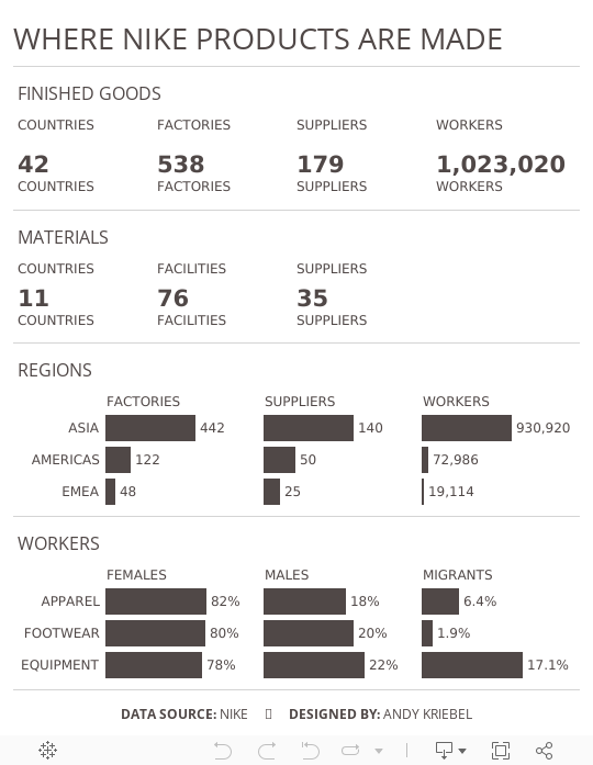
Makeover Monday: Where Nike Products Are Made


What works well?
- The summary card on the right is packed full of information and as you zoom, you get different levels of detail.
- Keeping the map a single color allows you to focus on where the factories are located.
- Excellent interactivity
- Overall, everything is simple and clean.
What could be improved?
- Adding some filtering capabilities
- Make it easier to identify the smaller countries, possibly by outlining the countries with a white border.
What I did
- Mimic the style of the cards with its BANs
- Make some of the importion that's buried deeper in the map more evident
- Use Nike official colors
- Add some simple interactivity through actions
This is a pretty simple viz this week and I really enjoyed making it. It's almost like a report card.
June 26, 2017
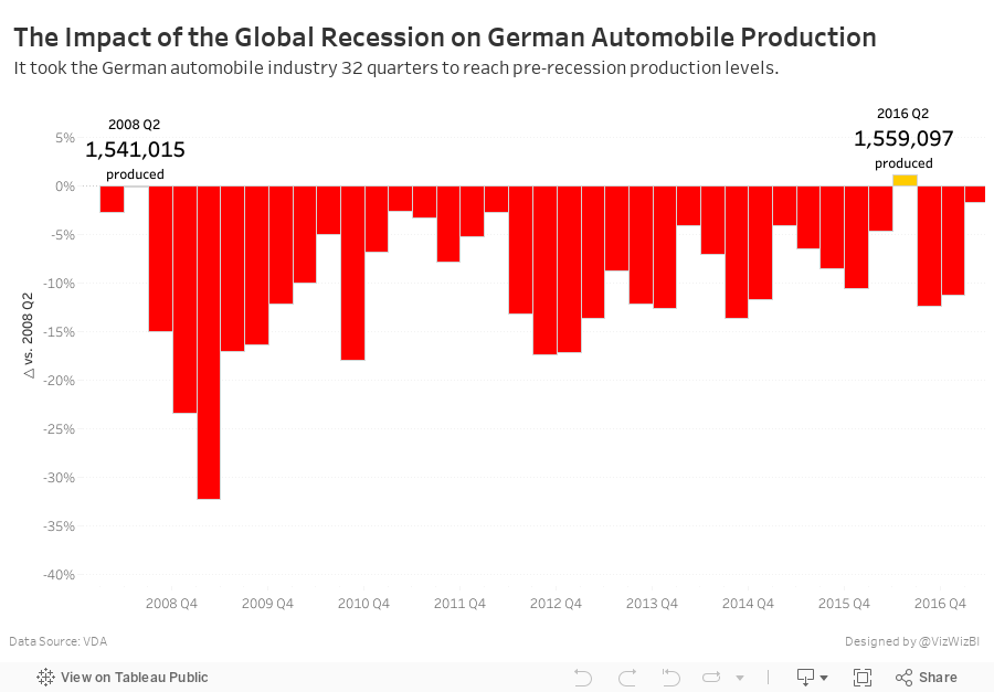
Makeover Monday: The Impact of the Global Recession on German Automobile Production
Life will be hectic these next two weeks. I'm off the Germany for 10 days, helping our German team with Zen Master events in Frankfurt and Hamburg before heading to Exasol Xperience in Berlin next week. This week, we're looking at German car production to make it more relevant for the #MakeoverMonday live sessions we'll be running.

What works well?
- Line charts are generally very easy to understand
- Including a trend line
- Great responsiveness for the tooltips
- Including the Year over Year change in the tooltip
- Including a BAN in the tooltip
- Putting the tooltip into a sentence
What could be improved?
- Needs a better title
- Remove the car icon from the tooltip
- Remove the up and down arrows from the tooltip; they're redundant to the text.
- It's pretty boring. What's the story?
What were my goals?
- Find a story in the data
- Create a more informative visualisation
- Explore the data, particularly with all the ways you can create time series in Tableau
- Keep the viz to a single worksheet in order to keep it simple
- Give the viz a meaningful title
- Use German colors
- Get it all done in an hour; I'm really pressed for time as I type this.
- Keep the idea of the tooltips from the original with the BANs.
Ok, that's it. Here's my Makeover Monday week 26 viz.
Subscribe to:
Posts
(
Atom
)


