December 22, 2019
#MakeoverMonday: How much are Brits & Europeans expected to spend on Christmas?

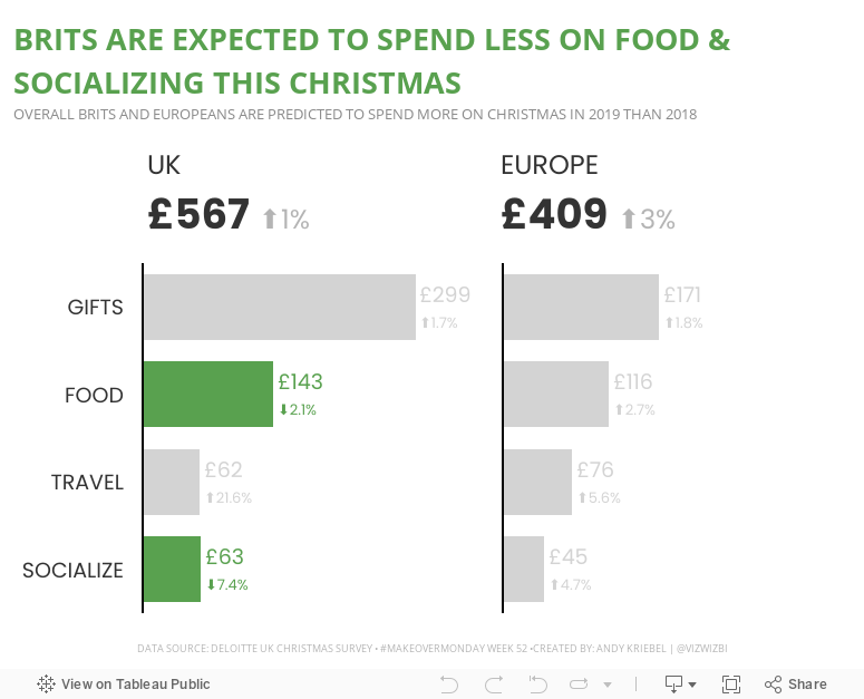
This week, Eva picked Christmas-themed data...a simple survey from Deloitte about expected Christmas spending and the UK and Europe.

What works well?
- It a simple table that is easy to understand without doing much thinking.
- My eyes were immediately drawn to the two red declining arrows, which makes it seem to be the focus on the visualization.
- The table is neatly organized from highest to lowest spending categories.
- Everything is clearly labeled.
- The highlight box on the right provides a nice summary.
What could be improved?
- Remove the shading from 2018
- Removed the shading from the background of the Total cell
- Align the text labels either left of right, but not center
- Remove the borders between the rows, but keep them to separate the headers and totals from the rest of the table
- Change the font color of the categories to black; green could give the impression that they are increasing
- Align the arrows on the second table with the rows they correspond to
- Why is spending less red? I would think spending less is good

December 23, 2018
Makeover Monday: Spending on Christmas Gifts in America

I believe Charlie Hutcheson is the only community member to complete all 156 weeks, though Simona Loffredo has only a couple of weeks to catch up on before the end of the year to join Charlie (and me) in the 100% club. As of this writing, Charlie has 307 vizzes on his Tableau Public profile, while Simona has 197. That's an incredible achievement and a testament to their dedication to improve week by week.
It's nearly Christmas Day, so Eva picked a Christmas-themed data set. Let's have a look at the viz:
 |
| Original viz by Statista |
What works well?
- It's a line chart based on time, so it's easy to understand what it's telling us.
- Using one color
- I kind of like the banding for every other year.
- Good axis title for the measure
What could be improved?
- Remove all of the numbers except the first and last years.
- Add a title
- Add the data source; surely Statista didn't come up with the data themselves.
- Remove the paywall so we can see information about the source and the publisher.
- Remove the paywall for downloading the data. All you really need to do is type the numbers into Excel anyway.
- Is there any insight?
What I did
- Create something simple
- Supplement with additional data to see if it can add any context.
- Deloitte's 2018 Holiday Survey of Consumers for information about the number of gifts purchased
- US Census for Monthly Retail Trade spending - I used the Total (excl. Motor Vehicle and Gas) and divided it by the number of months.
- Population data from the World Bank (1999-2017) and the US Census (2018)
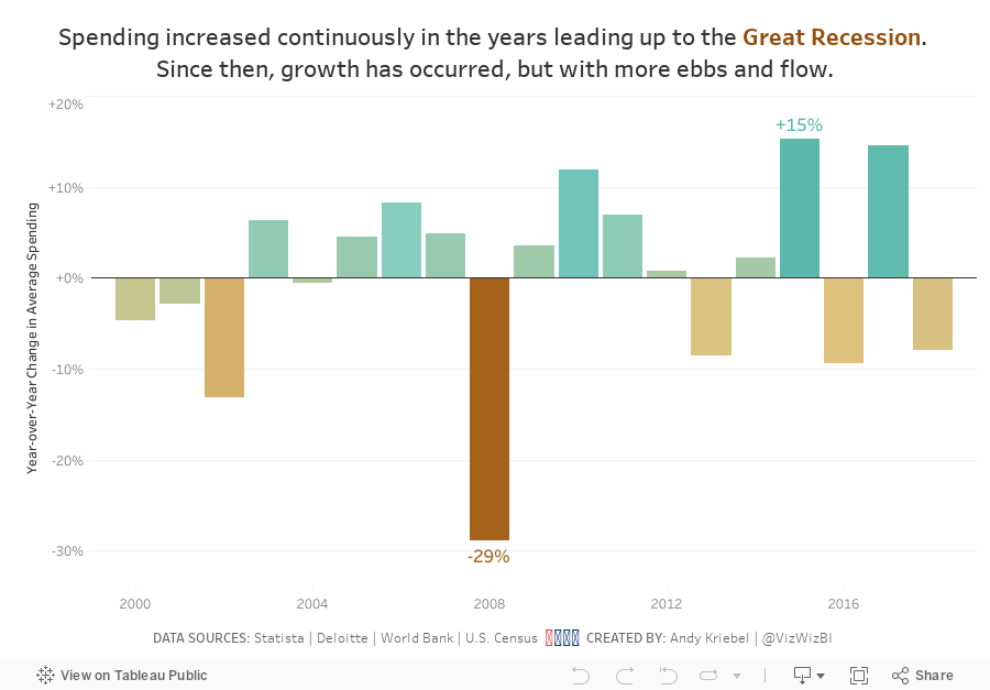
- Looked at year-over-year change
- Compare the statistics to look for relationships
January 26, 2015
Makeover Monday: Facebook's Global Economic Impact
In the report, the first graphic that Deloitte shows was this donut chart that explodes into three slanted pie charts:

Some of the most striking problems:
- Using a donut chart to represent parts-to-whole is a bad idea. Read this post by Steve Wexler for a good explanation on why you shouldn't use donut charts.
- There's an implicit hierarchy from the ecosystem to the breakdown of each ecosystem, yet this view goes in the opposite direction by having the regional breakdown above the totals.
- The pie charts, while not 3D are slanted, which distorts their proportions.
- Pie charts are not the best way to compare proportions.
- The title is super small. Looking at this as a stand-alone graphic, it's difficult to understand what the purpose of the graphic is in the first place.
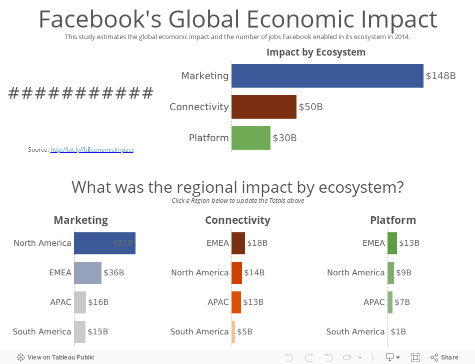
In this version, I attempted to address the concerns I outlined above by basically changing everything to bar charts and rearranging the view. Does this work better? Note that I added some interactivity as well.
February 14, 2011
Money League: See how much the top football clubs make
Let me start by saying I am a HUGE Arsenal fan. I catch every game that’s on TV here in the States.
If you’re living under a rock and don’t watch football, the knockout stages of the UEFA Champions League begin Tuesday with Arsenal hosting Barcelona on Wednesday in the biggest tie of the round. Catch the game on Fox Soccer Channel at 2:30pm ET. If you want to see the game played at its absolute highest level, this is the game to watch. It will be a beautiful sight.
Annually Deloitte publishes a list of the top 20 football clubs in the world based on revenue. As always, the Guardian Datablog published a viz to go along with its article. They published this absolutely hideous stacked bar chart. Seriously, this is what they published. How do you even know which team is which? There is a fancy mouse-over feature. This stuff kills me!
With Tableau, there are so many better ways to make this data interesting. Here’s my take:
Interacting with the viz you can quickly see that:
- The Barclays Premier League dwarfs the other leagues in all revenue types
- The Barclays Premier League has seven of the top 20 teams (click on any of the league logos to filter the list of teams)
- Real Madrid is a MUCH bigger club than its city neighbor Atletico de Madrid (350% bigger)
- Manchester United is also a MUCH bigger club than its city neighbor Manchester City (229% bigger). I hate them both, but Manchester City even more since they think they can buy themselves a title. No chance with an Italian manager; the football is way too negative!
- Arsenal dominates matchday revenue, thanks in large part to the spanking new Emirates Stadium (I can’t wait to see it some day). I heard on TV today that they generate $3M every game
- The top three clubs in terms of broadcasting revenue are all in Italy. According to the NY Times, “Italian teams negotiate their own television contracts, with the top clubs like Inter Milan, A.C. Milan and Juventus garnering huge deals”, whereas it’s a shared revenue pool in the other leagues. Heck, Real Madrid’s rank in broadcast revenue puts them at 17th, but their overall revenue has them at #1.
- German clubs lead the way in commercial revenue. I know virtually nothing about the Bundesliga other than their games are fun to watch and the chanting by the fan is endless
Does anything else stand out to you?
Go you Gooners!






