Showing posts with label format. Show all posts
April 18, 2024
How to Create a Donut Chart in Tableau
angle
,
circle
,
color
,
donut chart
,
dual axis
,
format
,
how to
,
label
,
pie chart
,
size
,
tableau
,
text
No comments
Make your data delicious with this Tableau donut chart tutorial.
Donut charts are a common way of showing part-to-whole data – but be aware that it’s difficult to accurately compare the size of the segments.
They are similar to a pie chart – but the centre can be a good way of making space to include more information about the data (e.g., total).
September 14, 2021
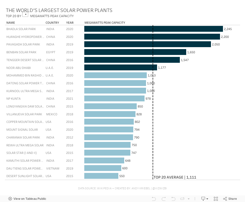
#MakeoverMonday 2021 Week 37 - The World's Largest Solar Power Plants
bar chart
,
color
,
drill down
,
energy
,
format
,
formatting
,
how to
,
Makeover Monday
,
number format
,
parameter
,
set action
,
solar power
,
table calculation
,
tooltip
,
WatchMeViz
No comments

If you have a look at the video below, you'll see me create a drill down action, using a boolean table calc to color the bars, create a parameter to choose a metric, and lastly I show you how to create different number formats for a single calculation.
September 6, 2021
#MakeoverMonday 2021 Week 36 - How Has American Support For Abortion Changed Since 1975?
annotate area
,
anti-abortion
,
Congress
,
female
,
format
,
labels
,
law
,
line chart
,
Makeover Monday
,
opinion
,
pro-choice
,
rights
,
texas
,
trend
,
women
No comments

Despite the massive setback to women's right in Texas, less Americans are anti-abortion than in 1975. Now maybe if the barbaric dinosaurs in Congress in Texas came into the 21st century, they'd finally realize women are our equals and we shouldn't control them. It's all very, very disgusting. They should be ashamed, but of course they're not. In fact, they are quite proud of what they "achieved".

May 25, 2021
How to Create a Marginal Histogram
aggregation
,
analysis
,
bar chart
,
color
,
column chart
,
containers
,
context
,
dashboard
,
data visualization
,
distribution
,
format
,
frequency
,
heatmap
,
how to
,
layout
,
marginal histogram
,
tableau
,
tip
,
tutorial
,
worksheet
No comments

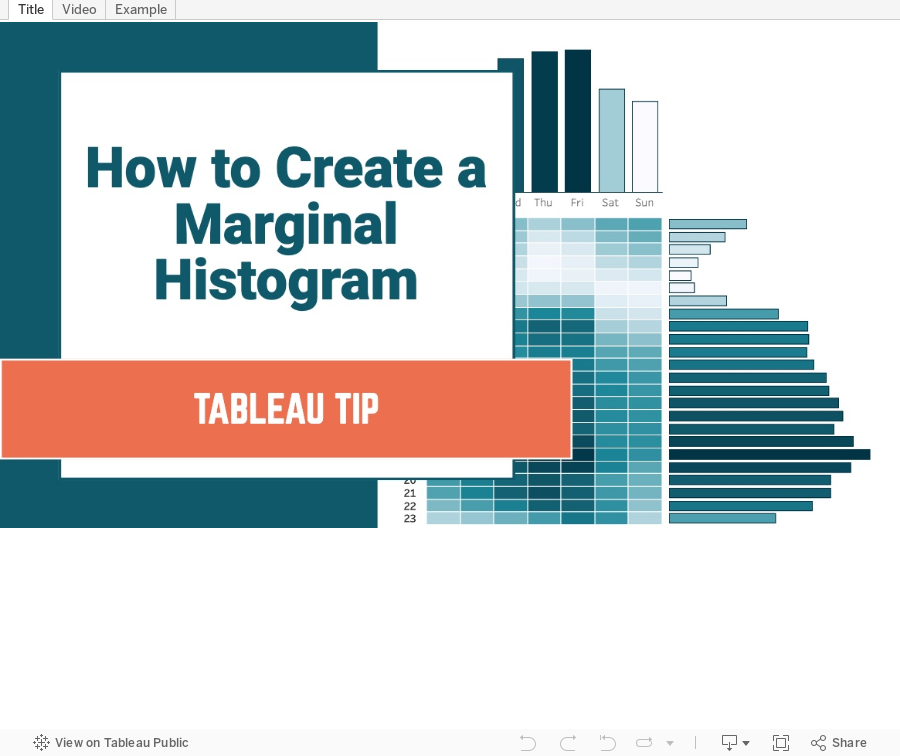
You can think of a marginal histogram as a heatmap with a histogram to the side and the top of the heatmap. Each graph provides a frequency distribution.
In this example, I'm going to show you how to create a marginal histogram that displays a frequency distribution of the number of taxi rides by weekday and hour for January 2020 in NYC.
October 6, 2020
#TableauTipTuesday: How to Format Numbers as Trillions
beginners
,
billions
,
custom number format
,
decimal places
,
format
,
formatting
,
number format
,
tableau
,
tip
,
training
,
trick
,
trillions
,
tutorial
No comments

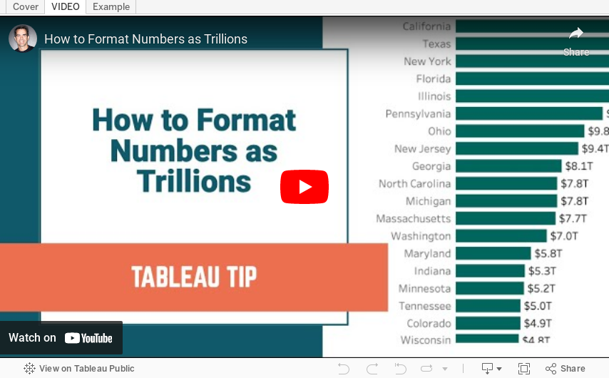
During #WatchMeViz this week, I showed how to format numbers as trillions. Trillions isn't an option in Tableau's number formatting. However, you can get around it with a custom format. In this video, I show you how to do that. It's quite simple!
July 28, 2020
#TableauTipTuesday - Using Set Actions to Change the Format of the Selected Value in a Dropdown Filter or Parameter
action
,
action filter
,
actions
,
dashboard action
,
format
,
formatting
,
parameter
,
parameter actions
,
parameters
,
set
,
set action
,
set actions
,
sets
,
Tableau Tip Tuesday
,
tip
,
tips
,
worksheet action
No comments


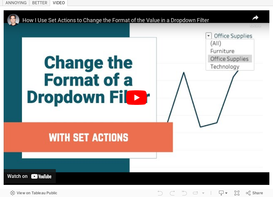
Notice how the font for "Office Supplies" next to the dropdown selector (9 pt) does not match the font size of the option displayed (12 pt). In this video, I show you how to work around that in a couple different methods.
- Using Category as a filter
- Using a Set Action so that the (All) option can also be displayed
The final product uses set actions. This method also applies to Parameters, but I have not included those in the video. The steps are mostly the same except you would use a Parameter Action instead of a Set Action.
Enjoy!
Subscribe to:
Posts
(
Atom
)






