February 13, 2017
Makeover Monday: How Much Do Americans Spend on Valentine’s Day?
bubble chart
,
donut chart
,
infographic
,
love
,
Makeover Monday
,
mobile
,
trend
,
valentine's day
No comments
This meant spending my Sunday morning find a new viz and data set. A quick google search turned up this infographic from KarBel Multimedia:Maybe some love or Valentine's Day dataset for #makeovermonday week 7? We love data. It's our day too. @TriMyData @VizWizBI— Staticum (@staticum) February 11, 2017

What I like:
- Color choices that match the theme
- Simple title that tells me what I'm about to see
- Proper sourcing
- Nice description that include a question that explains what the viz is about
- Donut chart works well here as it's only 2 slices
- Clear labeling
What could be improved:
- Why use bubbles to compare the sizes of the spending? A bar chart would be way easier to read.
- There's very little context. Is this spending increasing or decreasing?
- While the color choices work for the theme, this sure is A LOT of pink.
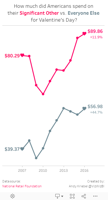
For my viz, I wanted to create a mobile version that looks at the historical spending trends in two groups: significant others and everyone else. I don't lover my effort this week (pardon the pun), but there's only so much time in a day. Lastly, special thanks to Eva for the color palette.
Subscribe to:
Post Comments
(
Atom
)


No comments
Post a Comment