December 30, 2018
Makeover Monday: Team by Team NHL Attendance
attendance
,
hockey
,
KPI
,
Makeover Monday
,
NHL
,
trend
No comments

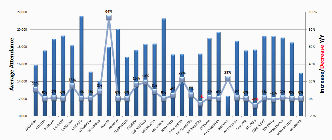
For week 1, we're making over this chart from NHL to Seattle. Granted the chart is from 2013, but it's still worth a makeover. If you want to see what John Barr has done since then, you can find a more recent visualization of NHL attendance from him here.
What works well?
- The teams are ordered alphabetically, which makes it easy to find a specific team.
- Axes are clearly labeled
What could be improved?
- You should NEVER EVER truncate the axis of a bar chart.
- You should not use a line chart for non-ordinal data (e.g., team names).
- There's no title.
- 3D bar charts are meh
- Labeling each square makes the viz feel cluttered.
- Ordering the bars from highest to lowest would make it easier to see where a team ranks.
What I did
- I grouped the team into their respective conferences and divisions.
- I create a couple of KPIs and repeated them for each team.
- I started by lining up the teams horizontally, which kept me under an hour. Then I sent a screenshot to Eva and she said it would make more sense to have them vertically and geographically west to east. THAT TOOK FOREVER! Three sheets for each team, each within a "team container", which is inside a "Division" container, which is inside a horizontal container to give each division container the same space. What a pain!
It's done. So with that, here's my first Makeover Monday for 2019. Click the image for the interactive version.
Subscribe to:
Post Comments
(
Atom
)


No comments
Post a Comment