Showing posts with label NHL. Show all posts
December 30, 2018
Makeover Monday: Team by Team NHL Attendance
attendance
,
hockey
,
KPI
,
Makeover Monday
,
NHL
,
trend
No comments

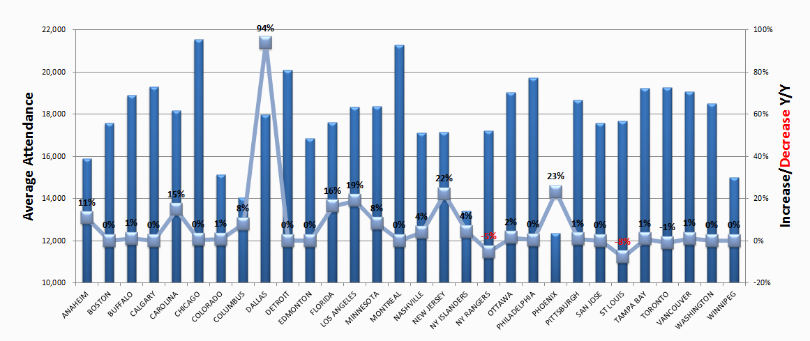
For week 1, we're making over this chart from NHL to Seattle. Granted the chart is from 2013, but it's still worth a makeover. If you want to see what John Barr has done since then, you can find a more recent visualization of NHL attendance from him here.
What works well?
- The teams are ordered alphabetically, which makes it easy to find a specific team.
- Axes are clearly labeled
What could be improved?
- You should NEVER EVER truncate the axis of a bar chart.
- You should not use a line chart for non-ordinal data (e.g., team names).
- There's no title.
- 3D bar charts are meh
- Labeling each square makes the viz feel cluttered.
- Ordering the bars from highest to lowest would make it easier to see where a team ranks.
What I did
- I grouped the team into their respective conferences and divisions.
- I create a couple of KPIs and repeated them for each team.
- I started by lining up the teams horizontally, which kept me under an hour. Then I sent a screenshot to Eva and she said it would make more sense to have them vertically and geographically west to east. THAT TOOK FOREVER! Three sheets for each team, each within a "team container", which is inside a "Division" container, which is inside a horizontal container to give each division container the same space. What a pain!
It's done. So with that, here's my first Makeover Monday for 2019. Click the image for the interactive version.
November 19, 2015
Philadelphia Has the Worst Sports Teams in North America
I was listening to Sports Radio WIP yesterday as I was driving to get a cup of delicious Dunkin Donuts coffee. I heard one of the hosts talk about how Philly is the worst sports city in all of North America for cities that have teams in all four major sports leagues. A quick Google search turned up this article.
How bad are Philly sports teams?
I took the ugly table of numbers from the article and built the interactive dashboard you see below, confirming my worst fears.
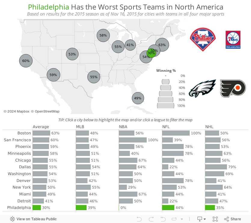
This merely confirms the misery that is being a Philadelphia sports fan.
How bad are Philly sports teams?
- The Eagles are more or less unwatchable. They’re inventing new ways to lose.
- The 76ers have lost 20+ games in a row. That’s really, really hard to do in the NBA.
- The Flyers couldn’t score if there was no goalie in the opposing net.
- The Phillies…well, they did their best to be one of the worst baseball teams of all-time.
I took the ugly table of numbers from the article and built the interactive dashboard you see below, confirming my worst fears.
This merely confirms the misery that is being a Philadelphia sports fan.

September 28, 2015
Makeover Monday: How Much More Valuable are NFL Franchises than Other Leagues?
business intelligence
,
change
,
Chart of the Day
,
context
,
Cork Gaines
,
Makeover Monday
,
MLB
,
NBA
,
nfl
,
NHL
,
sports
,
variance

A couple weeks ago, Business Insider published a very simple bar chart showing the total value of all franchises for the four major professional sports in the USA. At the Data School, I’m always stressing context in visualisations.
Business Insider’s chart is lacking context, so in today’s makeover, I walk you through a few simple methods for adding context to a simple bar chart.
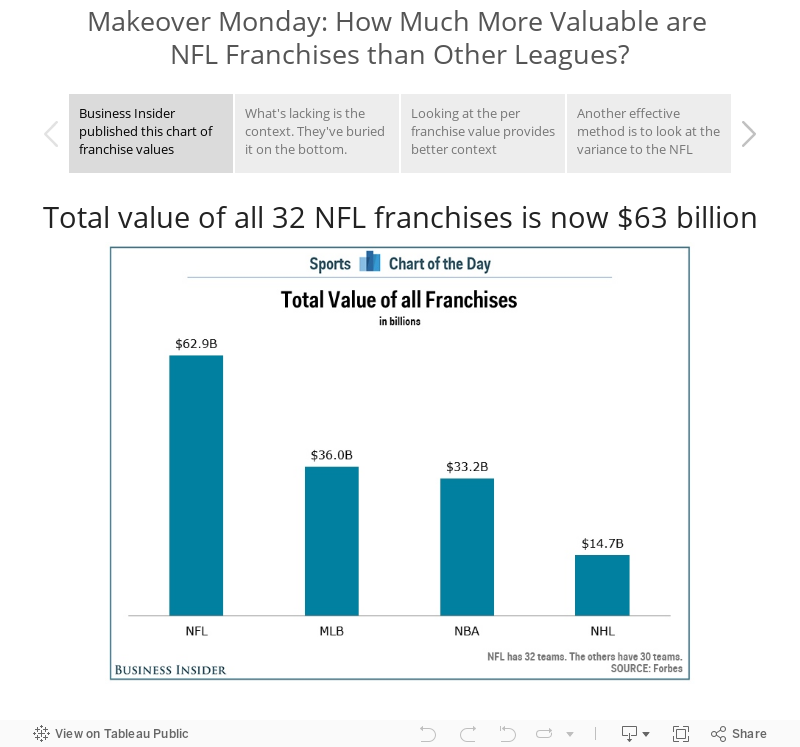
Business Insider’s chart is lacking context, so in today’s makeover, I walk you through a few simple methods for adding context to a simple bar chart.
Subscribe to:
Posts
(
Atom
)






