April 25, 2016
Makeover Monday: Victims of the 21st-century Slave Trade

This week for Makeover Monday we are looking at this Viz of the Day from CNBC as seen on Tableau Public. For me, this is a really poorly done viz that really doesn’t tell us anything. When I look at this and say to myself “so what?”, I can’t answer that question.

Let’s start by looking at what works well:
- The table provides a nice summary of how many countries in each region fall into each tier.
- Clicking on a region and/or tier filters the map
- Nice “About” option
Really, that’s about all I can come up with that works well. There are so many things that could be done better:
- The most major problem is that there’s no context. What is good and what is bad? Is the situation getting better or worse? Context is so critical in visualisation and this viz totally lacks context.
- The title is misleading; was that intentional? These countries aren’t necessarily trafficking the children. Yes, it’s unbelieably terrible how the children are treated, but the title needs to be more accurate.
- The bubbles in the table add no value.
- Poor color choices
- Tooltips are useless
- There are no trends
- There’s no call to action. What am I supposed to do with this information? Again, so what?
Keep in mind that Makeover Monday is NOT about criticizing the author, it’s about critiquing the visualization and trying to create a more compelling story and more interesting visualizations.
What I wanted to try to focus on this week is whether or not childhood slave trade is getting better or worse. The data set that I created contains data back to 2007. Since we have geographical data (i.e., countries), I first wanted to see if viewing the countries by their tier status as a series of small multiple maps would reveal anything.
 |
| Click on the image to interact |
Unfortunately seeing trends across multiple maps is extremely difficult. Even if I drill into a specfic region, Africa for example, it’s still really hard to see patterns.
 |
| Click on the image to interact |
Ok, so maybe filtering even further by tier status would help. Let’s first look at all tier 3 countries.
 |
| Click on the image to interact |
Maybe you now have a case for making sense of the small multiple maps, but it takes too much work to see the rate of change. Enough of the maps, clearly they won’t work for displaying change. Fortunately Tableau lets us fail fast!
An alternative to the small multiple maps would be a heat map. In this view, I placed Country in the Rows and Year in the Columns and added a filter for Region.
 |
| Click on the image to interact |
Now we’re getting somewhere. I really like this view because it shows concentrations well. At a glance I can see that there were fewer Tier 2 in 2015 than in 2007 and more contries have moved towards Tier 3. It’s also clear that there are no more Tier 1 countries in Africa.
Contrast that to Europe.
 |
| Click on the image to interact |
Nearly every country in Europe is Tier 1 or Tier 2 and have been consistently. The transition in Russia from a Tier 2 Watch List to Tier 3 pops out as well.
So far, the heat map is my favourite. In Tableau though, since it’s so easy to create lots of views, I iterated some more. Next, I created this unit chart which shows each country in each region by year, simply color-coded by their tier status.
 |
| Click on the image to interact |
I love the look of this unit chart. Notice that I intentionally made each section 5 circles wide. I did that so they’re easier to count. Two things in particular jump out to me in this view:
- The number of Tier 2 Watch List and Tier 3 countries in Africa is growing.
- Asia had an increase in Tier 2 Watch List countries early on and is not slowly progressing more countries towards Tier 2 status.
To get an even better look at whether regions are progressing, I can filter the unit chart to only Tier 2 Watch List and Tier 3 countries. Filtering the data makes my two impressions above even more evident.
 |
| Click on the image to interact |
Lastly, I wanted to look at a time series view. In this case, I need to aggregate the data up to the Region level and count the number of countries in each Tier. The rationale behind this is to simply see how regions are doing over time. Are they getting better or worse? Is the number of Tier 1 and Tier 2 countries growing or are the number of Tier 2 Watch List and Tier 3 countries increasing?
 |
| Click on the image to interact |
It makes complete sense that the time-series view would reveal patterns best. That’s exactly the best use case for a line graph. I like the clean look about this chart. It’s easy to compare within a region and tier or across regions or across tiers or across regions and tiers.
But does this give me the BEST context? Is there a better way to show how the situation has changed since 2007? Yes, by comparing each year to the first year. In this view, I’m now showing the % change in the number of countries in each region in each tier since 2007. I’m using % change because it’s more contextual than simply the change.
 |
| Click on the image to interact |
In this post, I’ve shown you many ways to iterate through the data to find a compelling story, but this doesn’t bring it all together quite yet. In order to do so, I need to combine some of these views into a dashboard. I’m going long-form again this week as there’s simply too much information that needs to be shown to be effective in a single screen.
I’ve created both desktop and mobile version with the design a bit differnent in each.
December 21, 2015
Makeover Monday: Crude Oil Prices Have Taken a Dive Since June 2014


What can be improved?
- The title doesn't tell us anything about the visualisation itself. It's important that titles engage the readers and let them know what to expect. Or the title could provide a headline for the story.
- The title says 1986-present, yet the initial visualisation shows only 2005-2015.
- The subtitle says that the viz shows "a look at previous August prices", yet every month in shown.
- There are too many lines with too many colours. Try adding all of the years back to 1986. It really gets messy then.
- It's too hard to see the overall trend from 2005-2015. The peaks and valleys are nearly impossible to see.
- The table on the bottom right is in reverse chronological order. Why? And what does the colour on the background of the table mean? It's not necessary.
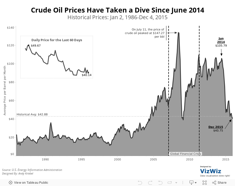
So, given this list of concerns, I've created this visualisation that shows:
- The entire timeline from 1986-2015.
- I note key events that were occurring in the financial markets.
- I made the whole viz simpler and cleaner. Notice the absence of colour.
- I included the historical average for context (things aren't as bad as the original viz makes things out to be).
- I included a close-up view of the daily oil price for the latest 60 days.
Feel free to download the viz and create your own version.
January 29, 2015
Emergency Makeover: Vaccination Rates at California Elementary Schools
Consider this Viz of the Day from January 28, 2015.

What is incredibly ironic is that I saw this literally minutes after having talked about color blindness in a data viz class I was teaching. In the room was a colleague of mine, who is red-green color blind. I showed it to him and said "What do you see?" to which he responded "A bunch of brown dots."
I ran the map through the Vischeck color blindness simulator and low and behold, this is what you get:

Now can you understand why I'm getting so upset? Who picks VotD after all? Why aren't best practices part of the criteria? Does anyone know the criteria? Is there a criteria?
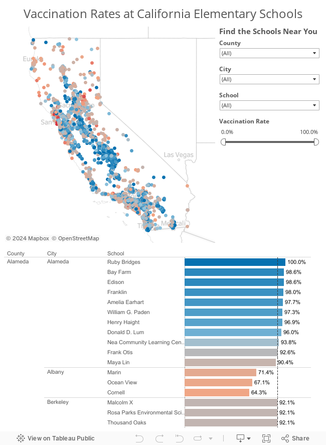
I downloaded the workbook and made a few simple adjustments to it. Here's my version after about 15 minutes of TLC. I focused on color, sorting, tooltips and filtering.
Don't get me wrong; It's a huge honor to get chosen for VotD. I know I get excited every time one of my vizzes is chosen. But what I really want, and I think there are lots of other people with me, is for VotD to be an amazing gallery that everyone recognizes as the most outstanding work done with Tableau. Work that's designed well. Work that's visually appealing. Work that follows best practices. Work you'd want to emulate.
With the visibility that the Viz of the Day gallery has, am I asking for too much? If I am, please tell me. Explain to me why I'm off base. If you're in agreement with me, let your voice be heard.
November 28, 2014
My new website focusing on data viz best practices
This led me to create www.DataVizDoneRight.com, which I will use to highlight examples of data viz best practices I find around the web. The content will not be exclusively Tableau focused, as there is tons of great content outside the Tableau community as well.
The first post is up. Go check it out here.
October 15, 2014
Tableau Wannabe Podcast: Episode 10 - Viz of the Day, Arsenal & Willard Brinton
This week, Matt, Emily and I:
- Reviewed the Maharashtra Election dashboard from Viz of the Day
- Conducted a live discussion and made updates to my Arsenal Injury Crisis viz
- Discussed Andy Cotgreave's amazing talk from #DATA14 - 100 Years of Visualization Best Practices—It's Time to Stop Making the Same Mistakes






