February 11, 2018
Makeover Monday: The Winter Olympics

What works well?
- Simple title and subtitle
- Noting when he combined countries
- Simple filtering
- Nice small multiples design
- Including summaries under each country name
- Sorting the countries from most medals to least
- Including blocks for each medal won
What could be improved?
- Right-align the filter titles so they are next to the filter itself.
- I'd prefer the gold medals at the bottom and bronze on top.
- Provide an option to look at the top N countries so that you can see it one screen.
- The x-axis doesn't make sense. If it's supposed to represent a year, why does it start at zero and end at 25?
What did I do?
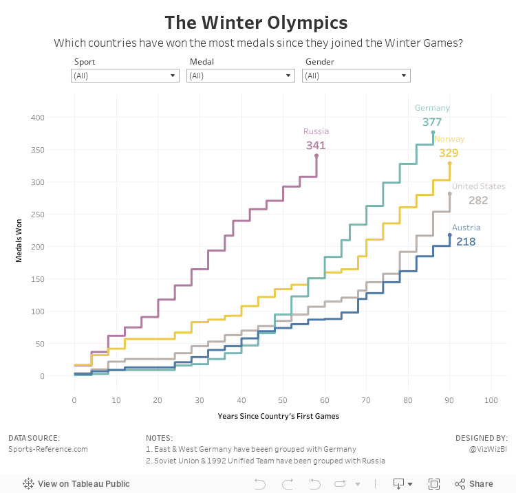
- Focused the visualisation on the cumulative medals won by the top 5 countries based on the filters; I did this by creating stepped lines based on Rody's tutorial.
- Made the x-axis represent the number of years since a country first participated in the games; this makes comparing the cumulative medals easier. In other words, it's easier to see which country won medals the fastest.
- Place the filter titles above each filter
- Moved the notes to the bottom, out of the way
- Simplified the tooltips
January 24, 2018
Makeover Monday: How far have the turkey vultures flown?
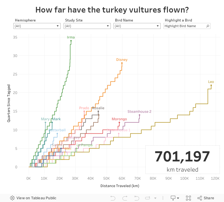
In addition to the stepped lines, I wanted to be able to compare all the birds on the same baseline. I created a calculation for quarters since each bird was tagged and then calculated the running total of the distance along the quarters. Standardizing the data this way helps me to see which bird flew the farthest (Leo) and which bird has flown to longest (Irma, which really means Irma has been tagged the longest).
Lastly, I sent the viz to Eva for some feedback and she suggested swapping the axes so that distance was on the X and time on the Y. This definitely makes more sense since distance is the independent variable.
Fun learning exercise and Rody's blog really makes creating stepped lines so, so much easier.
November 22, 2017
Workout Wednesday: Fun with Formatting
The data this week is the top 100 global brands, which you will need to download here. The data is only two columns: (1) the name of the company and (2) it's 2017 value.
Here are the requirements:
- Everything MUST be done in a single worksheet. Yes, the title, subtitle, footer, etc. all must be done in one sheet.
- Put the worksheet in a dashboard before publishing that is 1200x650, but DO NOT add anything else to the dashboard.
- Display the data in 5 columns, with each column being a grouping of 20 brands.
- The brands must be displayed in order based on their value.
- Include the ranking next to each name. These need to be left aligned.
- Match the tooltips (easy)
- Make sure every line you see in mine is in yours.
- The title should be 24pt Tableau Semibold. The subtitle is Tableau Book 9pt.
- The footer is 12pt.
- The column headers are 14pt Tableau Medium.
- Everything else is Tableau Book 9pt.
December 16, 2016
How have humans grown in the last 100 years?

This morning I was catching up on my backlog on feedly and read the two amazing blog post by Rody Zakovich and Alexander Mou about creating a Sigmoid curves. I have never created a chart like this before and I love the visual appearance so I thought I’d give it a go.
I went back to my Data School Gym challenge from a few months ago because I knew it was simply comparing one point in time to another like Alexander covers in his blog. In this case, I was looking at the change in human height by country from 1896 to 1996. Alex’s blog is so well written and easy to follow. All I had to do was essentially copy/paste his calculations and I was off.
I’m asked very often how to get better at Tableau. For me, there’s no better way than practicing. And when you think you’ve practiced enough, practice more. You will never ever know everything. Just keep learning, like I’ve done this morning. With that, here’s my first Sigmoid curve.
March 17, 2016
Tableau Tip: How To Create a 100 Mark Unit Chart inside of a Tooltip
This is a guest post from Rody Zakovich. Rody has been a very active participant in Makeover Monday and seems to have really kicked on with his curiosity in “making things work” in Tableau. Yesterday he posted this Tweet:

I immediately invited him to write it up as a guest post here. Give Rody a follow on Twitter and thank him for all of his great contributions.

Tableau 9.3 is almost out, and it’s bringing with it a lot of awesome features and improvements. BUT, it looks like we’re still going to have to wait a little longer for the bomb diggity VIZ IN TOOLTIP feature to be released. All hope is not lost though, there are ways we can “visualize” data in tooltips now, it just takes some creative thinking.
Some readers may already be familiar with how to create visualizations in tooltips thanks to Andy Cotgreave’s post from back in September of 2010.
Tableau supports ASCII Unicode Characters as strings. By using 3 calculated fields, you can create sub-strings of Unicode blocks to mimic a horizontal bar chart.
- A calculated field/parameter containing a series of ASCII Unicode Blocks : [BAR]
‘▮▮▮▮▮▮▮▮▮▮▮▮▮▮▮▮▮▮▮▮’ - A Calculated Field that determines the % of Total Value : [% of Coffee Sales]
ROUND( (SUM(COFFEE SALES) / SUM(SALES)) * 20 ) - A Calculated Field that returns a Substring of the Unicode Blocks based on % of Total Value
LEFT ( MIN([BAR]) , [% of Coffee Sales] )

I’ve used this technique a lot, and it works really well for adding additional context. It can even be used as a way to slowly move heavy Excel readers over to data visualization.
Creating a 100 Mark Unit Chart follows this same basic idea.
Step 1:
Create the Grid of ASCII Characters in a Calculated Field. This example uses a 5 X 20 matrix, but you can use whatever scale you want (You will just need to change the calcs below accordingly).
[100 Mark Unit Chart]
'▮▮▮▮▮▮▮▮▮▮▮▮▮▮▮▮▮▮▮▮' + CHAR(10)
+ '▮▮▮▮▮▮▮▮▮▮▮▮▮▮▮▮▮▮▮▮' + CHAR(10)
+ '▮▮▮▮▮▮▮▮▮▮▮▮▮▮▮▮▮▮▮▮' + CHAR(10)
+ '▮▮▮▮▮▮▮▮▮▮▮▮▮▮▮▮▮▮▮▮' + CHAR(10)
+ '▮▮▮▮▮▮▮▮▮▮▮▮▮▮▮▮▮▮▮▮'
The CHAR(10) serves as a Line Break, holding the structure of the Matrix. You can press ENTER instead of using CHAR(10), but be aware that pressing ENTER in a calculated field creates Two additional ASCII Characters in your String Field, whereas CHAR(10) only creates One.
Step 2:
Since CHAR(10) creates an additional character each time it is used in the Matrix, we need to create a calculated field to adjust for it. This allows us to get the proper number of characters needed in the Substring calcs used later.
[Adjustment]
IF [Your % of Total Calc] <= 20 THEN 0
ELSE (FLOOR([Your % of Total Calc] / 20))
END
Step 3:
Create the Substring representing [Your % of Total Calc]. This would be the Total number of Units you want to Highlight in your Tooltip.
[Left Mark]
LEFT([100 Mark Unit Chart], ([Your % of Total Calc] + [Adjustment]))
Here we take a LEFT substring of the [100 Mark Unit Chart] by the length of [Your % of Total Calc] + [Adjustment]. For example 23% breaks down as
▮▮▮▮▮▮▮▮▮▮▮▮▮▮▮▮▮▮▮▮ + CHAR(10) => 21 Characters in first Row
▮▮▮ => 2 Characters remaining from 23 [Your % of Total Calc] PLUS 1 for the adjustment
=> 23 Marks visible, 24 Marks actual
Step 4:
Create the Substring that represents 100 - [Your % of Total Calc] (The units you don’t want to highlight in the tooltip)
[Right Mark]
RIGHT( [100 Mark Unit Chart], ( 104 - ( [Your % of Total Calc] + [Adjustment] ) ) )
Here we take a RIGHT substring of [100 Mark Unit Chart] by the length of the string ( 104 ) minus [Your % of Total Calc] + [Adjustment].
This is the same as the Step above, except we work from the End string and find the number of characters not represented by [Your % of Total Calc]
Step 5:
Once you have the calcs setup, you just need to place the [Right Mark] and [Left Mark] Calcs side by side in the Tooltip, and color them as you like.
<ATTR(Right Mark)><ATTR(Left Mark)>

And that’s it! Now you can have dynamic Unit Charts right there in your tooltip.

Here’s the great news, as you can tell from the image above, this technique doesn’t have to be limited to the tooltip (i.e., it still has a purpose once Viz in Tooltip is released), you can use it on the Text Mark as well. Take for example the image below. The dashboard is actually just one crosstab containing a single Dimension on the Rows Shelf, but we can create the appearance of a 100 Mark Unit Chart.
 |
| Click on the image view in Tableau Public |
I hope you enjoyed reading this, and picked up a few tricks along the way. If you have any questions, or need further explanation, please feel free to reach out to me anytime on Twitter (@RodyZakovich) or by email at RodyZakovich@gmail.com
Regards!
Rody Zakovich






