February 11, 2018
Makeover Monday: The Winter Olympics

What works well?
- Simple title and subtitle
- Noting when he combined countries
- Simple filtering
- Nice small multiples design
- Including summaries under each country name
- Sorting the countries from most medals to least
- Including blocks for each medal won
What could be improved?
- Right-align the filter titles so they are next to the filter itself.
- I'd prefer the gold medals at the bottom and bronze on top.
- Provide an option to look at the top N countries so that you can see it one screen.
- The x-axis doesn't make sense. If it's supposed to represent a year, why does it start at zero and end at 25?
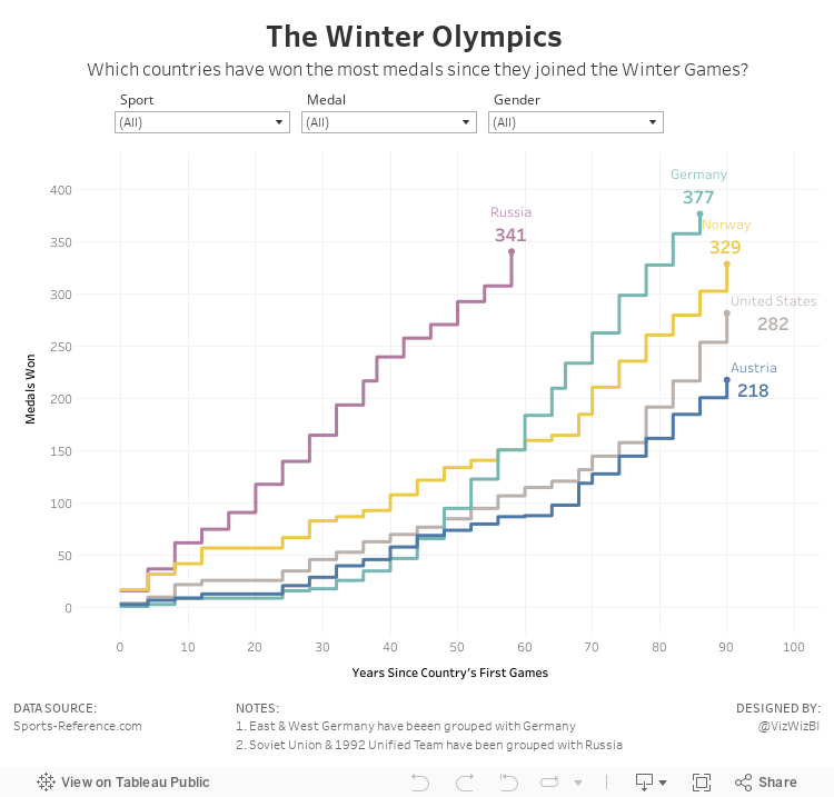
What did I do?
- Focused the visualisation on the cumulative medals won by the top 5 countries based on the filters; I did this by creating stepped lines based on Rody's tutorial.
- Made the x-axis represent the number of years since a country first participated in the games; this makes comparing the cumulative medals easier. In other words, it's easier to see which country won medals the fastest.
- Place the filter titles above each filter
- Moved the notes to the bottom, out of the way
- Simplified the tooltips
Thanks Rody! You're a good sport!
Subscribe to:
Post Comments
(
Atom
)


No comments
Post a Comment