February 25, 2018
Makeover Monday: World Economic Freedom

What works well?
- Nice search functionality
- Simple colors (though maybe tough for color blind people)
- The table clearly show the top 10 countries
- Being able to "Play" the visualisation and watch the map change
- Really nice tooltips
- Clicking on a country give you specific information about each of the rankings for that country
What could be improved?
- The filled map makes it hard to see small countries and especially to see how they change.
- The up/down arrows next to the numbers clearly show better or worse, but compared to what?
- There's no sense of change because you can't easily compare years.
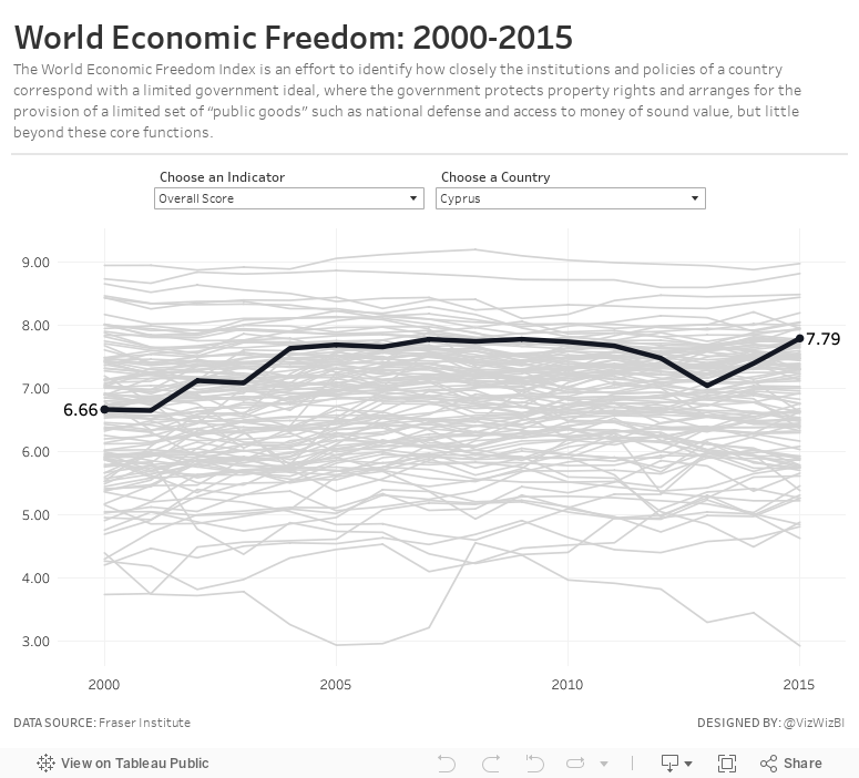
My Goals
- I knew I didn't want to use a map, so I wanted to focus on other chart types.
- Verify which countries had data for which years
- Limit the data to only years 2000-2015 and to those countries that had data for all of those years
- Provide the user with an option to swap out for a different metric
- Provide context for all countries against each other
- Allow the user to select a country to highlight
Subscribe to:
Post Comments
(
Atom
)


was this done in 10.5? love it..
ReplyDeleteThank you. Yes it was done in 10.5.
Delete