April 12, 2017
Workout Wednesday: How many times has a team been top of the Premier League?
@VizWizBI @infolabUK @dataschooluk @MissLaura203 Sounds great but please don't feel obliged to. Maybe sneak it in as a Workout Wednesday of sorts to avoid creating extra work for yourself?— Charlie Hutcheson (@CharlieHTableau) April 11, 2017
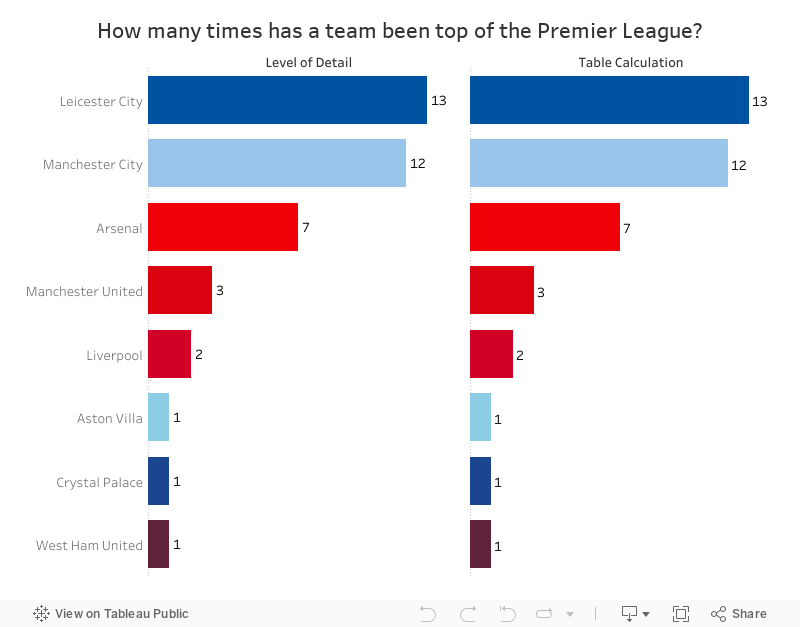
The requirements this week are pretty simple and use a data set of Premier League points from the 2015/16 season. Note that this data set doesn't include the whole season; that's not the purpose of the exercise.
- Must be a single chart
- Match the colors of the teams exactly
- Match the tooltips
- Sort the teams by the number of weeks they were in first place
- Left bar chart must be based on a LOD expression
- Right bar chart must be based on a table calculation
- Both bar charts need to have a label on the end of the bar with the number of weeks in first place
- Match the column headers
- View size is 800x600
January 11, 2015
What If Premier League Standings Were Based on Points per Goal?
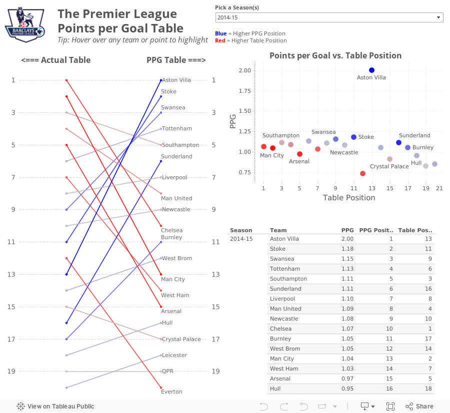
So far in the 2014-15 season, Aston Villa has the highest points per goal of any Premier League team in the last 10 seasons.This was quite intriguing to me, so this morning while I was enjoying a cup of coffee at Tully's I went to ESPNFC.com and downloaded the standings for the last 10 years. I added two columns to this dataset, which you can download here.
- Points per Goal (PPG)
- PPG Position (i.e., a rank of each team based on PPG)


From there, I wanted to understand the difference between Villa's actual place in the EPL table and their place in the fictitious points per goal table. For this view, I created a slopegraph, which I first wrote about creating in Tableau here.
If you're unfamiliar with slopegraphs, Andrew Wheeler summarizes them well in his paper "A Critique of Slopegraphs":
Slopegraphs show values for two numeric variables by line segments for each observation by connecting points on two parallel axes. They are frequently recommended for visualizing the changes in ranked data (Bertin, 2011; Tufte, 2001).I put all of the pieces together in this simple dashboard, which you can download here. Do you notice anything else interesting or unusual?
March 27, 2011
Creating vs. Finishing – A Follow-up to OnFooty for the Premier League
On Football has quickly become one of my favorite blogs to follow (Twitter) and one of the most interesting posts of late was an analysis of “finishing” in Major League Soccer. OnFooty analyzed conversation rate vs. the number of shots for each team over the total season. Typically conversion rate is calculated as goals/shots on target, but OnFooty has a terrific case for using shots in lieu of shots on target.
In conclusion, Sarah said “The upper right quadrant (teams that are above average at both creating and finishing) contains the MLS Cup Finalists and the number one seeds for each conference.
This quickly led me to the Premier League and interestingly enough, the same analysis holds true through 30 rounds (29 for some teams) this season. The top four teams are all in the upper-right quadrant.
If you follow English football, you might note these things as well:
- Tottenham needs to improve their finishing if they want to secure a returns spot into the Champions League qualification round (for the 4th place finisher)
- Blackpool (one of the most exciting teams to watch) score at a terrific rate, but since they’re in 15th place in the table, they obviously need to work on their defense (their philosophy is to outscore their opponents since they know they can’t stop them
- Wigan has the worst conversion rate and sits last in the table…enough said
Play with the view below. Choose your vertical and horizontal axis, check out the different tabs. What do you see?
I’m compelled to look historically to see if this theory holds true season after season…maybe one day when I have more time on my hands (I’m busy tallying stats for my daughter’s soccer team).






