September 19, 2022
#MakeoverMonday Week 38 - American Business Applications
bar chart
,
business
,
comparison
,
dashboard
,
dashboard action
,
filter
,
heat map
,
hex map
,
line chart
,
Makeover Monday
,
parameter
,
start up
,
tableau
,
time series
,
trellis chart
,
trends
,
United States
,
USA
No comments

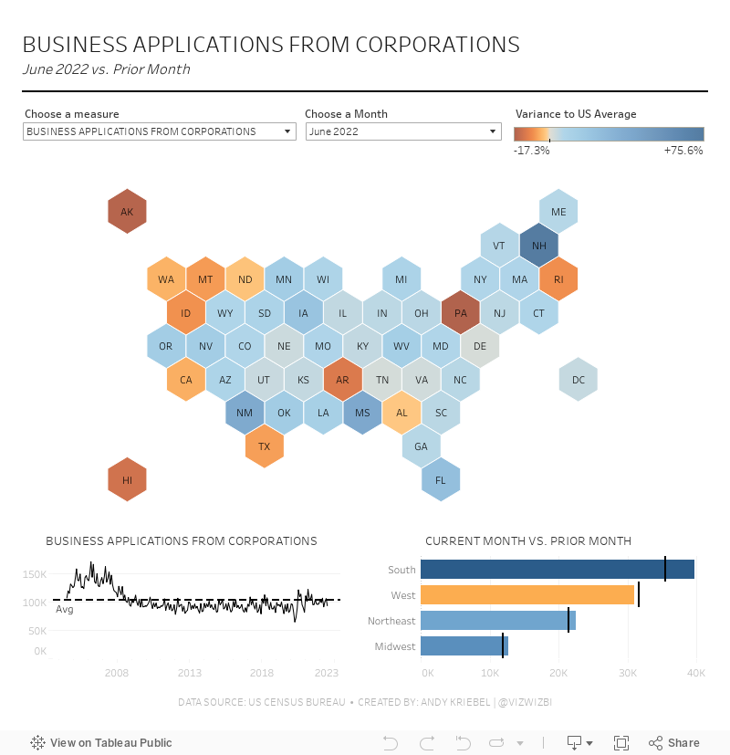
My original idea was to compare each State to the US average. I got the calculations right, but it was thoroughly uninteresting. Basically, the variance rarely changed. Therefore, there was nothing to see in the analysis.
I stopped the livestream after 90 minutes, the audience and I had suffered enough. Afterwards, I took a break and came back to Tableau. This time, I thought more clearly through the solution I was trying to create. Basically, I wanted something very much like the original, just a bit better looking.
It turns out I was overcomplicating the implementation and the calculations. Parameters were a much, much better solution and allowed me the flexibility I needed to create the month over month calculations.
I'd encourage you to check out the video. I tried lots of different things and explained what I was doing along the way, so you're sure to learn something. My final dashboard is below the video.
Have a great week everyone and thank you for being so supportive of Makeover Monday.
Subscribe to:
Post Comments
(
Atom
)


No comments
Post a Comment