Showing posts with label Golden State Warriors. Show all posts
April 22, 2019
#MakeoverMonday: Which NBA arena makes Stephen Curry's favorite popcorn?
basketball
,
food
,
Golden State Warriors
,
Makeover Monday
,
NBA
,
new york times
,
popcorn
,
Stephen Curry
No comments

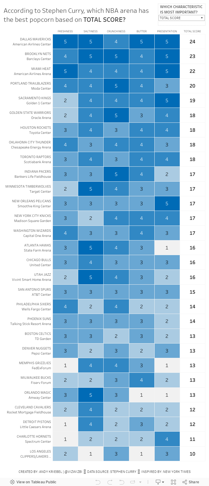
In the NYT article, they included a simple heatmap:

What works well?
- A heatmap is a good chart choice. Because the highest rating is darkest, those pop out more.
- Sorting the teams/arenas by the total score.
- Including borders around each cell helps separate them.
- Have both the team and arena together in a single cell but in multiple rows.
- Including the rating for each field.
- I love the data source!!
What could be improved?
- Needs a better title
- The diagonal rotation of the text makes the categories harder to read than necessary.
What I did
- I really like the original, so I also created a heatmap.
- I change the colors to use the blue from the Golden State Warriors brand colors.
- I made the category headers horizontal.
- I created a calculation to include the team and arena in the same field, but on multiple rows.
- I used viz in tooltip to shows the rating across all categories for each team.
- I included an option to allow the reader to sort by their most important factor.
June 13, 2017
The Difference Between the Warriors and Cavaliers This Season Is Striking
basketball
,
Cleveland Cavaliers
,
color
,
comparison
,
context
,
cumulative
,
difference
,
Golden State Warriors
,
line chart
,
NBA
No comments
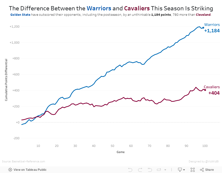
Last week I highlighted a really nice line chart from Business Insider over on my Data Viz Done Right site. As a learning exercise I wanted to recreate their chart while also incorporating the feedback I suggested. I highly recommend this process to anyone wanting to learn and practice; take a viz you like and try to rebuild it in Tableau.
Since the Warriors won the NBA title last night, I've updated the viz with the latest data. Simple, fun, effective visualisation. And the Warriors are pretty damn good!

Since the Warriors won the NBA title last night, I've updated the viz with the latest data. Simple, fun, effective visualisation. And the Warriors are pretty damn good!
November 21, 2015
The Golden State Warriors Have the Most Efficient Payroll in the NBA
First let me start by saying that this post is an update to a previous post I had written in which I indicated that Brian Windhorst of ESPN didn’t have his facts straight about the Warriors payroll. Indeed he was correct. My apologies to Brian and my thanks to reader Trevor who pointed out that the data I had used was from 2013 and that the 2015 data matches Brian’s statement.
With that being said, I decided to re-work the story and elaborate on Brian’s point. In this story, I walk through an analysis of NBA payrolls versus winning percentage.
With that being said, I decided to re-work the story and elaborate on Brian’s point. In this story, I walk through an analysis of NBA payrolls versus winning percentage.

November 17, 2015
Tableau Tip Tuesday: Aligning Time - An Analysis of the Greatest 3-Point Shooters of All-Time
basketball
,
cumulative
,
Golden State Warriors
,
line chart
,
NBA
,
stats
,
Stephen Curry
,
Tableau Tip Tuesday
,
video
In this week’s tip, I review how to align measures that start at different time periods in order to understand how Stephen Curry compares to the greatest NBA 3-point shooters of all-time. In order to do that, I need to create a table calculation to align the seasons each player played.
Click on the video tab to see how I built this.
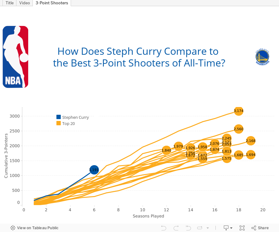
SPOILER: At this point in his career, Curry is far and away the best 3-point shooter of all time.

Click on the video tab to see how I built this.
SPOILER: At this point in his career, Curry is far and away the best 3-point shooter of all time.
Subscribe to:
Posts
(
Atom
)






