June 13, 2017
The Difference Between the Warriors and Cavaliers This Season Is Striking
basketball
,
Cleveland Cavaliers
,
color
,
comparison
,
context
,
cumulative
,
difference
,
Golden State Warriors
,
line chart
,
NBA
No comments
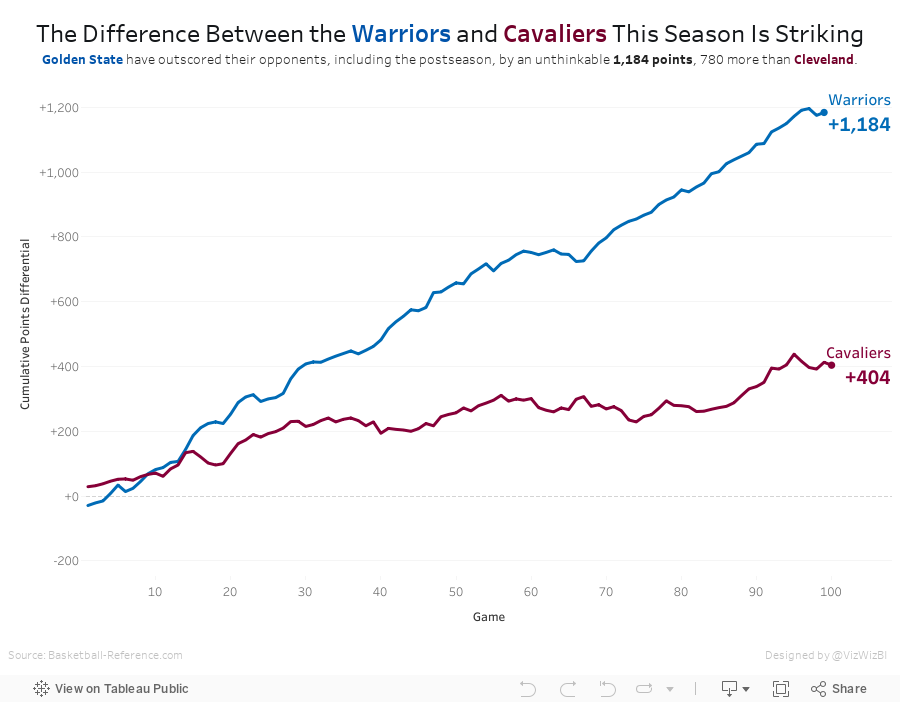
Last week I highlighted a really nice line chart from Business Insider over on my Data Viz Done Right site. As a learning exercise I wanted to recreate their chart while also incorporating the feedback I suggested. I highly recommend this process to anyone wanting to learn and practice; take a viz you like and try to rebuild it in Tableau.Since the Warriors won the NBA title last night, I've updated the viz with the latest data. Simple, fun, effective visualisation. And the Warriors are pretty damn good!
Subscribe to:
Post Comments
(
Atom
)


No comments
Post a Comment