June 7, 2017
Workout Wednesday: National Parks Have Never Been More Popular
calculated field
,
fivethirtyeight
,
label
,
LOD
,
national parks
,
United States
,
USA
,
Workout Wednesday
No comments
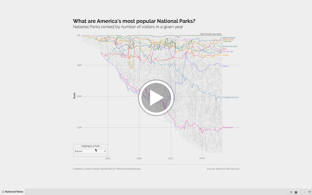
- Dashboard must be 800x735
- Everything will need to be floated in the dashboard to make it look right
- Title, subtitle and viz must all be one worksheet
- Footers are separate with a line separating them from the viz
- Rank grid lines must be included at 1st, 25th, 50th and 75th. They must be labeled as I've done it.
- Year grid lines should only be shown for 1925, 1950, 1975, and 2000.
- Include an option for the viewer to pick a park to highlight
- When (None) is picked from the highlighter, then it should show the default view (first image below).
- When a park is selected from the highlighter, it should be the only line displayed and should be displayed as a black line (second image below) unless it's one of the default parks. In that case, it should retain its default color.
- Align the highlighter as I've done on the bottom left of the chart.
- Match the park names
- Match the tooltips (pay attention to the park names)
- Match the title and subtitle
- Match the line labels
- Viz and highlighter should be limited to National Parks and National Historical Parks
- OPTIONAL: Use the Raleway font
I suspect will probably find building the bump chart fairly straightforward. The tricky bits are the coloring, highlighter, park names, labels and grid lines. Feel free to ask questions if you get stuck.
Click on either image for the interactive version. I've also included a video demonstrating how the final viz should work.
Click on either image for the interactive version. I've also included a video demonstrating how the final viz should work.
Get the data here. Good luck!
Subscribe to:
Post Comments
(
Atom
)


No comments
Post a Comment