January 21, 2014
Spreading the gospel, one data viz nerd at a time
Fact: If I didn’t start my blog, I wouldn’t be working at Facebook.
When Facebook was looking for people to build out their new Tableau team, naturally they started scouring the web to find people that could make an impact. The only reason Facebook knew I existed was because I write my blog. That brings me back to the beginning…how did I get started and why?
Back in September 3, 2007, in no less than one hour, I:
- Ran a Google search for dashboard software
- Downloaded and installed Tableau 3 (people new to Tableau have no idea how good they have it now)
- Watched the first two intro training videos
- Created my first dashboard

That one hour changed my life. I became seriously OCD about Tableau and data visualization.
Almost another two years passed. I had been reading tons about data visualization, but there were very few blogs about data viz or Tableau and Tableau Public didn’t exist. I had been practicing a lot, I loved writing and I needed a way to document my work. I wasn’t even considering that other people might actually read it; the blog was like a diary after all.
There was a void, so I created vizwiz.blogspot.com. I chose to host it on blogger for no other reason than I was already using it for my personal blog and it’s super simple.
I started the blog as a place for me to take existing charts and graphs I found on the internet and transform them into something more meaningful. My first blog post on August 17, 2009 was a remake of our friend the pie chart.

People were starting to read my blog more (particularly after the Huffington Post mentioned my post about birthdays). I had a small following on my blog, but I wanted more people to know that I had content to share that they might be interested in. After all, one of the best things about the Tableau community is the willingness of people to share their knowledge.
Facebook and Twitter are embedded in our every day lives and are the two best ways to spread a message, so I adjusted my creation flow for blog posts to optimize my time and the blog’s reach.
1. Publish a blog post
2. Use the Facebook Share Button in Chrome to create a post on the VizWiz Facebook page
3. I’m not a very active Twitter user (go figure), so I created a recipe on IFTTT.com that automatically posts content I share on my Facebook page to Twitter. This includes posts from my own blog as well as content I find on the internet. Basically, I share on Facebook and I get Twitter for free (one less step for me). Hopefully they’ll add support for Pinterest soon too.


Naturally, once your blog gains some followers you’ll begin getting feedback. It’s critical that you engage with your audience.
- Respond to blog comments (I would recommend you turn on word verification and moderation to help avoid spam)
- Use an RSS reader (I use feedly) and Facebook to follow people and pages your like. If you enjoy their content, share it.
- Help others if you’re willing and able. If you post an interesting technique, people might have questions. Hop on a screen sharing session, Skype or Google Hangout with them. Trust me, you’ll learn more from helping other people than you can ever learn on your own.
I’m always looking for great data viz and Tableau content to read. I keep a log of sites I follow here. It’s a bit out of date, so if you don’t see your site on there, leave me a comment and I’ll check it out.
In the meantime, feel free to follow me on Facebook, Twitter, Pinterest and Tableau Public.
March 9, 2013
Where do American’s commute to work? An interactive map of county-to-county commutes.
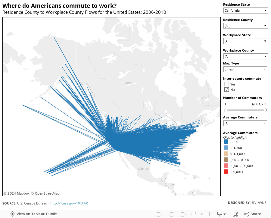
Our mission at Facebook is to “make the world more open and connected” and I thought a great way to look at connectedness is through commuter flows. I built the map below, which contains 255K+ lines, using census data about American commuters (this is census data, not Facebook data).
My initial test results for this example reveal:
- Tableau 8 is not noticeably faster than Tableau 7, even with the OpenGL graphics turned on. This is the case both on Desktop and Server.
- There’s a bug in 8 that is prohibiting worksheets from dynamically sizing within a container. The basically kills the ability to show/hide viz types dynamically using containers and parameters.
From Brian McKenzie’s working paper:
Workplace information is crucial for understanding the degree of interconnectedness among our nation’s communities. Commuting plays an important role in the larger interchange of people, goods, services, and information across places, and helps shape the contours of metropolitan and micropolitan statistical areas.
The Census Bureau produces county and MCD-level commuting flow tables every five years, using non-overlapping 5-year ACS estimates beginning with 2006-2010.
To give you an idea for how I am using this, consider this question: Where do people travel from that want to come to the Silicon Valley (San Mateo County, CA)?
To do this I:
- Filter the Workplace State to California. This will reduce the Workplace County list to only counties in CA.
- Filter the Workplace County to San Mateo.

From this, I wanted to only see where a large number of commuters were coming from, i.e., the most frequent commuters to Silicon Valley. I filtered out the Average Commuters of 1-100 and 101-500.

This is interesting. As I would expect, there are a lot of commuters from the closest counties. However, there’s a significant number of people that commute from LA. Fascinating.
Switch to the Dots view if you don’t want to see the lines.

Another nice looking viz is: Residence State = Georgia with 501 average commuters and higher. There are not loads of people traveling outside of Georgia, but then again, it has a lower population than CA (there’s a population bias in the data).

Give it a try with where you live and work. Share an image of your findings. Note that this initial view is filtered to those residing in CA so that it will draw in a reasonable amount of time. Once it loads, check (All) for Residence State and see all commutes in the US. It’s pretty cool.
Download the data here and the workbook here.






