Showing posts with label transporation. Show all posts
June 25, 2018
Makeover Monday: When are bicycles hired in London?
bicycles
,
cycling
,
London
,
Makeover Monday
,
TfL
,
transporation
,
transport for london
No comments

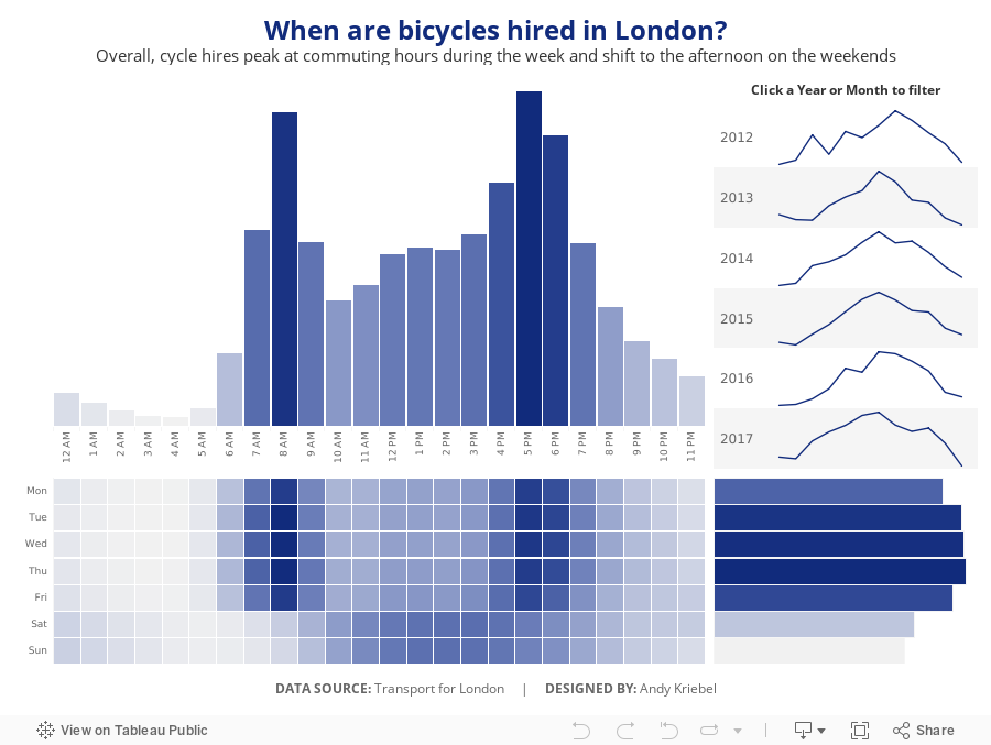
I asked Eva to use data from Transport for London's open API about their cycle hire scheme. Data is available back to 2012 and I offered to prep it for her and upload it to Exasol...all 50M+ bike hires worth. I love the weeks when we get to use Exasol because I can ask and answer questions on massive data sets without any performance constraints.
The visualization to makeover this week comes from Sophie Sparks:
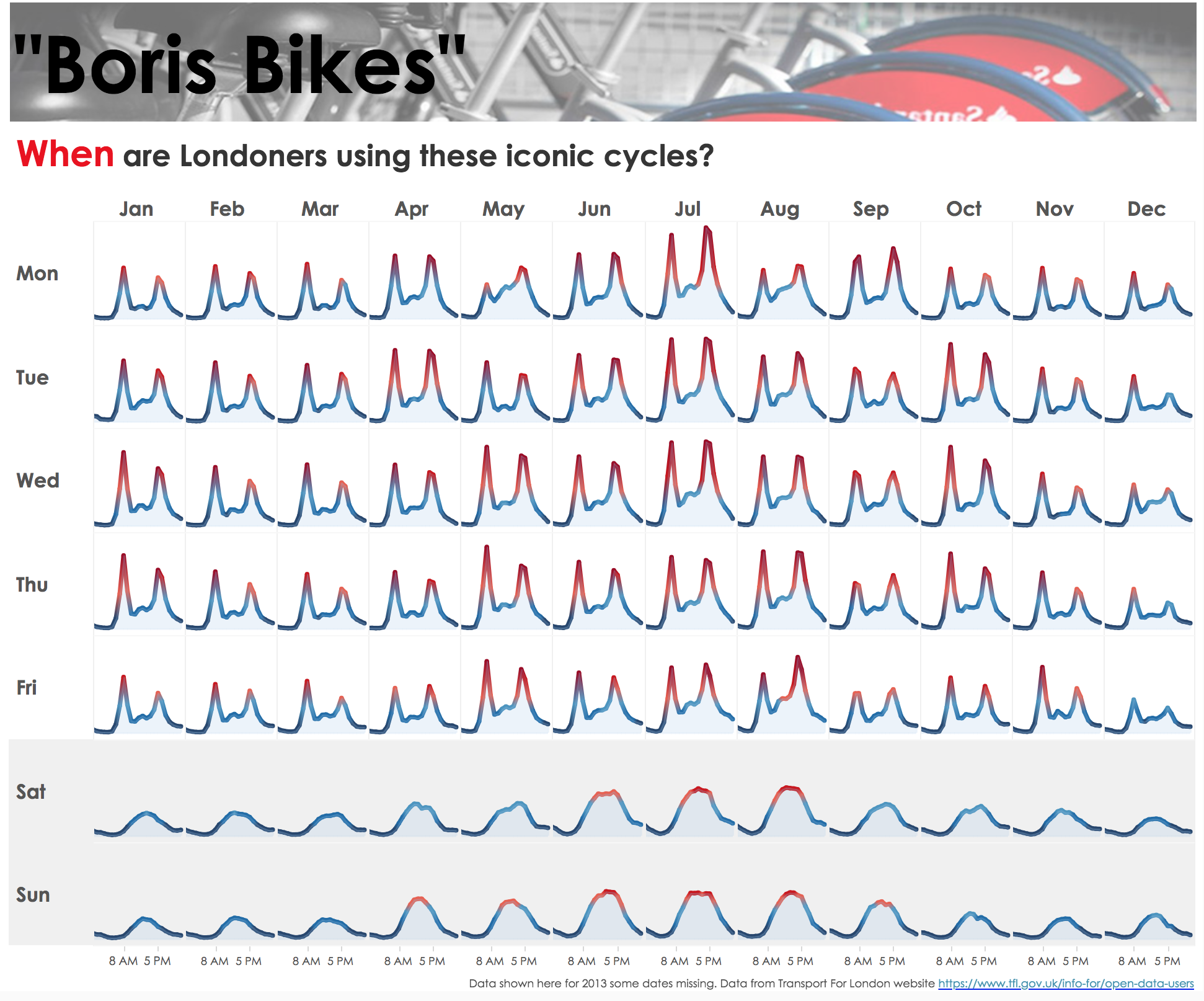
What works well?
- The small multiple layout works great or showing cyclical patterns (see what I did there?).
- The diverging color scale helps accentuate the peak periods.
- The shading under the lines makes the viz feel more full and complete.
- Shading the weekends helps separate them from the rest of the weekdays.
- Putting the word When in red in the title to match the peak period.
What could be improved?
- I would remove the section at the top that says "Boris Bikes" and the image.
- Include some sort of insight as a subtitle.
- There's no indication of what the y-axis means. I assume it's the number of bikes hired, but it could just as easily be something else.
What I did
- First, I rebuilt Sophie's viz because I like it.
- I wanted to focus on the weekday and hourly patterns in the data.
- Use the TFL blue as a single color for the viz.
- Provide some interactivity so that people could see when the peaks and troughs in the data are for a specific year or month.
Click on the image for the interactive version.
March 9, 2013
Where do American’s commute to work? An interactive map of county-to-county commutes.
census
,
commute
,
connection
,
flow
,
line
,
map
,
social
,
tableau
,
transporation
5 comments
Testing the limits of Tableau can be quite fun, especially when you’re given free reign to use any data set. Yesterday I wanted to test map rendering capabilities between Tableau 7 and Tableau 8.
Our mission at Facebook is to “make the world more open and connected” and I thought a great way to look at connectedness is through commuter flows. I built the map below, which contains 255K+ lines, using census data about American commuters (this is census data, not Facebook data).
My initial test results for this example reveal:
From Brian McKenzie’s working paper:
To give you an idea for how I am using this, consider this question: Where do people travel from that want to come to the Silicon Valley (San Mateo County, CA)?
To do this I:

From this, I wanted to only see where a large number of commuters were coming from, i.e., the most frequent commuters to Silicon Valley. I filtered out the Average Commuters of 1-100 and 101-500.

This is interesting. As I would expect, there are a lot of commuters from the closest counties. However, there’s a significant number of people that commute from LA. Fascinating.
Switch to the Dots view if you don’t want to see the lines.

Another nice looking viz is: Residence State = Georgia with 501 average commuters and higher. There are not loads of people traveling outside of Georgia, but then again, it has a lower population than CA (there’s a population bias in the data).

Give it a try with where you live and work. Share an image of your findings. Note that this initial view is filtered to those residing in CA so that it will draw in a reasonable amount of time. Once it loads, check (All) for Residence State and see all commutes in the US. It’s pretty cool.
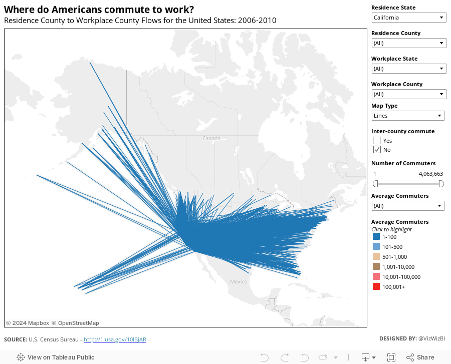
Download the data here and the workbook here.
Our mission at Facebook is to “make the world more open and connected” and I thought a great way to look at connectedness is through commuter flows. I built the map below, which contains 255K+ lines, using census data about American commuters (this is census data, not Facebook data).
My initial test results for this example reveal:
- Tableau 8 is not noticeably faster than Tableau 7, even with the OpenGL graphics turned on. This is the case both on Desktop and Server.
- There’s a bug in 8 that is prohibiting worksheets from dynamically sizing within a container. The basically kills the ability to show/hide viz types dynamically using containers and parameters.
From Brian McKenzie’s working paper:
Workplace information is crucial for understanding the degree of interconnectedness among our nation’s communities. Commuting plays an important role in the larger interchange of people, goods, services, and information across places, and helps shape the contours of metropolitan and micropolitan statistical areas.
The Census Bureau produces county and MCD-level commuting flow tables every five years, using non-overlapping 5-year ACS estimates beginning with 2006-2010.
To give you an idea for how I am using this, consider this question: Where do people travel from that want to come to the Silicon Valley (San Mateo County, CA)?
To do this I:
- Filter the Workplace State to California. This will reduce the Workplace County list to only counties in CA.
- Filter the Workplace County to San Mateo.

From this, I wanted to only see where a large number of commuters were coming from, i.e., the most frequent commuters to Silicon Valley. I filtered out the Average Commuters of 1-100 and 101-500.

This is interesting. As I would expect, there are a lot of commuters from the closest counties. However, there’s a significant number of people that commute from LA. Fascinating.
Switch to the Dots view if you don’t want to see the lines.

Another nice looking viz is: Residence State = Georgia with 501 average commuters and higher. There are not loads of people traveling outside of Georgia, but then again, it has a lower population than CA (there’s a population bias in the data).

Give it a try with where you live and work. Share an image of your findings. Note that this initial view is filtered to those residing in CA so that it will draw in a reasonable amount of time. Once it loads, check (All) for Residence State and see all commutes in the US. It’s pretty cool.
Download the data here and the workbook here.
Subscribe to:
Posts
(
Atom
)


