June 25, 2018
Makeover Monday: When are bicycles hired in London?
bicycles
,
cycling
,
London
,
Makeover Monday
,
TfL
,
transporation
,
transport for london
No comments

I asked Eva to use data from Transport for London's open API about their cycle hire scheme. Data is available back to 2012 and I offered to prep it for her and upload it to Exasol...all 50M+ bike hires worth. I love the weeks when we get to use Exasol because I can ask and answer questions on massive data sets without any performance constraints.
The visualization to makeover this week comes from Sophie Sparks:
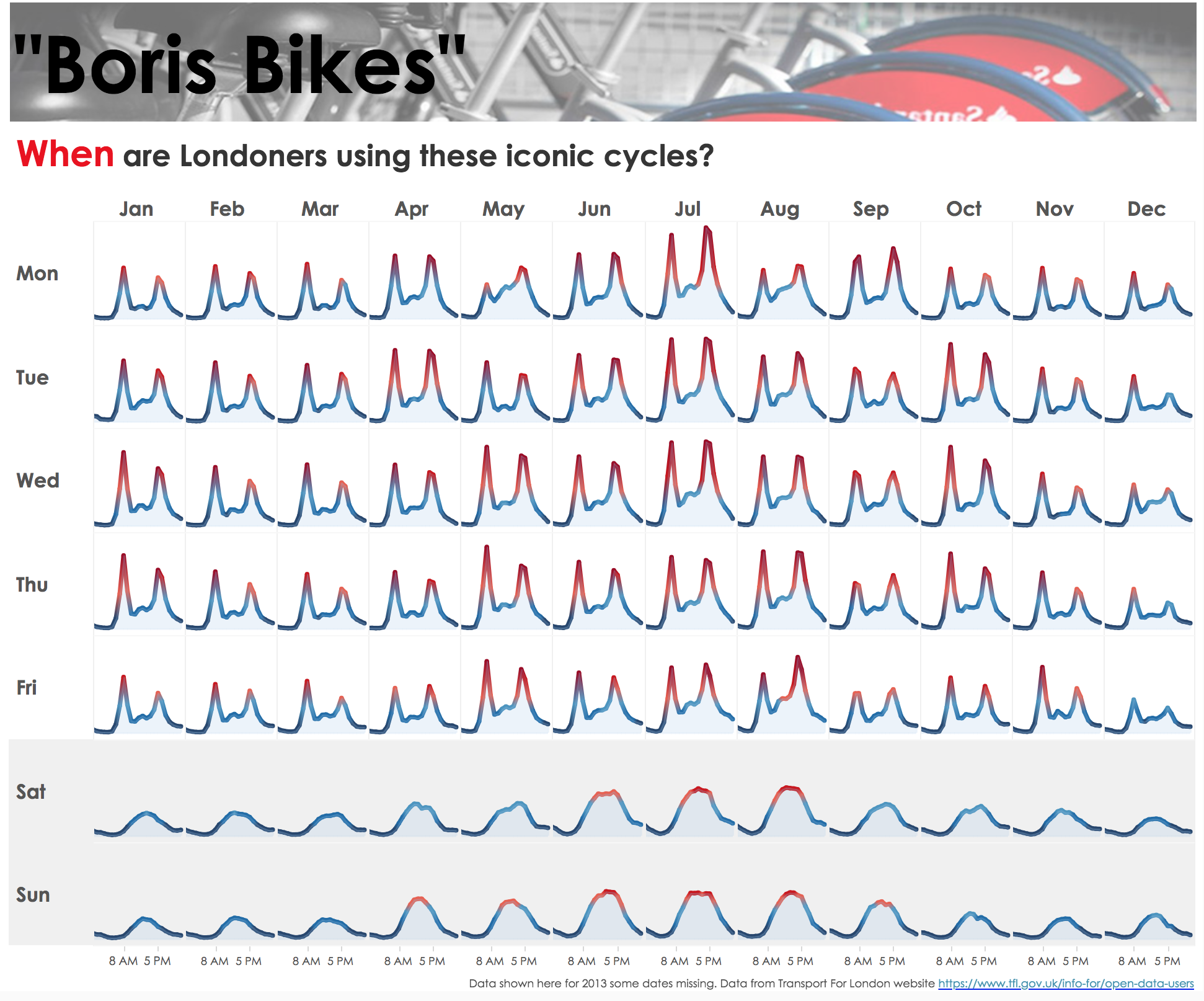
What works well?
- The small multiple layout works great or showing cyclical patterns (see what I did there?).
- The diverging color scale helps accentuate the peak periods.
- The shading under the lines makes the viz feel more full and complete.
- Shading the weekends helps separate them from the rest of the weekdays.
- Putting the word When in red in the title to match the peak period.
What could be improved?
- I would remove the section at the top that says "Boris Bikes" and the image.
- Include some sort of insight as a subtitle.
- There's no indication of what the y-axis means. I assume it's the number of bikes hired, but it could just as easily be something else.
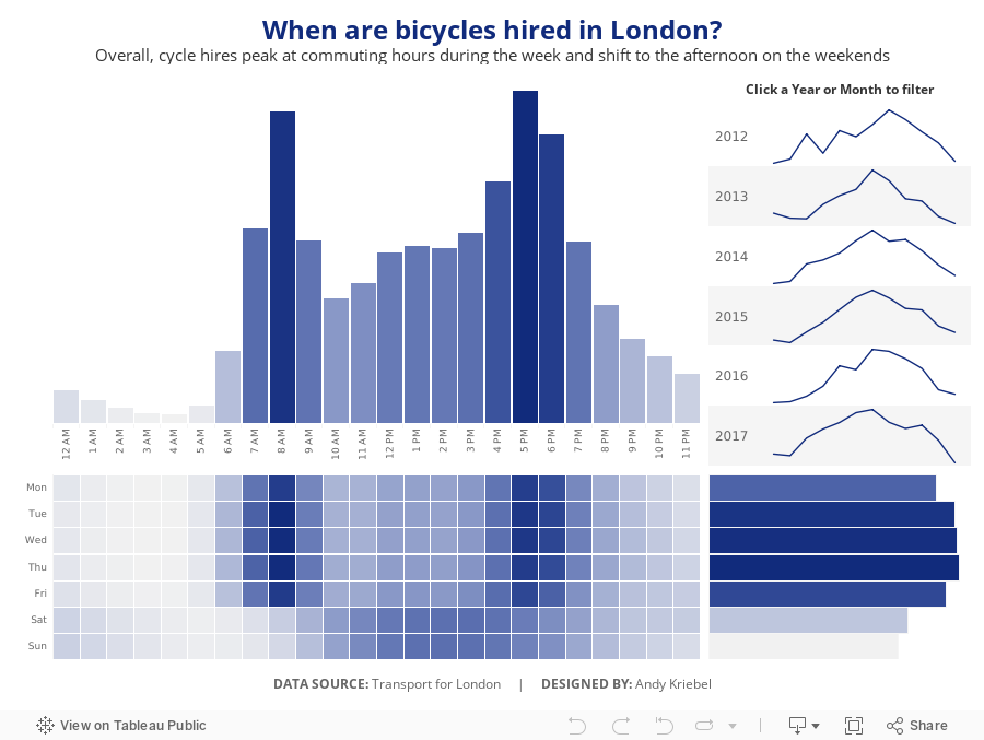
What I did
- First, I rebuilt Sophie's viz because I like it.
- I wanted to focus on the weekday and hourly patterns in the data.
- Use the TFL blue as a single color for the viz.
- Provide some interactivity so that people could see when the peaks and troughs in the data are for a specific year or month.
Click on the image for the interactive version.
Subscribe to:
Post Comments
(
Atom
)


No comments
Post a Comment