August 24, 2018
Makeover Monday: Africa's Deadliest Armed Conflicts - Density Map vs. Heat Maps
ACLED
,
Africa
,
Alteryx
,
armed conflict
,
density
,
heat map
,
Makeover Monday
,
map
,
violence
,
workflow
No comments


The workflow is simple and I'm sure there's a more elegant want to create it. The guts of the workflow:
- Create spatial points from the latitude and longitude of each record.
- Convert the spatial points into a heat map by grouping the points into grids.
- Union the four streams back together.
- Export the data as a shapefile.
The reason I have four streams in the workflow is because I didn't see a way of doing a grouping by the event type within the heatmap tool.
The Alteryx heatmaps are easy to adjust; I played with the grid size and maximum distance a few times until I got something close to Tableau's density maps (without fiddling with the settings endlessly). I settled on a grid of 33 miles and a max size of 75 miles.
I also chose to create the shapes as donuts so that they wouldn't stack on top of each other. Here's the result:
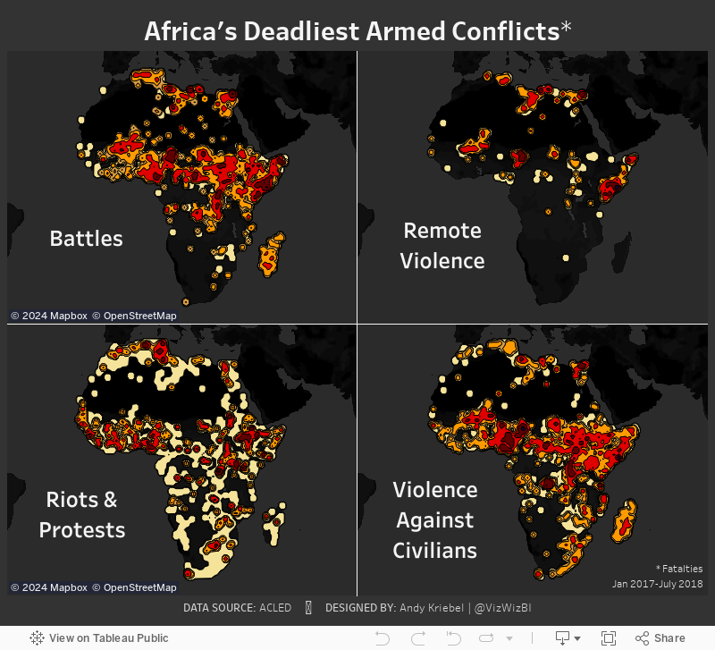
Density Maps vs. Heat Maps
Let's start by looking at the difference between the density map and the heat map.

Here are some of the differences I have noted:
- Density maps in Tableau are completely dependent upon the number of marks in the view. The more accurate you want the density, the more marks you need to include. That's 9229 marks in this case.
- Since the heat maps Alteryx generates are shapefiles, they will render much faster as there are only 28 marks.
- The Alteryx heat maps clearly encompass all points, meaning you can see EVERYWHERE that there was an incident.
- Tableau's density maps hide the outliers.
- You can't have highlight actions on a density map as there no dimension categorizing the heat.
- The density maps looks much cleaner than the heat maps.
I like both version and they both have their benefits. The point of me doing this, though, was to improve my skills. The only way I'll get really good at Alteryx is to use it more. Focused time helps me develop. Removing distractions like social media (those things that don't help you learn) are a good way to free up wasted time. Make time to learn and you'll rarely regret it.
Subscribe to:
Post Comments
(
Atom
)


No comments
Post a Comment