August 19, 2018
Makeover Monday: Africa's Deadliest Armed Conflicts
ACLED
,
Africa
,
armed conflict
,
density
,
Makeover Monday
,
map
,
violence
No comments

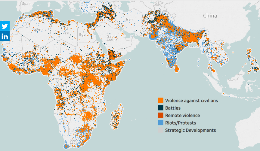
What works well?
- The map is zoomed into the areas that are the focus of the data.
- The color palette has enough variation to distinguish between the type of violence.
- Putting every incident on the map helps show the volume of conflicts.
What could be improved?
- Because the dots are overlapping and there's no transparency, you can't see what is behind each dot. Are there battles behind the violence against citizens? I have no idea from this chart.
- Some of the dots look like they are sized differently. Why?
- There's no title.
- The data source isn't referenced.
- While the color palette give a good range, I'm not sold on the color choices. These are all bad topics, but the blue could come across as not bad.
- Have fatalities been accounted for?
What I did
- I like the idea of a map for this data set, but I think a density map will work much better. As this is now only in beta, I can only post an image. I'll post the interactive version once Tableau 10.3 comes out.
- I wanted to understand where the deadliest conflicts occur, so I create a metric for fatalities per incident.
- The density is colored by this metric.
- I separated out the types of violence to address the issue of overlapping.
With that, here's my Makeover Monday week 34 about Africa's deadliest armed conflicts.
Subscribe to:
Post Comments
(
Atom
)


No comments
Post a Comment