July 14, 2019
#MakeoverMonday: More than ever, Americans aren't having sex


What works well?
- Overall, the chart is really good.
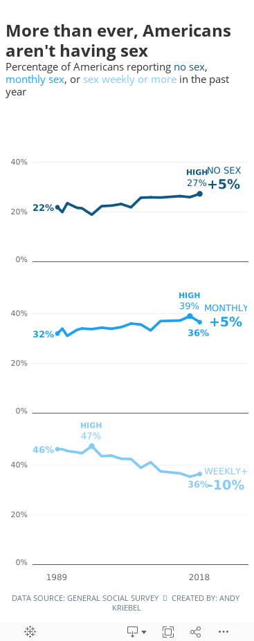
- The title and subtitle make it very clear what the viz is about.
- The labels focus you to the topic the creator wants you to focus on.
- I like how the first year is a filled dot and the last year is an open dot.
- Bolding the first and last years on the axis
- Including the % sign on the y-axis for only the top value
What could be improved?
- Is this colorblind friendly? I'd recommend verifying.
- Does green mean good?
- I don't know how they came up with the percentages they did. They don't match the source.
- Label the lines directly with their frequency instead of using a color legend.
- Lighten the gridlines.
What I did
- Like the original, I filtered out 2012 because the data looks corrupted.
- I liked the original, so I didn't change a whole lot. The main difference was splitting up the frequencies vertically.
- Because I split of the frequencies, I made the viz tall and skinny and mobile friendly.
- I labeled the start and end of each line.
- I labeled the highest value for each frequency.
- I included the change between 1989-2018 on the end of each line as a summary. I had to float everything to make this work, which damaged my soul a bit.
- I'm only displaying the first and last year on the y-axis.
- I included tooltips so the reader can see the exact values.
- I used three shades of a single color that go from least sex to most sex (since the focus is on less sex).
- I kept the same title and subtitle.
- I used fonts from the Washington Post website. NOTE: They won't render on Tableau Public unless you have the same fonts installed (Playfair Display and Yantramanav).
Subscribe to:
Post Comments
(
Atom
)


No comments
Post a Comment