July 1, 2019
#MakeoverMonday: The Top Killers in Game of Thrones

Now that I've admitted my shortcoming, I would like to thank David Murphy for volunteering his viz and data set for this week's Makeover Monday.
From the perspective of an analyst, this is exactly the kind of data I love; data I know nothing about. This helps me approach the data without any bias and to ask simple questions of the data before deciding on my visualization. More on that after a quick review of David Murphy's viz.
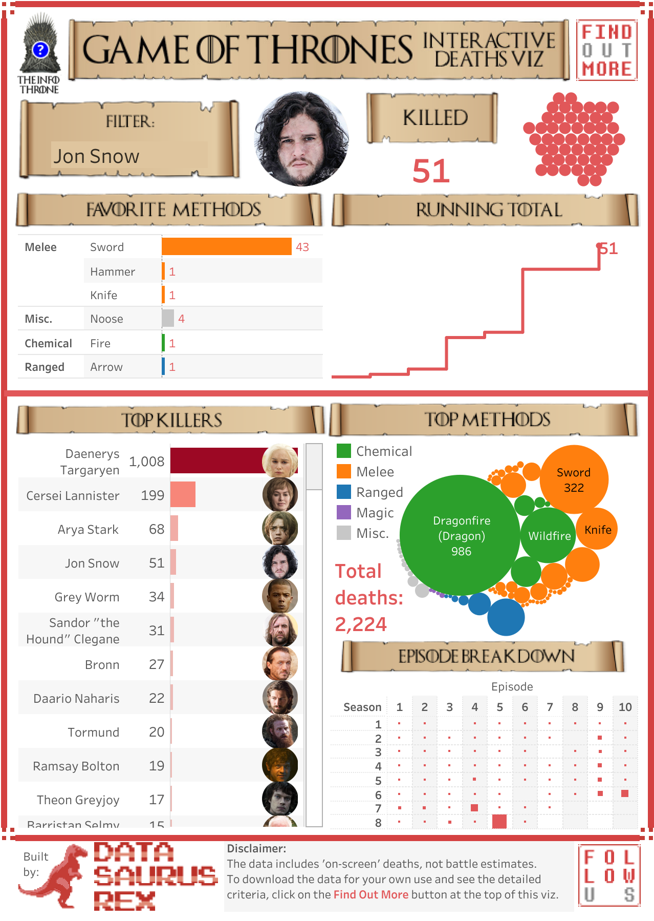
What works well?
- Visually, it captures your attention quickly.
- The person chosen, profile picture, and summary of people killed gives a quick summary before the viz goes into more detail.
- The viz is designed to go into more detail as you scroll down.
- The headers of each section look really cool and break apart the viz well.
- Using a bar chart to rank the killers.
What could be improved?
- The viz is only relevant to people who understand Game of Thrones.
- It's not obvious that the bubbles on the right represent people killed.
- Packed bubbles are rarely a good option for ranking.
- There are too many colors.
- The bar chart doesn't need to be double encoded (length and color represent the same data).
- The episode breakdown would be easier to understand as a heatmap.
- Remove the character pictures from the bar chart.
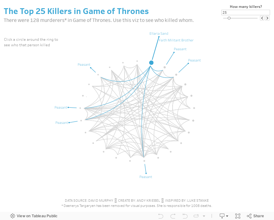
What I did
I started by trying to understand the data. Seasons, episodes, killers, and victims are all easy to comprehend so I stuck with those. The obvious chart choice would be a bar chart, but this week, I thought I would try something new. I supposed seasons and episodes create a time series, but I didn't like how that turned out.
The next chart that popped into my head was a network graph, but I wasn't sure it would work visually. I gave it a try though by assigning random coordinates to each person and connecting them using the makepoint and makeline functions. It looked like crap. That's because of my random coordinate generator; I imagine there's a better way to approach that.
I liked the idea of some type of graph connecting people so I did a google search for chord diagrams and this amazing viz and tutorial from Luke Stanke. Luke included all of his data prep steps. He used R, which I have used sporadically, but I thought it would be fun to learn how to create the workflow in Alteryx. His steps were really well documented, making them quite simple to replicate. All I had to do was swap out my dimensions for his and change a couple of aggregations.

His tutorial then take you through how to build the viz in Tableau. Easy peasy! Lastly, I removed Daenerys Targaryen from the data set because she killed 1008 people, which is over 500% more than the next highest killer and it was making everything else look terrible. I don't think the labeling is quite right, but I also couldn't figure out how to debug it after many tries.
And now I have my first chord diagram in Tableau showing who killed whom in Game of Thrones.
And now I have my first chord diagram in Tableau showing who killed whom in Game of Thrones.
Subscribe to:
Post Comments
(
Atom
)


No comments
Post a Comment