June 23, 2019
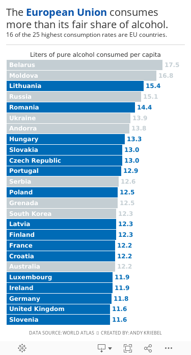
#MakeoverMonday: The European Union consumes more than its fair share of alcohol

.png) |
| Source: World Atlas |
What works well?
- Clear title
- Countries are listed in decsending order
- Simple color for the bar chart
- Labeling the axis
What could be improved?
- The axis is truncated; this is a big no-no for a bar chart.
- The labels for the countries don't need to be rotated on a diagonal.
What I did
- A bar chart is the easiest way to communicate, so I've kept that.
- I rotated the bars to make them horizontal.
- I save space by labeling the inside of the bars with the country name.
- I labeled the ends of the bars so that I wouldn't need an axis.
- I highlighted the EU countries, since I found that an interesting piece of the analysis.
- I created the viz as a mobile size, since I thought this was as good of an opportunity as any to practice mobile design.
Thoughts?
Subscribe to:
Post Comments
(
Atom
)


No comments
Post a Comment