June 9, 2019
#MakeoverMonday: Is it wrong for same-sex adults to have sexual relations?


What works well?
- The title, question response, and breakdown are all organized together. They also look quite crisp; that's because they render differently because they aren't part of the Tableau rendering.
- The scale goes to 100%.
- The horizontal gridlines help guide the eye.
- Showing the year header every five years
- Using a line chart to show trends over time
- Allowing the user to highlight a line by clicking on the legend
- Overall, it's an easy chart to understand.
What could be improved?
- The share, print, export, and table buttons are in the way. Move them to the footer.
- The colors are too similar.
- Remove the dots on the lines for each year.
- Why is the title green?
- Legend text is cut off for some selections
What I did
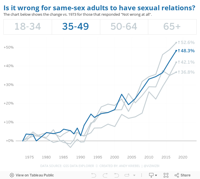
I like the overall design of the original, so I decided to clean it up and change the main metric to answer the question differently.
- I removed all of the dots from the lines.
- I allow the user to highlight an age via a parameter action.
- I changed the metric on the change from % of population to the change vs. 1973. For me, this is a more meaningful way to show the change in opinions.
- I moved the title closer to the chart.
- I used Benton Sans as the font (Tableau fonts get boring sometimes).
This ended up being pretty much what I built last week, and I'm ok with that. If a chart works, stick with it.
Subscribe to:
Post Comments
(
Atom
)


No comments
Post a Comment