November 12, 2018
Makeover Monday: The Lack of Diversity in Tech Companies
diversity
,
dot plot
,
equality
,
gender
,
inequality
,
Makeover Monday
,
silicon valley
,
tech
No comments

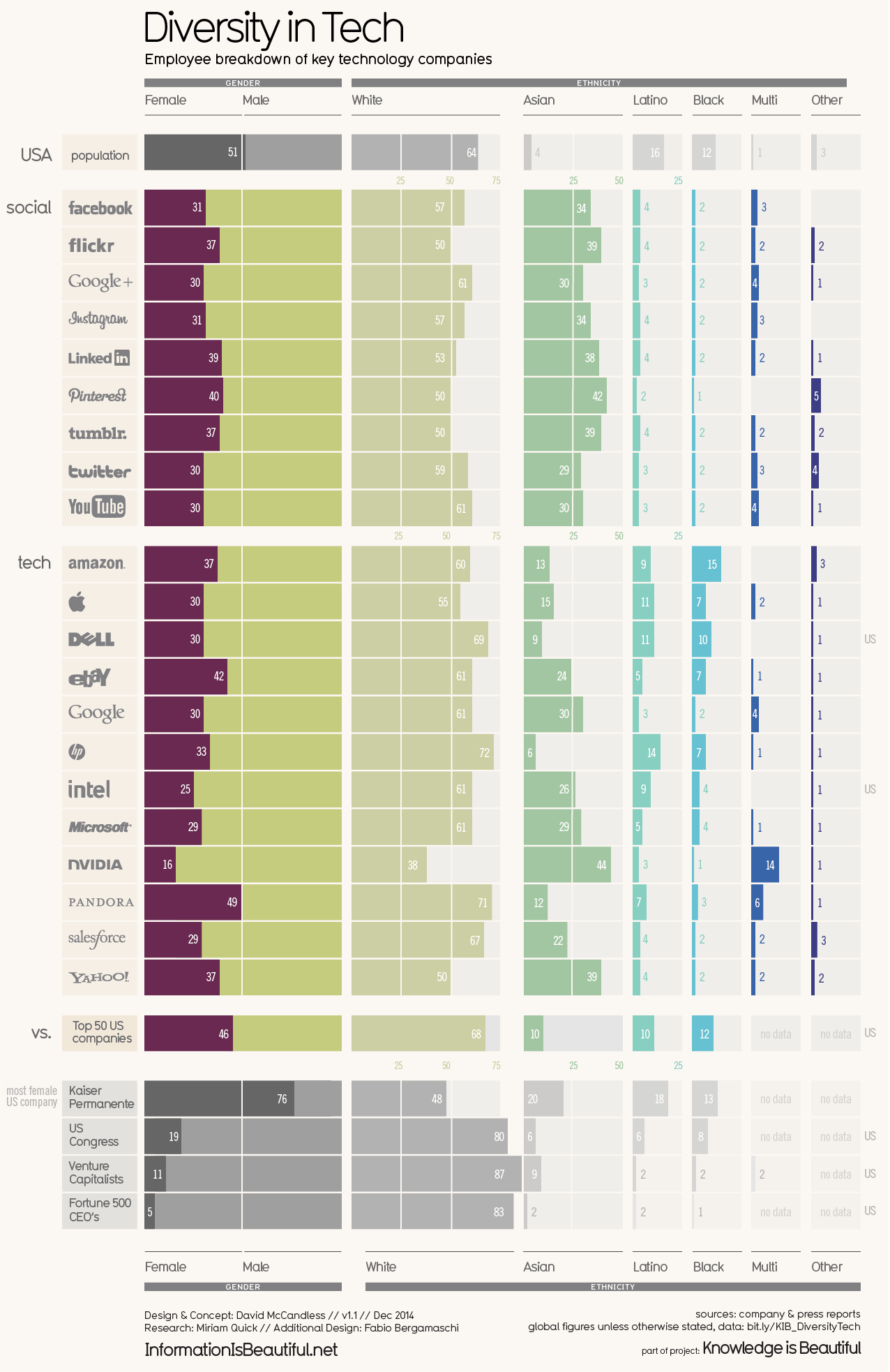
What works well?
- Vertical groupings work well for comparisons
- Using more pronounced colors for the companies and greying out the comparators
- Nice filtering options
- Title and subtitle are simple and tell us what the viz is about
- Good labeling
- Including a white divider line at 50%
- Including sort options
What could be improved?
- Including the gender breakdown as well as the ethnicity breakdown in the same chart makes it feel too cluttered.
- As the years are set as filters, it's overly difficult to see if companies are becoming more or less diverse over time.
- Are the logos necessary?
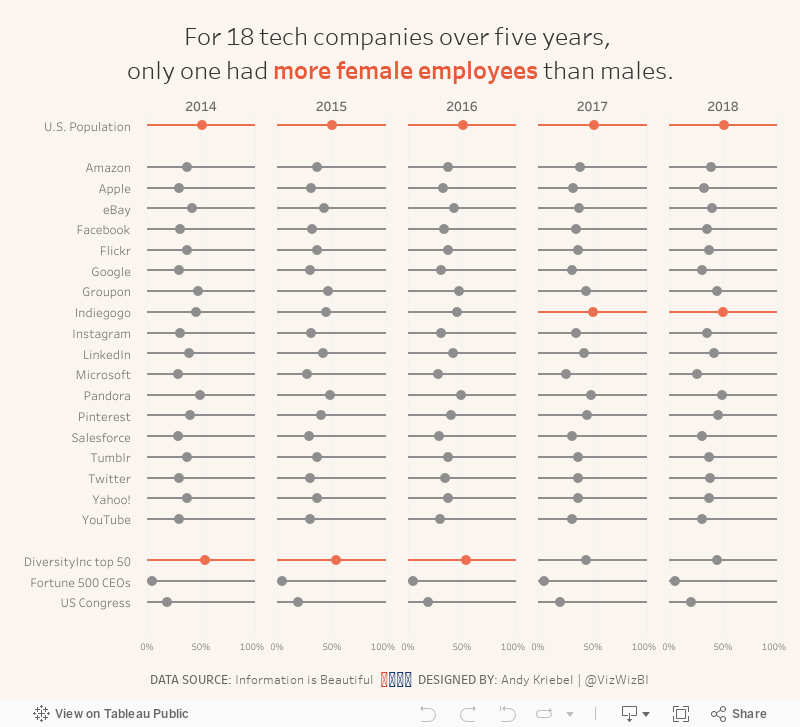
What I did
- Focused on the gender diversity
- Chose a simple dot plot to make the viz less cluttered
- Included a more impactful title
- Kept their background color, but used a different color for highlighting
Subscribe to:
Post Comments
(
Atom
)


No comments
Post a Comment