November 12, 2018
Makeover Monday: The Lack of Diversity in Tech Companies

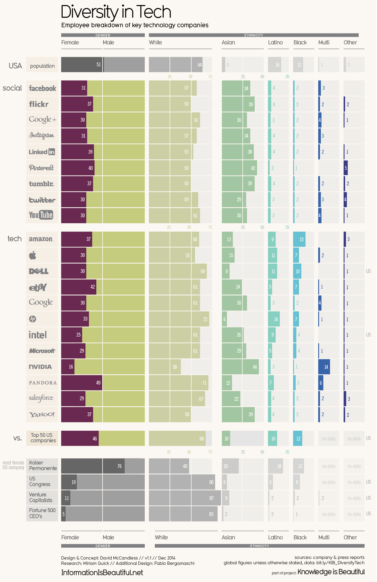
What works well?
- Vertical groupings work well for comparisons
- Using more pronounced colors for the companies and greying out the comparators
- Nice filtering options
- Title and subtitle are simple and tell us what the viz is about
- Good labeling
- Including a white divider line at 50%
- Including sort options
What could be improved?
- Including the gender breakdown as well as the ethnicity breakdown in the same chart makes it feel too cluttered.
- As the years are set as filters, it's overly difficult to see if companies are becoming more or less diverse over time.
- Are the logos necessary?
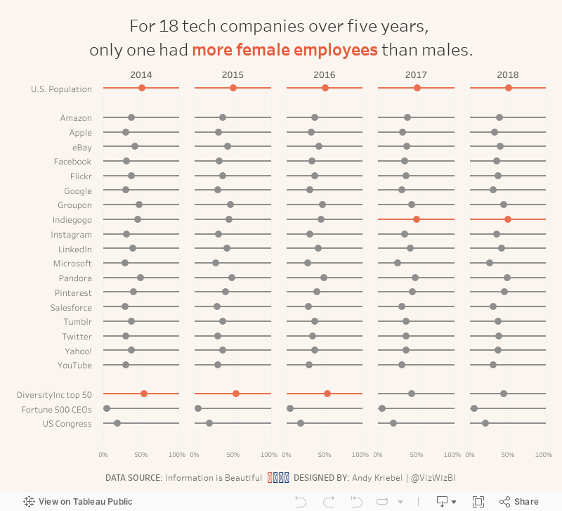
What I did
- Focused on the gender diversity
- Chose a simple dot plot to make the viz less cluttered
- Included a more impactful title
- Kept their background color, but used a different color for highlighting
April 4, 2016
Makeover Monday: America's Most Diverse Cities Are Often The Most Segregated
 |
| Click on the image for an interactive version |
Diversity…always a hot topic in the States, particularly around election time. This week we for Makeover Monday, we look at this visualisation from FiveThirtyEight.

I chose those chart for two main reasons:
- It’s already good. How will everyone approach a chart that is already good vs. a one that has many flaws?
- I felt like there was more to the story than this chart reveals. The chart takes quite a while to comprehend, so surely there’s a better way to communicate the message.
Let’s start by consider what works well and what doesn’t. What works well?
- As with all FiveThirtyEight charts, it conforms to their principle of simplicity in design.
- The additional red trend line helps to clearly show what is above and below “normal”.
- Highlighting specific cities
- Additional descriptions through text aid in understanding
Ok, but when we look at those same reasons for being effective, we can also find some areas of weakness:
- Why are those particular cities highlighted? Some explanation is given, yet the design leads you to believe those are the most important cities.
- No information is provided for how the red trend line is drawn or calculated. Why not? Is the model not sound enough to promote sharing of it? It makes me skeptical.
- What does the location of a city on the scatterplot really mean? You have to read to complicated descriptions below the chart to gain that understanding.
- We have location information (i.e., cities), which immediately makes me wonder if there are geographic implications. HINT: there are!
I iterated through many different charts looking for a story. To me, the measure that is the most impactful in the Integration/Segregation Index. This is a measure of how far a city is from being fully integrated. The worse the number, the more segregated a city. This is the easiest metric to understand and the most telling. I created a slope graph and a bar chart that I threw away. In the end, I combined several views into a single dashboard.
- All of my charts use the integration/segregation metric for color
- I broke the chart into four quadrants and labeled each quadrant to aid in understanding.
- I included jitterplots of the city and neighborhood diversity indices to show concentrations.
- I included a map so that you can more easily see that cities east of the Mississippi River tend to be more segregated, which is emblamtic of the history of the United States. Eastern states have their roots in slavery, and it doesn’t appear all that much has changed from a segregation perspective.
- I included a filter so that the user can look at just the quadrant they are interested in.
I feel like my design gives the reader much more information about the problem, the story, and even a bit of historical context. While all of the data is the same in each chart, this is an example where including multiple displays of the same data in a single view can aid the understanding of the reader. When we’re creating data visualisations, it’s important to make them as simple to understand as possible. If you step away from your work and it’s not completely clear, then you should keep iterating.
You may also notice that I did something a bit different with the map. This is a Tableau map, yet you only see borders around the US states. I’ll create a video sometime for how I did that. If you’re curious in the meantime, download the workbook and see if you can reverse engineer my technique.






