October 17, 2018
Tableau Tip Tuesday: 82 Charts in 80 Minutes
Monday, I ran a free Tableau Zen Master Tips & Tricks webinar. I changed it from the previous webinars I ran last year; this time I focused on charts. I wanted to see how long it would take me to build 82 charts. It took a little under 80 minutes. This was a rehearsal of sorts for the Tableau Speed Charting session Jeff Shaffer and I are running at TC18.
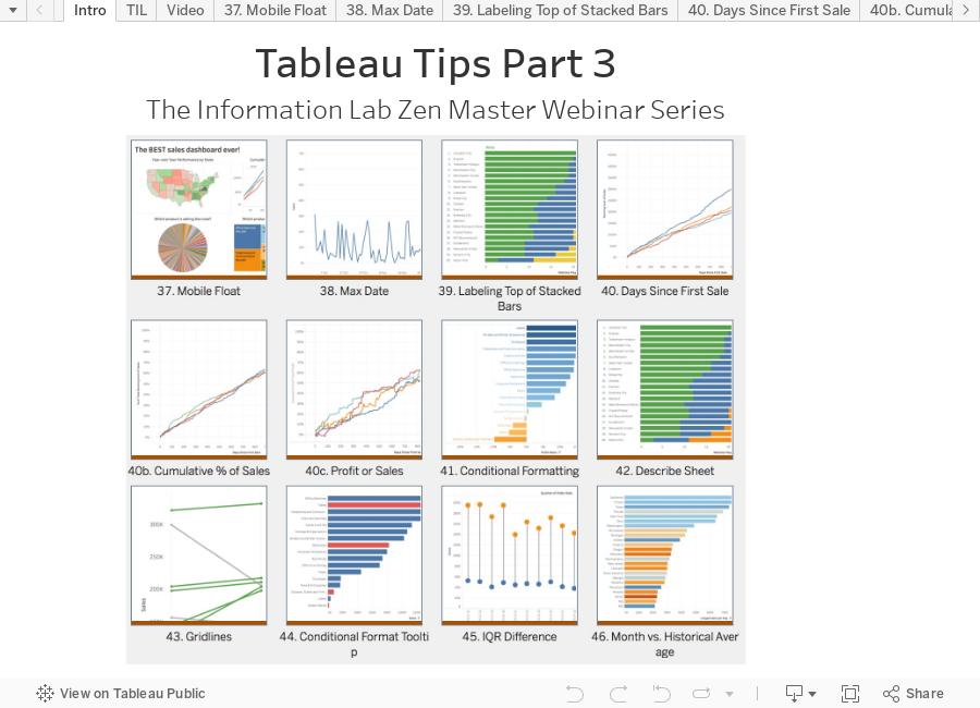
Click on the image below to access the workbook with all of the chart types. I've also embedded the video from the session in the "Video" tab. Enjoy!

November 1, 2017
Tableau Tip Tuesday - The Information Lab Zen Master Webinar Series - Part 3
Hopefully you've enjoyed the series. I'd love to hear your feedback on how useful the video are and things I could do differently. Enjoy!
September 26, 2017
Tableau Zen Master Webinar Series
Have you ever wanted to learn from a Zen Master for free? Well here's your chance.
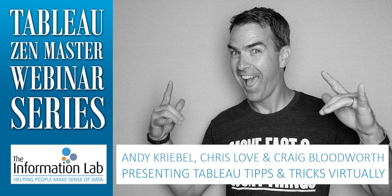
Join us for The Information Lab Europe Tableau Zen Master Webinar Series with me, Chris Love and Craig Bloodworth. We'll be sharing our love for Tableau in three webinars starting in October.
Sign up here:
Part I: My 20 Favorite Tableau Tips
Presenter: Andy Kriebel
Date: Oct 17, 2017 9:00 AM BST
Register: https://attendee.gotowebinar.com/register/3519156674736335618
Part II: Advanced Charting with Unions
Presenter: Chris Love
Date: Nov 10, 2017 9:00 AM GMT
Register: https://attendee.gotowebinar.com/register/5166142629772726786
Part III: The Future of Mapping in Tableau
Presenter: Craig Bloodworth
Date: Dec 05, 2017 9:00 AM GMT
Register: https://attendee.gotowebinar.com/register/2448374186282591490
After registering, you will receive a confirmation email containing information about joining the webinar.
April 30, 2012
Free Tableau Training Tonight – 6:30pm PT
Tonight I will be training the LA Tableau User Group and you’re welcome to join. I’ll be teaching them how to build this interactive viz.
We’ll cover the following techniques:
- Effective use of colors
- Custom shape files
- Using parameters for dynamic visualizations
- Effective design for effective communication including bar charts and heat maps
- Creating simple calculated fields
- Putting it all together in an interactive dashboard
I expect the session to last from between 60-90 minutes.
Download the shape files here and the data here. You will need these to follow along.
Unzip the shape files to My Tableau Repository\Shapes\NBA and save the data to My Tableau Repository\Datasources.
| Live Meeting Details | ||||||||||||||||
|
April 18, 2012
Live Webinar: Atlanta Tableau User Group – April 26th 1-4pm
This month we will be making the ATUG meeting available as a webinar. The agenda includes:
- Blend This – Paul Lisborg, Newnan Utilities
- Parameter Madness – Andy Piper, Norfolk Southern
- Interactive Data Blending
- Dynamic Path Coloration
- Dynamic Table Creation
This will be a hands-on session, so have your laptop and Tableau ready to go.
Webinar details
Meeting Number: 715 959 099
Meeting Password: atug
To join this meeting (Now from mobile devices!)
- Go to https://nsc.webex.com/nsc/j.php?J=715959099
- If requested, enter your name and email address.
- If a password is required, enter the meeting password: atug
- Click "Join".
- Follow the instructions that appear on your screen.
Audio conference information
1-866-672-6771
User code 02 56 577#
December 13, 2011
ATUG Webinar – Jedi Tricks and Brilliant Dashboarding (Thursday Dec 15, 1-4pm ET)
While we prefer that you join us in person, this month we are offering the Atlanta Tableau User Group meeting as a webinar. Anyone is welcome to join.
RSVP (if you plan to attend in person) – http://www.tableausoftware.com/usergroups/atlanta-dec15-11
Please join 5 minutes early as we will start promptly at 1pm.
Agenda:
- Jedi Tricks – Marc Rueter, Tableau Software
- In this session, Marc will show ten powerful tricks that will make you truly the master of your analytics.
- Hands-on Training: Tips & Tricks – Andy Kriebel, Coca-Cola
- Authoring Brilliant Dashboards
- Ten powerful tricks that will speed up your work
- Information - January & February Meetings
-- This will be a hands on session --
Webinar Login Information
URL: http://bit.ly/drY3e5
Toll free: (877) 906-9811
Conference code: 2561415367
November 10, 2011
Telling a Good Story: Effective presentation of analytical results
Another great TDWI webinar today: “Effective presentation of analytical results” by Jonathan Koomey. Much of the content will be review for those that have read books by Edward Tufte and Stephen Few (many of the examples used were taken from Show Me the Numbers), but it’s always good to hear someone else’s take on effective presentations. My key takeaways:
- Know your audience - Think about what your audience cares about, and express your results in those terms
- Don’t forget the decision maker
- Use structured storytelling to present the key results
- Document your work (results & methodology) so that others can recreate it
- Break up graphs and tables into two categories
– Those that give you insights
– Those that help you tell your story to others - Charts and figures must focus on the data
- Improving poor visualizations is a great way to teach best practices
– Even simple changes can make a huge difference in communication - My favorite quote: “Data are dull only when chosen poorly and presented badly”
Download the presentation here or read it below.
UPDATE (11/11/2011): The webinar video is now available for replay. Watch it here.November 8, 2011
Ammunition: Driving Smart Decisions at Your Organization
Lyndsay Wise of Wise Analytics and Francois Ajenstat of Tableau hosted a terrific webinar today about self-service BI. I especially appreciated the discussion about IT’s role as an enabling and support organization, rather than bureaucratic and controlling.
There are lots of battle wounds from sparring with IT about BI and if you are in an organization where it’s challenging to get IT support for self-service BI, rather than resistance, then this might be the ammunition you need.
You can download the presentation here or read it below.
UPDATE (11/11/2011): The webinar video is now available for replay. Watch it here.September 2, 2011
Join us at the September Atlanta Tableau User Group Meet-up
Please join Mischa Uppelschoten of UPS and Dan Murray of Interworks as they host the Atlanta Tableau User Group on Wednesday, September 21 from 2:00 - 4:00 pm at UPS.
This event is a time to share, listen, network and discuss experiences and opportunities with other Tableau users.
Information:
- Wednesday, September 21 from 2:00 - 4:00 pm
- UPS, 55 Glenlake Parkway NE, Atlanta, GA 30328
Agenda:
- Introductions / Networking
- Webinar – Tableau @ Oxford University: A Classic Tale of “Land & Expand” – Andy Cotgreave, Tableau Software
- Break / Networking
- Exploratory Vitas: Ways to Become Acquainted with a Data Set for the First Time – Hands-on activity – Dan Murray, Interworks
- November Meeting Discussion
Bring your laptop equipped with Tableau because this will be a hands-on session.
August 18, 2011
ATUG Webinar Today 1pm ET - Albert Birck (Maersk Line): Overcoming Resistance in BI Projects
Join ATUG today at 1pm ET as special guest Albert Birck from Maersk Line joins us all the way from Europe to present his talk from the European Tableau Customer Conference:
Overcoming Resistance in BI Projects
- Outgunned and outnumbered
- Feeling like an outlaw
- No funds, only problems to solve
- Locked-in
And how 'guerilla-analytics' can help you deal with it
-------------------------------------------------------
To join this meeting (Now from mobile devices!)
-------------------------------------------------------
- Go to https://nsc.webex.com/nsc/j.php?J=715230391
- If requested, enter your name and email address
- If a password is required, enter the meeting password: stealth
- Click "Join"
- Follow the instructions that appear on your screen.
Meeting Number: 715 230 391
Meeting Password: stealth
-------------------------------------------------------
Audio conference information
-------------------------------------------------------
USA: 1-866-672-6771
International: +44 20 7198 1751
User code: 02 56 577#
July 20, 2010
Zero-Based Scale Violated

I just so happened to be re-reading the zero-based scale section in Stephen's book "Show Me the Numbers" yesterday and in the book Stephen says (p. 169):
- "You should generally avoid starting your graph with a value greater than zero, but when you need to provide a close look at small differences between large values, it is appropriate to do so. Make sure you alert your readers that the graph does not give an accurate visual representation of the values so that your readers can adjust their interpretation of the data accordingly."
I was able to reproduce Stephen's graph using the Coffee Chain data source provided by Tableau, including using the exact range for the banding that Stephen used. This time, however, I started with a zero-base scale (which is the default in Tableau).

The profits look much more constant in this example. In Stephen's example, the changes month to month are much more exaggerated.
In the end, I'm sure it was done to merely illustrate the feature, but beware of how you use this feature yourself.
July 9, 2010
What's wrong with "visual" spend analytics?

- The largest slice should be first and it should start at the zero position.
- The legend is in an order that makes sense, but the slices don't match that order.
- The colors are way too strong.
- The third bullet on the left tells a good message, but if you want to see the true impact of that 97%, you need to start at the zero position.


- The title of the graph is black with white font, making it difficult to read and it garners too much attention. A light gray background with a black regular font works better.
- The text in the table is blue. Why? What value does it add?
- A darker or double line to separate the rows from the total would make the total more distinct.
- Numbers (as well as their headers) that represent quantitative values should ALWAYS be aligned to the right. Aligning the data to the right allows for quicker comparisons of the values; it's much easier to find the bigger values.
Towards the end of the session, John showed how you can wrap all of the visualization together in a dashboard. While this makes perfect sense, he wasn't careful enough about the design. Let's look at two examples.

- The dashboard title is meaningless. Every dashboard title should be a statement/phrase that captures the attention of the reader and signals what they are looking at. An example might be: "Expected savings were not achieved in the most recent quarter"
- The background is of the entire dashboard is gray, making it difficult to read the black font against it. A white background is nearly always preferred.
- As before, the chart titles are black with white font. Choose a light gray background and a regular black font.
- Six pie charts. Really? Six? Why not bar charts? The purpose appears to be to show rank, in which case a bar chart is preferred.
- Each set of two pie charts can be combined into one bar chart. The results would be three bar charts.
- The color shelves and quick filters just seem off for some reason. The placement strikes me as needing cleaning up. I'd have to work on this.

- When someone views a dashboard, their eyes automatically go to the upper left corner of the chart. The first thing they see here is the company logo. This would be best placed on the upper right.
- The contact information should then be shown below the company logo, like he has it, but on the right.
- The quick filters should be on the right, whether this is a banner for a home page or not.






