Showing posts with label consumption. Show all posts
March 22, 2021
#MakeoverMonday Week 12 - How much do Americans spend on cereals?
America
,
BAN
,
bar chart
,
bump chart
,
consumers
,
consumption
,
economics
,
economy
,
KPI
,
Makeover Monday
,
parallel coordinates
,
spending
,
variance
No comments
Time really flew by on today's #WatchMeViz. Before I knew it, an hour had passed, I'd built lots of things, and I hadn't yet decided on my "final" visualization. So instead, I have three this week!


Watch the video here to learn how I built these charts.
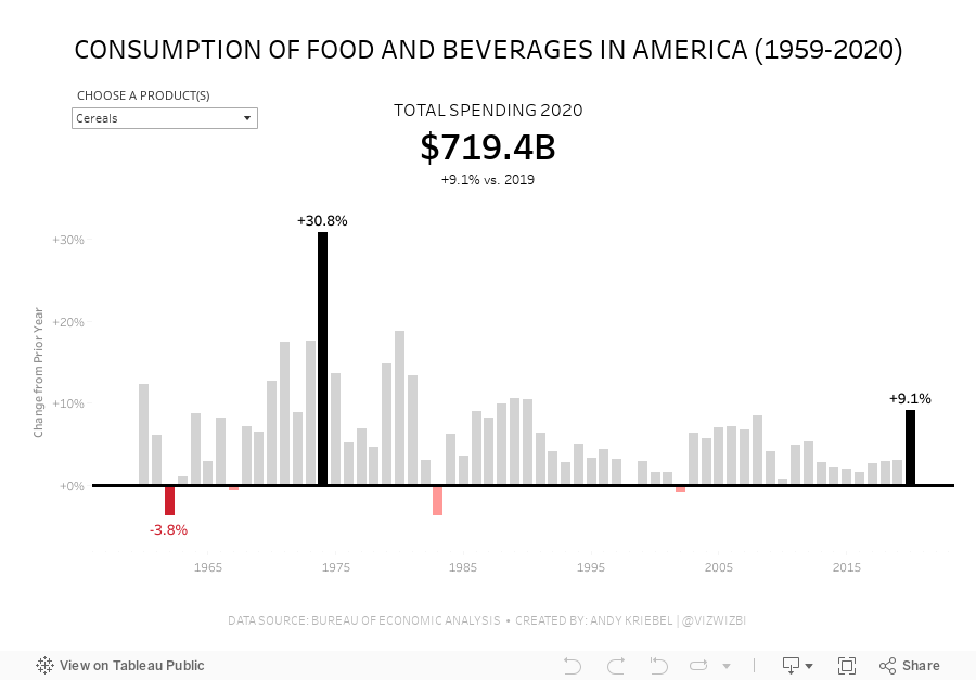
Viz 1 - Year over Year Change in Consumption of Food and Beverages in America
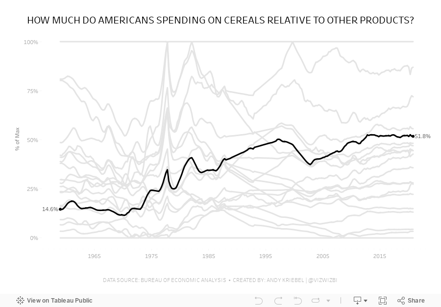
Viz 2 - Parallel Coordinates - How much do Americans spend on cereals relative to other products?
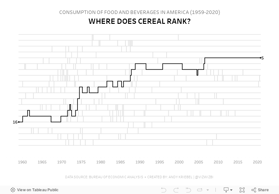
Viz 3 - Bump Chart - #MakeoverMonday 2021 Week 12 - How Does Cereal Rank in American Food Spending?
January 4, 2018
Makeover Monday (Power BI Edition): Poultry and Livestock Consumption
beef
,
chicken
,
consumption
,
interactive
,
livestock
,
Makeover Monday
,
meat
,
pork
,
poultry
,
Power BI
,
responsive
,
tooltips
,
United States
8 comments
This week I've dedicated time to learning new tools. Earlier this week I posted vizzes created in Google Data Studio, Datawrapper and Infogram. Tableau's main competitor is Power BI, so this morning I downloaded and installed PBI Desktop, connected to the data via the data.world connector, and recreated my Tableau viz.

My First Experience With Power BI
Keeping in mind that I knew in advance exactly the chart I wanted to build, here are my initial impressions and experiences with Power BI -- It took me a few hours to create the viz you'll see below. Since I've never used PBI before, I felt that the amount of time spent wasn't too bad. It took me about 30 minutes to create my first Tableau dashboard back in 2008.
- Googling for solutions was very helpful; there seems to be plenty of documentation about how to use Power BI.
- Formatting is very tedious, but you have a ton of control.
- You can get pixel perfect reports by choosing NOT to snap to the grid. I used snap to grid to align everything quickly, then switched to the non-snap option to move things around a few pixels. I found this quite simple.
- I didn't have to pivot the data to get the view I wanted. Pivoting the data made creating the chart in Tableau easier.
- Creating calculations is pretty straightforward if you're used to Excel. The only confusing bit for me was that you have to create a new column, not a new measure. That didn't make sense, but once I knew what to do, it wasn't a problem.
- Adding dots to the ends of lines required a separate calculated field (or column in PBI terminology).
- The tooltips look great out of the box and are super responsive, although I didn't see any way to control what appears in the tooltip. For example, if you hover over the dot on the end of the line, you'll see the extra calcs I had to create for the dots. It would be nice to be able to hide those from the tooltip.
- Formatting fields is done through the Data pane. When you click on the spreadsheet icon you get a data preview, then you click the column header and format it.
- You can't create custom number formats, which meant I couldn't put a + before the positive percentages.
- Embedding and sharing to the web takes too many steps. From PBI Desktop you have to Publish to Power BI, then in the browser, you have to Publish to Web. Seems like an extra step to me.
- I couldn't control the line thickness of the reference line at zero, but it was great to be able to move the reference line to the back (you can't move a reference line to the back with Tableau).
- Creating the equivalent of a table calc is pretty simple. For example, I used the LOOKUP function to create the change versus 1965. Again, if you're familiar with Excel formulas that should be easy to pick up.
- I couldn't add a reference line on a continuous date axis.
Overall, I found this a really useful exercise and enjoyed learning Power BI. It's very helpful for me to understand the pros and cons of Tableau and Power BI and helps me appreciate what both tools offer and how they approach reporting.
The biggest advantage for Tableau is how quickly you get into the flow of visual analytics. Power BI, as I see it so far, is a reporting tool, not a data analysis tool. That's a massive differentiator for me and truly sets Tableau apart.
My plan is to use PBI for a few more Makeover Mondays. Next time, I think I'll start with PBI then go to Tableau and see how I do not knowing exactly what chart I want to build ahead of time.
With that, here's my first Power BI report. I'd love to know your thoughts.
January 2, 2018
Makeover Monday: U.S. Poultry and Livestock Consumption (Alternative Tools Edition)
chicken
,
consumption
,
Makeover Monday
,
meat
,
poultry
,
turkey
2 comments
Yes, I love Tableau and it's my favorite, but learning how other tools work, how easy or difficult they are to use, and whether they allow visual analytics, helps me to understand the marketplace and be a more informed data visualizer.
Given this week's data set is so simple, I decided to give a few other tools a try. Below you'll find several versions of essentially the same chart I created in Tableau using other tools. Are these tools perfect? No, but no tool is; they get the job done though.
Google Data Studio
Datawrapper
Infogram
Subscribe to:
Posts
(
Atom
)


