Showing posts with label waste. Show all posts
April 1, 2019
#MakeoverMonday: How much plastic waste has been found on UK beaches?
beach
,
environment
,
Makeover Monday
,
plastic
,
UK
,
united kingdom
,
waste
No comments

Don't believe me? Watch Drowning in Plastic on the BBC. If this documentary doesn't change you mind about the amount of plastic you waste and the impact its having, then you need to have a deeper look into your soul.
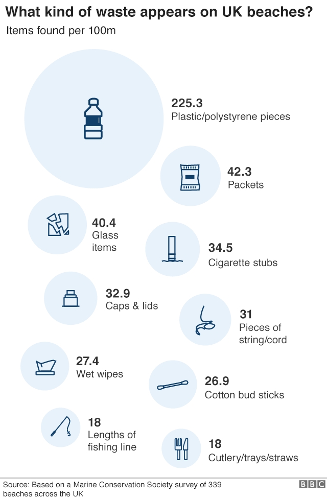
This week, Eva chose a data set about the waste found on UK beaches.
 |
| SOURCE: BBC |
WHAT WORKS WELL?
- Including the raw numbers, and how big they are, provides great impact.
- They sort going down the page.
- The title is clear, concise, and tells you what you are about to see.
WHAT COULD BE IMPROVED?
- The infographic makes it appear as though this is ALL of the waste found on the beaches. However, it's only the top 10. You can see that if you read the original article Eva linked to.
- The icons are cute, but are the necessary?
- A simpler visualization, like a bar chart, would make the impact of the plastic more apparent.
WHAT I DID
As I did last week, I wanted to try out another tool. This week, I played around with infogram.
- Infogram is great for building simple infographics very quickly.
- The customization options help you create a good looking visual.
- The interactions on the charts are super responsive.
- You can change the theme or chart type with one or two mouse clicks.
- There's no "publishing" required. It's already live to everyone once you create your graphic.
- The chart types are limited, but I suspect 90% or more of what you need is available.
- If you want a chart to display the graphic a slightly different way, you may need to edit the data and either crosstab or transpose the data.
Overall, using infogram was a pretty fun experience. I haven't used it for a while and it seems to have come a long way since then. With that, here's my Makeover Monday for week 14.
September 19, 2009
Katrina Contracts
government
,
halliburton
,
hurricane
,
katrina
,
spending
,
waste
2 comments
I read a story recently about Halliburton and the incredible number of contracts and money they scored from Hurricane Katrina. Oh by the way, George Bush was President, Dick Cheney was VP and Cheney was CEO of Halliburton from 1995-2000.
That led me to finding how Katrina contracts were being awarded by government Department. It's been tough to identify just which contracts were awarded to Halliburton since most of them are to subsidiaries. I'm working to gather all of those. The data was gathered from the Federal Procurement Data System (FPDS).
This is a very simple analysis, well not really much analysis at all, but in this instance, given the amount of information I want to display, I actually think the pie chart works better. Thoughts?


That led me to finding how Katrina contracts were being awarded by government Department. It's been tough to identify just which contracts were awarded to Halliburton since most of them are to subsidiaries. I'm working to gather all of those. The data was gathered from the Federal Procurement Data System (FPDS).
This is a very simple analysis, well not really much analysis at all, but in this instance, given the amount of information I want to display, I actually think the pie chart works better. Thoughts?
Subscribe to:
Posts
(
Atom
)






