Showing posts with label mark type. Show all posts
December 8, 2021
#WOW2021 Week 45: Customer Purchasing Habits (RFM Analysis)
bar chart
,
color
,
customer purchasing habits
,
dashboard
,
dot plot
,
dual axis
,
how to
,
labels
,
mark type
,
parameter
,
RFM analysis
,
threshold
,
Workout Wednesday
,
WOW2021
No comments

Personally, I felt a lot of pressure not to mess up with Ann watching. As Erica Hughes of DS20 pointed out, this is how I make them feel during training. I promise it's done with love! 🙂
Here's the video of our session. We nearly finished in the allocated hour. After we dropped off, I cleaned up the tooltips and put together the dashboard, so that's not included in the video.
Click on the image below to view the viz on Tableau Public.
October 1, 2018
Workout Wednesday: Vertical Label and 3 Mark Types
area chart
,
ascii
,
line chart
,
mark type
,
parameter
,
shading
,
vertical label
,
Workout Wednesday
No comments
For Workout Wednesday week 39, Rody challenged the Community to create a shaded area chart with a line on top and marks for each month. That's three mark types, but Tableau only supports two at a time. In addition, the axis label has to be vertically aligned, that is, each letter in the word has to be below the preceding word.
I was expecting some crazy polygon calculations from Rody, and perhaps that's how he approached it. I, however, was able to create the required view with only two marks and the text shelf. Before I get to how I came up with my solution, here's my submission:

For the dashboard layout:

I was expecting some crazy polygon calculations from Rody, and perhaps that's how he approached it. I, however, was able to create the required view with only two marks and the text shelf. Before I get to how I came up with my solution, here's my submission:
For the dashboard layout:
- I used a vertical container with a 50px blank on each side.
- The rest of the viz is in a horizontal container in the middle of the vertical container.
- I added spacing to the outside edges of the black line to get the spacing right.
- I added some spacing at the top of the parameter and the dynamic title.
- The parameter is in a horizontal container with a blank on either side set to distribute evenly.
For the chart:
- I used an area chart on one axis.
- I used a line chart on the other axis.
- I used an ascii ● as a label on each mark on the line. This has to be centered vertically and horizontally for it to appear in the correct place for each month.
- For the vertical label, I used this knowledge base article to add a line break after each letter. Since there are 8 letters max, my formula has 8 lines and then I trim the text.
I'm sure there's a better way to do the vertical labels using the length of the string, but this works. In programming, I'd use a WHILE loop. Thanks Rody!
August 4, 2015
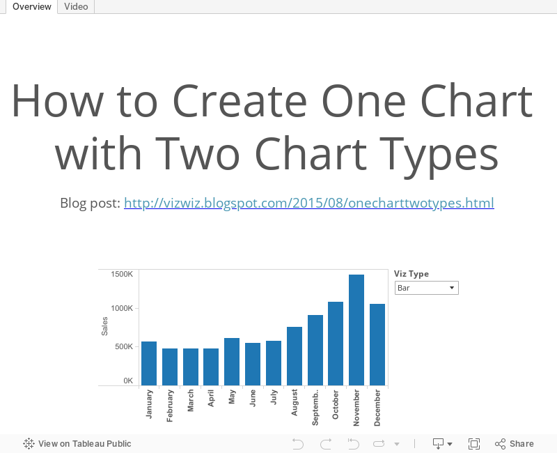
Tableau Tip Tuesday: Create One Chart with Two Chart Types
bar chart
,
dual axis
,
line chart
,
mark type
,
tableau
,
tip
,
Tuesday
No comments

I've previously written about how to create two chart types on a single chart, so this week I am presenting you with a recorded version of that same post.
Subscribe to:
Posts
(
Atom
)






