Showing posts with label latin america. Show all posts
May 16, 2017
Makeover Monday: Female vs Male Youth Employment in Latin America & Caribbean Countries
caribbean
,
employment
,
female
,
highlight
,
latin america
,
Makeover Monday
,
male
,
slope graph
,
unemployment
,
youth
No comments
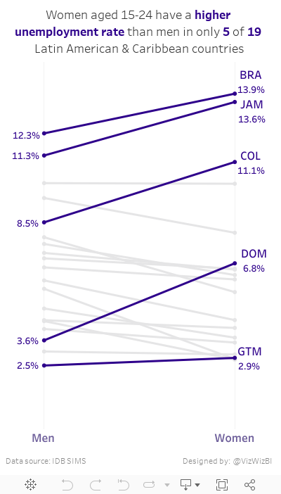
Today, I had a few spare minutes and knew that Eva really wanted me to create something with the full data set she created for #VizForSocialGood. Also, I was really surprised at the remarkably few slope graphs this week. This is a great data set for slope graphs, whose main purpose is comparing two points.
So, here is my second Makeover Monday this week. Special thanks to Eva for feedback on my iterations. In this viz, I wanted to compare the unemployment percentage for 15-24 year olds by country. Perfect use case for a slope graph...and my 500th Tableau Public viz!! I wonder who has more??
May 15, 2017
Makeover Monday: What jobs do young people in Latin America hold?
bar chart
,
Cole Nussbaumer
,
donut chart
,
employment
,
jobs
,
latin america
,
Makeover Monday
,
text
,
youth
3 comments
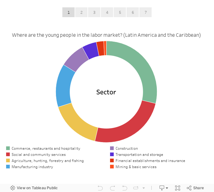
For Makeover Monday, this week is a collaboration with #VizForSocialGood and Inter-American Development Bank. It's always a special day when you can make an impact. Eva and I are also hosting a Brightalk webinar about Makeover Monday at 4pm BST today. Join us if you have a chance.
This week's makeover is a donut chart that shows how many youths in Latin America and the Caribbean are employed in different jobs.

What works?
- Using a question for the title
- People immediately understand how to read a donut chart
- Sectors are sorted from largest to smallest
- Nice tooltips
What could be improved?
- Why are mining and basic services combined?
- The middle of the donut is wasted.
- The data doesn't tell an effective story.
- A bar chart would make comparing the sizes easier than a donut chart.
- Too many colors
For my viz, I decided to start by recreating the original in Tableau and then using story points to walk through each step of my makeover. I recalled this great post by Cole Nussbaumer in which she presents alternatives to pie charts. In particular I really like her big number viz, so I did my best to emulate that style. Simple and more effective that the donut chart for me.
Subscribe to:
Posts
(
Atom
)


