April 5, 2017
Workout Wednesday: Do UK exports fit the Pareto Principle?
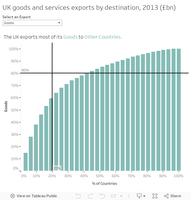
The Pareto principle (also known as the 80/20 rule, the law of the vital few, or the principle of factor sparsity)[1] states that, for many events, roughly 80% of the effects come from 20% of the causes.For Workout Wednesday week 14, Emma decided to look at UK exports and see if they follow the Pareto principle. As an exporter, I imagine it would be really bad if 80% of your exports only went to 20% of countries. I'd think you'd want to spread your exports around the world. I'm not an economist, so I'm just guessing.
What's the answer? No, UK exports do not follow the Pareto principle.
Having done this type of chart countless times, it only took me about 1 minute. The trickiest part for me was getting the first ranked country into the sheet title. I accomplished this through a table calc since I already had country in the view and I knew I needed to compute by country for the calculation.

I used a LOOKUP table calc because it let's me find a specific value in the view no matter which mark I'm on. I then added the IF THEN because the US and Other needed to have special labels. Pretty straightforward.
UPDATE: I just took a peek at how Emma created the title calc and she used an LOD along with a LOOKUP. Overly complex I'd say, but it gets the job done and that's the beauty of Tableau. You can nearly always solve the same problem many ways.
Here's my Workout Wednesday creation:
May 23, 2016
Makeover Monday: The Militarization of the Middle East in a Post-9/11 World

After an epic week 20 for Makeover Monday, I had great expectations for this week. Another great data set, this time looking at global arms imports and exports. But dang it was tough! I really struggled this week making something I was happy with. In the end, time is up and I learned a lot.
Let’s start by looking back at the original visualisation.

What works well?
- The colors clearly distinguish imports and exports.
- The labels provide the needed context.
- Nice small line charts for Europe and the Middle East along with an indicator for the rate of change.
What could be improved?
- The title of the article doesn’t match the chart.
- It’s hard to compare countries.
- Why were the countries that are shown selected? Are they the top N?
- Why is the timeframe 2011-2015? That seems a bit arbitrary.
- Why are there only sparklines for Europe and the Middle East?
- The lower section with the flags has nothing to do with the map.
- In the lower section, why don’t UAE and China show awaiting delivery? It should be consistent.
- Is there a better story that can be told? The data goes back to 1950 after all.
I decided to focus on the title of the article: “The Militarization of the Middle East”. And I focused even farther by looking at the post-9/11 era from 2002-2015. America initiated a war with the Middle East. I wanted to know how that impacted the import of arms to the region.
Once again this was a week of iterations. I started with this small multiple map view, but didn’t think it showed the change through the years very well.
 |
| Click the image for the interactive version |
I then looked at a slope graph comparing the % of total arms imported in the region by country in 2002 compared to 2015. This definitely shows the rate of change better, but I lose the context of the years in between.
 |
| Click the image for the interactive version |
Maybe a DNA chart will work better than the slope graph? Not really, it just flattens it out.
 |
| Click the image for the interactive version |
I was getting frustrated by this point, so I decided to take the opportunity to learn a new technique. I read Matt Chamber’s blog post recently on how to build ranked bump charts and thought this would make a great use case for this type of chart. In this view, I can see how a country moves year by year in the ranking of arms imported into the Middle East. I really like being able to click on a country and see it highlighted.
What the bump chart loses, though, is the context of the overall value of the arms imported. So to take care of that, I included the sparkling which also updates when you click or tap on a country. In the end, I’m satisfied and I learned something new. That’s a bit of what Makeover Monday is about.