Showing posts with label India. Show all posts
January 25, 2021
#MakeoverMonday Week 4 - Coal Production in India
coal
,
containers
,
dashboard
,
data visualization
,
environment
,
India
,
interactive
,
Makeover Monday
,
production
,
WatchMeViz
,
youtube
No comments

- Watch Me Viz - https://youtu.be/ur3Vhs7Ceck (also below)
- Tableau Workbook - http://bit.ly/MM2021W4
I'd been looking for a data set about India for quite a while now in an effort to keep the Makeover Monday Community in India engaged. This week, I found one about coal production at various mines across the country. It was an interesting topic to learn about, including why the research was done and the purpose. Read the manuscript for background info here.
The original visualization was a simple bar chart of coal production by District.

What could be improved?
- There's no title.
- The District names are way too small. My old eyes can't read it.
- I don't understand the sorting. I would pick one of the metrics to sort by.
- The comparisons need to be more clear, if that is the intent.
Watch Me Viz
To see what I built, check out the video below. I iterated through all of the dimensions with a series of bar charts to understand the data. Thank you very much to those that watched to help me understand what some of the values meant!! I ended up with a simple dashboard that allows you to explore the data by producer and mine within each State. See the viz below the video or here.
Final Dashboard (click to interact)
August 7, 2017
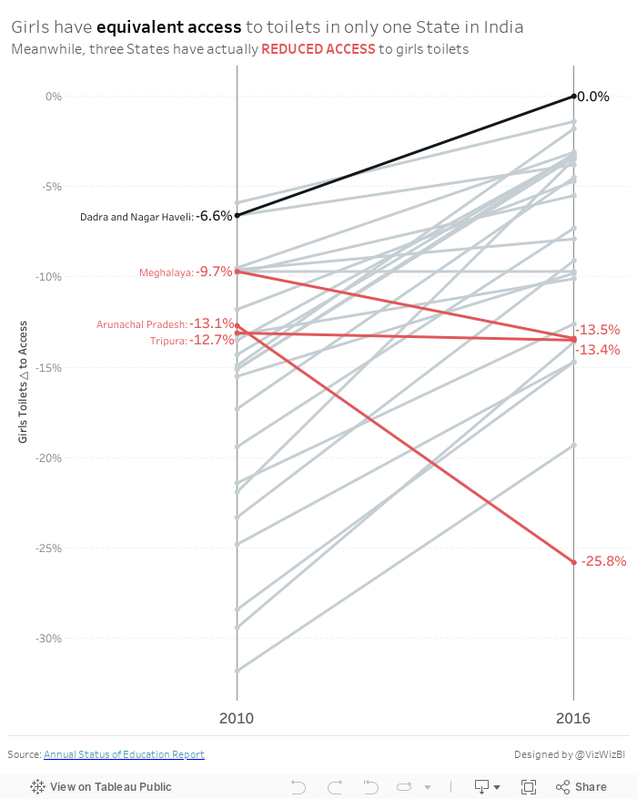
Makeover Monday: How has access to toilets changed for girls in India?
change
,
highlight
,
India
,
LOD
,
Makeover Monday
,
sanitation
,
slope graph
,
toilets
No comments
Let's have a look at the original:

What works well?
- The filled map helps you easily identify which States fall into which categories.
- The colors work well together.
What could be improved?
- The title doesn't make sense. What does access over sanitation mean?
- Sanitation is spelled wrong in the title.
- The legend is cut off.
- Making comparisons across the maps is nearly impossible.
- Making comparisons across years IS impossible.
- There's a lack of explanation as to what the data means.
- There's a lack of insight.
- Labelling each State makes the maps look very cluttered.
- There's no call to action.
My Goals
- Provide insight as to which States have gotten better
- Use a more meaningful metric rather than separating the two metrics
- Simplify and declutter the visualisation
- Highlight what's important
- Emphasize the inequality of access to toilets for girls
With those goals in mind, here's my Makeover Monday week 32.
Subscribe to:
Comments
(
Atom
)


