July 24, 2017
Visualizing 909 Weeks of the U.S. Drought Monitor
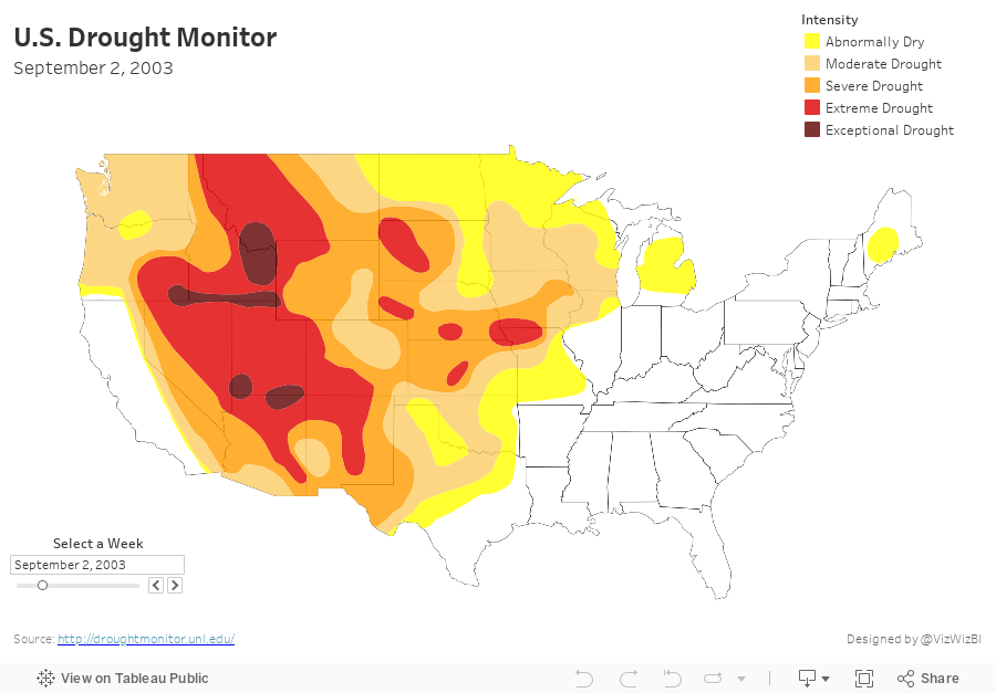
This weekend I wanted to learn how to combine 909 shapefiles into a single shapefile with the goal being to create a motion map of the US drought. As of this writing, Tableau doesn't have a way to union shapefiles, so this was a chance to practice Alteryx.
Here's a video of the motion map, followed by details of how I created it.
I started by going to the Drought Monitor website and downloading the weekly shapefiles for each year. These all comes down as zip files, which when you unzip show other zip files that need to be unzipped. That part is simple. Now, how do I go about combining them into a single shapefile?
This is where Alteryx is super handy. Notice how simple my workflow is. Damn Alteryx makes this work easy!
- Filter to a single date
- Double-click the Geometry field
- Add the Intensity field to the Color shelf
- Zoom to the continental US
- Change the background map to a custom Mapbox map I created that only shows the state borders
May 19, 2016
Rain Patterns at Mount Diablo: What 60 years of rain data tells us about the Northern California drought

I’ve been getting deep into Alberto Cairo’s latest book “The Truthful Art” and was particularly fascinated by the Rain Patterns in Hong Kong visualisation created by The South China Morning Post.
Immediately I began to think back to our time living in Northern California and the historic drought conditions. I decided to use Mount Diablo as a representative weather station because it was one of the most complete and oldest in the Bay Area.
I decided to use this visualisation as inspiration for a version of my own. Some interesting patterns reveal themselves:
- It hardly ever rains between the end of May and early October.
- The most single-day rain total in the last 60 years was 5 inches on 21-Jan-1967.
- Out of the 21,404 days in the data set, only 3,892 had any measureable rain (18.2%).
- We lived in Pleasanton for 1,070 days. During that time, there were only 145 days of measurable rain (13.6%) and only 57.3 inches of rain during that time (less than 1/2 inch per day that it rained).
- Over 60 years, there’s an average of 66 days of rain per year.
- During our time living there, we saw an average of 50 days of rain per year.
My version was made with Tableau 10, so I can’t publish it to Tableau Public yet. You can download the workbook here and the data set I used here. The data was sourced from NOAA.
Finally, a special thanks to Data Schooler Nisa Mara for her feedback during the process.






