November 14, 2022
#MakeoverMonday Week 46 - The Cost of Cocaine & Heroin

Quite the interesting topic this week. I get an email from The Economist regularly and there was an article about the wholesale price of cocaine. That led me down a rabbit whole and I found the data, but also for heroin and also for retail prices.
On Watch Me Viz, I stuck with simple lines charts that compared the price for a country to the overall price for all of the countries in the data set. I allow the user to choose a drug and a country.
I then wanted to show how to Dynamic Zone Visibility feature works (if you haven't seen it, be sure to watch it back). In the end, a simple dashboard that compares the measures in two ways, allows for some filtering, looks good, and that's it.
Check out the dashboard below the video.
August 11, 2019
#MakeoverMonday: The Social Investment of Clinical Trials

- The trial start date on the x-axis.
- The disease/condition of interest on the y-axis.
- Each bubble in the figure corresponds to a trial.
- The bubble color corresponds to the company
- The bubble size corresponds to the number of human subjects enrolled.
- The bubble shape indicates the trial’s current status.
So basically you need to be able to understand quadruple encoding of the bubbles, which is quite difficult. It's very hard to visualize data that is this dense; kudos to the author for giving it a go.
 |
| SOURCE: AERO DATA LAB |
WHAT WORKS WELL?
- The article reference provides a good overall analysis of the data.
- Including the trial start dates on the x-axis helps understand when the trial took place.
- Too many colors
- The x-axis labels are slanted.
- It's way too long (but I understand why it was designed that way).
- There aren't any legends.
- There are too many shapes.
- The bubbles are trying to do too many things at once.
- Comparisons are very difficult.
- I used BANs for the enrollees per pharmaceutical company. I then used this as a set action to highlight that company in the line chart.
- I looked at the enrollees per status, but I don't think that makes sense since it's the latest status.
- The same applies to the phase; it also only shows the latest phase.
- I looked at how many enrollees there have been since the start the first trial for each company.
- I included the enrollees per condition and used a set action for proportional brushing for the company selected.
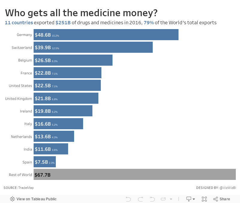
February 18, 2018
Makeover Monday: Who gets all the medicine money?
I love learning something new! Let's take a look at the original viz:

What works well?
- Resizing the continents by their overall exports makes it obvious that Europe is the largest exporter.
- I hate packed bubbles, however in this view, the largest countries stand out by double encoding with color.
- Including the percentages for each continent provides needed context
What could be improved?
- The packed bubbles make comparisons overly difficult.
- The color legend uses unequal intervals.
- Plotting the data on a map doesn't add any context.
- There's no sense of overall ranking across all countries.
- If you ask "so what?", there's no answer.
- Has an informative title and subtitle
- Provides context
- Provides insight
- Uses color effectively
April 16, 2017
Makeover Monday: Lamotrigine vs. Lamictal - How much does the NHS save by prescribing the generic drug?
I've used this dataset before, so I was already pretty comfortable with the data. The viz that she asked us to makeover in underwhelming given the detail of the data behind it.#MakeoverMonday for week 16: An introduction to the dataset and some tips for working with >700 million records...https://t.co/AfFganu8iB pic.twitter.com/lZCpCCpRRv— Eva Murray (@TriMyData) April 15, 2017

What works well?
- Line charts are always very easy to understand
- Laying the charts out side-by-side allows me to see that while prescriptions have been rising, costs haven't been rising at the same rate.
- Axes are clearly marked and not too crowded
- Title tells me what the viz is about, though it's pretty boring
- Chart titles describe what I'm seeing
- Using green for the lines, which is the color for pharmacists in the UK
- There's no story. Are the trends good or bad?
- There could be more comparisons and context. Something like cost per prescription makes it easier to understand if costs are going up or down overall.
- More detailed data, like at the quarterly or monthly level, might show more interesting patterns like if the prescriptions are seasonal.
- Do these trends apply to all regions in the UK? Does it apply to all medicines?
- Use a more impactful title.
- When I look at medical data, I always wonder what it means for me. This viz can't answer that.
May 16, 2012
Is drug testing working in baseball? An interactive analysis.
Cork Gaines wrote about the HR trend in baseball since testing started for performance enhancing drugs. He presented a chart of the trend (surprising effective given his past charts), but he never answered his own question….is testing working?
One way to determine the answer is through comparisons to other statistics.
I downloaded the season averages across both leagues and MLB in total from baseball-reference and built this interactive analysis. The stats are order by batting stats then pitching stats.
This viz allows you to compare home runs to many other statistics through the selectors at the top right. In addition you can:
- View any two statistics to look for trends by choosing a primary measure and a comparison
- Filter the time frame to all years, the pre-testing era, and the testing era (1993+)
- Filter the leagues to focus your analysis
- Click on a league at the bottom to highlight that league
In this initial view of HR vs. ERA, I see a couple of things:
- HR are on a slow descent in the testing era, especially since 2000
- ERA is in a similar decline, possibly indicating that improved pitches has had as much of an impact as testing
- Batting Average has remained flat. This means that the reduction in HR has not impacted BA.
- Teams are simply scoring fewer runs, likely due to the reduction in long balls
- The trend in complete games is despicable
What do you see? Play around with the different stats and see if you can draw any conclusions.

December 21, 2009
Cocaine: Are the number of addicts increasing?
There was a blog post on December 3rd with the subtitle "Latest figures show more and more young people seeking treatment for cocaine addiction." The report in this post was concise and to the point: the number of people between the ages of 18-24 seeking treatment for cocaine use has skyrocketed between 2005 and 2009. I wanted to take their text-based summary and create visualizations (which is what they challenge their readers to do).
First, I wanted to understand the amount of drug use for all drugs.

A few observations quickly jump out:
- 70% of the addicts are being treated for opiates or an opiates/crack cocktail. This should obviously be the focal point for reducing addiction rates.
- It looks like there could have been some type of drug prevention or treatment program launched in 2006-2007. I would have to do some deeper research to find out, but this quick visualization leads you in that direction, which is exactly what rapid fire analysis is all about.
- Female drug use is at its highest between the ages of 18-24, while men seek treatment between the ages of 25-29.

The facts stated are:
- A total of 1,591 people in England aged 18-24 began receiving treatment for dependence for cocaine in 2005-06.
- That number has soared to 2,998 in 2008-09, a jump of 88%.
- The number of women in the 18-24 age group rose 80% (from 329 to 592) over the four years, while the number of men increased by 91% (from 1,262 to 2,406).
- Among under-35s, the number of women starting treatment has gone up 60% (from 790 to 1,261), while for men it jumped 75% (from 3,024 to 5,263).
If you have Tableau Desktop, then you can created your own views and I'd love for you to share them. If not, you can use the free Tableau Reader and interact with the data by simply clicking on the points of interest. Once you click, all of the other views will automatically refresh.


