November 4, 2022
Tableau Charts: Comparison to Budget & Prior Year
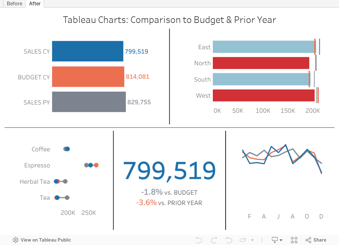
Are you looking for ways to improve how you visualize comparisons between 2 to 3 performance measurements in Tableau?
In many performance monitoring dashboards, you need to make comparison of actual values to budget or target. In this video, I will show you effective ways of making these comparisons.
I will also show you how to compare your performance to prior year (PY) to see if performance is improving year over year.
One thing you'll notice in these examples is the consistent use of color. Make sure your metrics use the same colour throughout your dashboards, reports and worksheets. The colors should be easy to differentiate.
I have 4 designs that you can apply to make any comparison look better and easier to understand.
Download the workbook for a bonus 5th chart type that compares these three metrics over time.


No comments
Post a Comment