November 4, 2022
Tableau Charts: Comparison to Budget & Prior Year
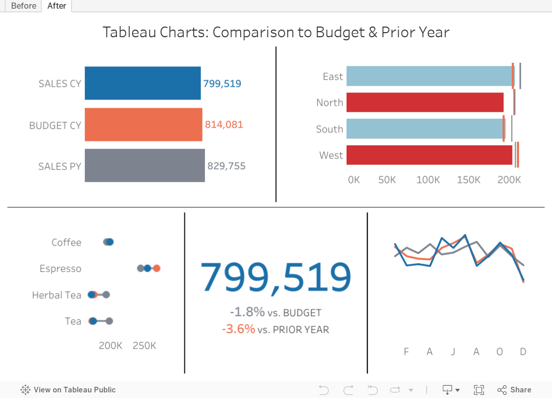
Are you looking for ways to improve how you visualize comparisons between 2 to 3 performance measurements in Tableau?
In many performance monitoring dashboards, you need to make comparison of actual values to budget or target. In this video, I will show you effective ways of making these comparisons.
I will also show you how to compare your performance to prior year (PY) to see if performance is improving year over year.
One thing you'll notice in these examples is the consistent use of color. Make sure your metrics use the same colour throughout your dashboards, reports and worksheets. The colors should be easy to differentiate.
I have 4 designs that you can apply to make any comparison look better and easier to understand.
Download the workbook for a bonus 5th chart type that compares these three metrics over time.
July 16, 2018
Makeover Monday: NBA Team Salaries Against the Cap
With that in mind, here's a second Makeover Monday from this week, a scorecard of NBA steam salaries vs. the salary cap. Click on the image below for the interactive version. From there, click or lasso any set of years and the bullet chart and BANs will update accordingly.

May 31, 2011
How to see a tornado at the Subway Series
On May 23, Sports Chart of the Day published this chart comparing wins and runs scored in the Subway Series (i.e., Yankees vs. Mets).

There are some fundamental problems with this chart:
- The stacked bars are irrelevant and misleading. Wins and runs scored are two very distinct stats and adding them together makes no sense whatsoever.
- Are these stacked bars or overlaid bars?
- The years are sorted in reverse order. This makes it much more difficult to see trends because you have to get your brain to think backwards in time
- The labels create too much chart junk
- The dark gray background…why do so many of their charts have this background? I don’t get it.
I recreated the data in Excel and threw it into Tableau and came up with three simple alternatives: a tornado chart, a line chart and a bullet chart. Which on is your favorite? What can you do with the data? Download the workbook and leave a comment with a link to your viz.






