May 21, 2017
Makeover Monday: How has alcohol consumption in Britain changed since 2005?
A couple weeks ago, BBC Health published this simple viz about the change in drinking habits in the UK between 2015 and 2016.
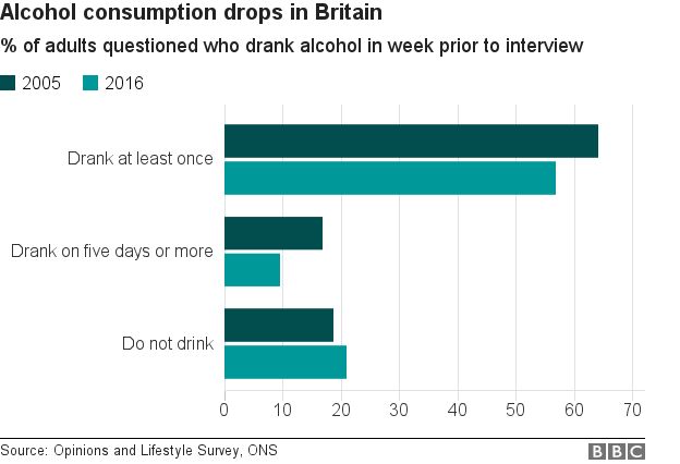
What works well?
- Simple title that tells me what the viz is about
- Subtitle that provides context for the numbers
- Side-by-side bars are a good way of comparing values year-over-year
- Overall clean layout
- Nice fat bars to make comparisons easier
- Colors are distinct enough
What could be improved?
- Include a % symbol on the axis somewhere
- This is a very narrow view of the data, whereas there are many more years available and it's also available by gender.
- It's a pretty boring viz; one that you'll often skim by and not engaged with.
- Label the bars
For my viz, I knew I wanted to use male, female and all people plus all years. This removes a bar chart as an option, preferring lines to show the trends since 2005. In addition, I wanted to show change since 2005 to provide better context that matches the purpose of the title.

I wanted to test out the Inconsolata font that Nathan Yau uses for his charts over on Flowing Data. If you have it installed on your computer, you'll see my intended display. If not, Tableau Public will server up something, not sure what really.
Lastly, the colors. I picked them from the ONS dashboard about the UK economy.
Click on the image below for the interactive version.
December 26, 2016
Makeover Monday: How Much Has the Cost of Christmas Dinner Really Risen?

Well, this is it! 52 weeks of Makeover Monday under our belts. Thank you for an incredible year and for participating in this amazing project.
In case you missed it, Makeover Monday will continue in 2017. Eva Murray and I have big plans in store for everyone. If you ever have questions, comments or feedback, give us a tweet.
Ok, so onto week 52. The BBC published an article early in December about the cost of Christmas dinner in the UK with this blaring headline:
Christmas dinner costs 'rise 14%'
Inside the article were these basic charts:


Fortunately, Andy C was able to locate the data on BBC Github. Let’s review the charts.
What works well?
- A line chart is a good choice for showing change over time.
- The line chart uses about a 3x2 ratio which doesn’t distort the shape too much given the axis is zoomed in.
- The bar charts work fine for comparing the two years.
What doesn’t work well?
- The line chart has smoothed curves, which lead you to believe there were changes throughout the year, but the data is only at the yearly level. This could be misleading.
- What food are included? The data on Github doesn’t match the data in the chart? How are we to know what they consider to be the Christmas foods?
- There’s no logical sort to the bar chart. It’s neither sorted by 2015 nor 2016. I can’t make out how it’s sorted.
- The bar chart doesn’t include all foods they have data for, so why did they only show these foods? Are these the foods that comprise the line chart? We have no way of knowing.
- Were the Christmas themed colors in the bar chart intentional? If so, I get why they did it, but it won’t work for their colour-blind readers.
- The title of the bar chart indicates it’s about the price change, but they make the reader do the change maths in their head. Why not just show the change?
- Why are they comparing 2016 to 2015 and not a different year? That seems a bit shortsighted and sensationalist to me.
For my version, I thought it was important to:
- Indicate when the peak price occurred
- Show the entire time period to get a better sense for the rate of change
- Indicate whether the 2016 price has increased or decreased compared to 2006
- Sort the products by the 2016 price
- Show the rate of change and the latest price
- Optimise the view for mobile
Given these ideas above, here is my last Makeover Monday for 2016. I’m looking forward to continuing this project with Eva in 2017.






