September 17, 2012
Tableau Tip: Adding a moving reference line for “today”
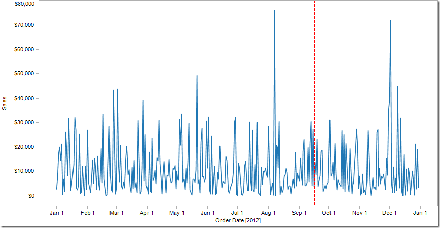
Picture a sales chart like this that represents your actual + forecasted sales:
It’s difficult to see where today is in this chart, so you’d like to see it as a reference line on your time axis. And you want it to be dynamic so that it moves automatically every day. Ultimately, you want a chart like this and when you look at the chart again in a month, the reference line should be no whatever day that is, October 18 for example.
Step 1: Build the view so that the date field is on the Column shelf and the measure is on the Rows shelf. Right-click on your date pill and choose Exact Date.
Step 2: Create a calculated field to get today’s date.
Step 3: Add the Today field to the Level of Details shelf. Right-click on the pill and choose Exact Date. The pill will turn green, indicating it’s a continuous dimension.
Step 4: Right-click on the x-axis (i.e., time) and choose Add Reference Line.
Step 5: Because the Today field is on the Level of Detail shelf, we can use it as a Reference Line. Set up the reference line with these settings (format the line as you wish).
That’s it. The chart looks like this:
If you don’t believe that it works, change the clock on your computer. Of course, change the clock back when you’re done.
Download the sample workbook here.
-------------------------------
Dan Murray left a great, incredibly useful comment to enhance the chart even more by color-coding actual and forecasted sales.
Step 1: Create a calculated field to determine whether Order Date is less today.
This results in a True/False dimension.
Step 2: Drag the Actual/Forecast dimension onto the color shelf.
Now you have a clear indication of where actuals stop and forecast starts, split exactly by the reference line.
Thanks Dan!


Handy when including forecasted data in a time series. I would also create a Boolean calc and drop te answer on the color shelf ... One that compares the date to Today.
ReplyDeleteGreat tip Dan! Thanks! I've amended my blog post with this tip.
ReplyDeleteHey guys
ReplyDeleteGreat tips! I'm using a zone graph and was wondering if there's a way to make the zone continue between the actual values and the forecast? Right now, ti creates a fracture in the zone....
Sam, there isn't a way that I'm aware of where you can keep the line continuous when you add color as a dimension. An alternative would be to have a line with only one color (i.e., remove the True/False from the color shelf), then add a shading band to the background.
ReplyDeletehttp://public.tableausoftware.com/views/TodayReferenceLine/ShadedForecast?:embed=y
You can download the workbook here:
https://dl.dropbox.com/u/14050515/VizWiz/Today%20Reference%20Line.twbx
Very handy tip! Thanks, Andy!!
ReplyDeleteBrilliantly simple, thank you
ReplyDeleteHi Andy:
ReplyDeleteI would like to create a dynamic reference line on x-axis (dates) that moves with the filters. The line should only show if a certain member of the dimension is selected.
Thanks in advance!
If you create a calculation to return the date you're looking for, then that should work fine. You would use that date on your reference line.
DeleteHi Andy:
DeleteI'd like to use this to color part of my x-axis line but use a different calculated date. If I use [Date] > [Planned Date] it's telling me that I'm using mixing aggregate with non-aggregate argument. It only seem to work if you use Today(1) ([DATE]> Today()) - it will give you a True of False result. Is there a way to use my [Planned Date] instead?
Thanks!
If your Planned Date is an aggregate calc, then that's what's causing the issue.
Delete