January 3, 2023
#MakeoverMonday 2023 Week 1 - The Change in Greenhouse Gases in the Atmosphere

2023 is here and #MakeoverMonday will be here the entire you to help you continue to learn and improve. Come on the journey with us each week. Build your portfolio. Showcase your skills. You just might get that job you've been seeking. It's happened, a lot, by participating every week.
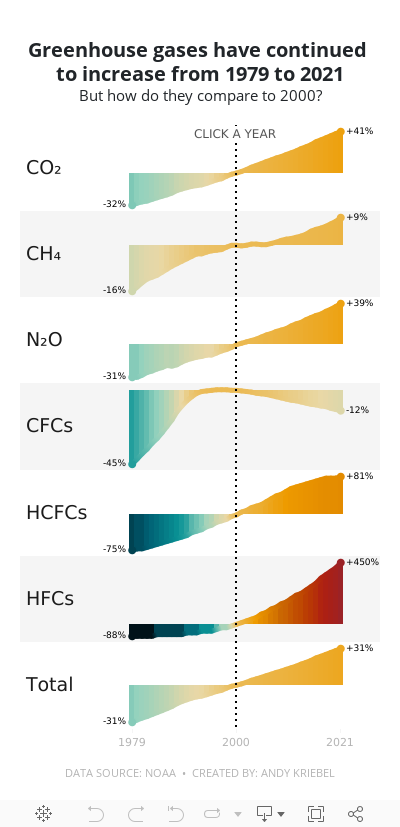
For week 1, we were analyzing greenhouse gases in the atmosphere from 1979-2021. The original visualization is quite simple.

We have CO2 and total gases on the left axis and the variance to 1990 on the right. Overall, the chart is pretty easy to read, with the exception of knowing that the red line is always compared to the 1990 value. That definitely needs to be more clear. It's also missing a title, so without the website it is posted on, you wouldn't necessarily know what it's about.
For my viz, I started by reproducing the original, but it doesn't look as good because the data we have starts at 1979. So you miss the big upward curve. From there, I focused primarily on making good looking sparklines that show comparisons with a parameter action. I also showed how to create an "area chart" with multiple colors. I'm going to create a tip video for it; I like how it turned out.
Here's the livestream and below is the visualization for you to interact with. The viz does not render properly on Tableau Public, but hopefully you get the idea.
I hope you continue to join me throughout the year so that we can learn together.
Have a wonderful 2023!


No comments
Post a Comment