April 16, 2018
Makeover Monday: The Seasonality of Confirmed Malaria Cases in Zambia Southern Province
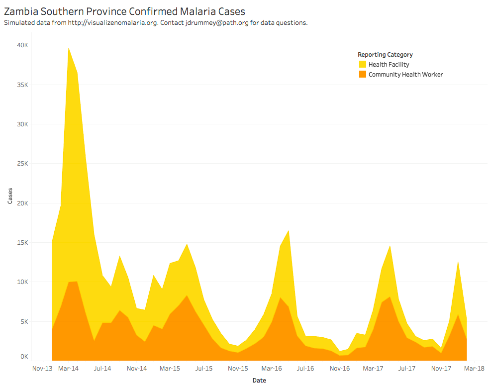
What works well?
- The colors are distinct from each other.
- The seasonality is very evident.
- The title is simple and tells us what theviz is about.
What could be improved?
- Are the colors stacked or is one behind the other?
- The overall decline is harder to see than necessary.
- What happened at the spikes? Adding some annotations would be helpful.
- Why is the data split between health facilities and health workers?
My Goals
- Can I show the overall decline more effectively?
- What does the viz look like when I combine the health facilities and health workers?
- Are there colors that will work more effectively?
- How can I make the seasonality more evident?
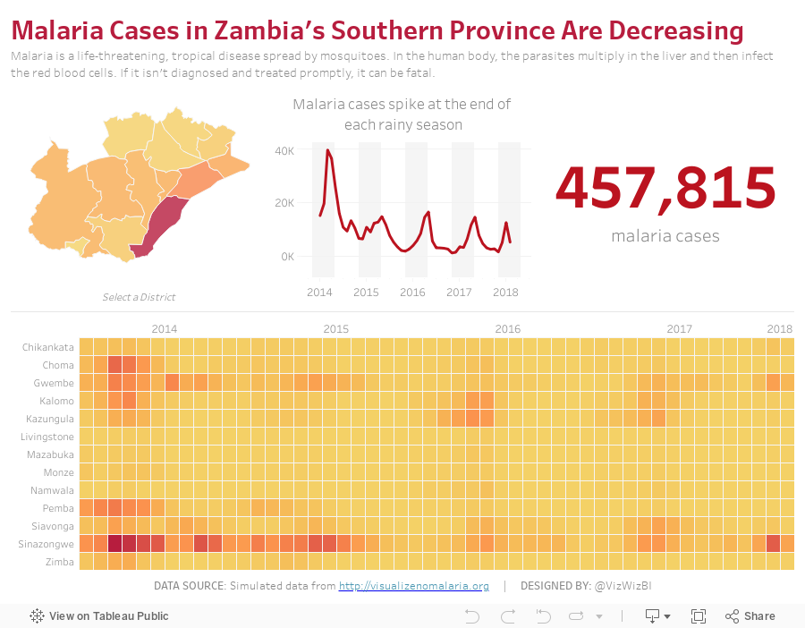
With those goals in mind, here is my Makeover Monday week 16. If this looks somewhat familiar, I created a very similar viz with a very similar data set for Makeover Monday week 34 2016.
Subscribe to:
Post Comments
(
Atom
)


No comments
Post a Comment