Showing posts with label prices. Show all posts
September 21, 2020
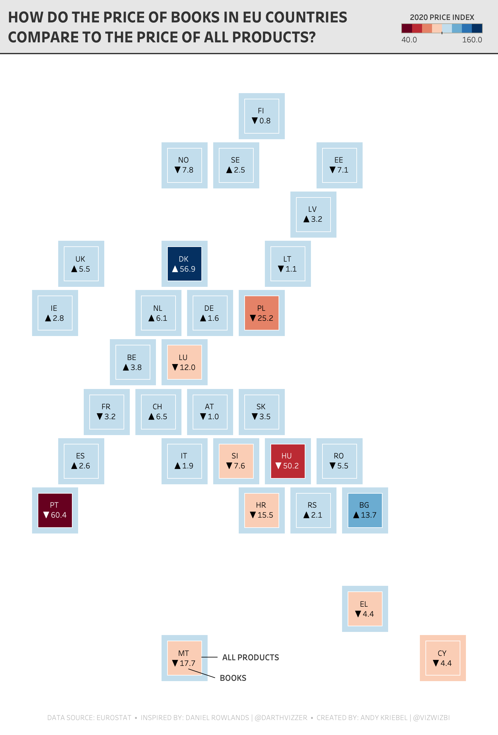
Watch Me Viz - #MakeoverMonday 2020 Week 38 - Pick Up A Book And Read
area chart
,
books
,
color
,
EU
,
europe
,
hex map
,
level of detail
,
LOD
,
Makeover Monday
,
map
,
prices
,
products
,
reading
,
shading
,
table calculation
,
teachers
,
teaching
,
WatchMeViz
,
Workout Wednesday
No comments
This week I went through a TON of iterations before settling on a hex map of Europe. In the video, you'll see me build lots of charts with time series, deviations, etc. before settling on a hexmap of Europe.
Download the workbook here.
Subscribe to my YouTube channel here to get all of the latest content and please share this is if you find it useful.
Here are a few useful links...
- Geometrics shapes (for the default number formatting) - LINK
- FIXED Level of Detail Expressions in a Plain English Sentence - LINK
- TABLE CALCULATIONS in a Plain English Sentence - LINK
- Shading between two lines - LINK
- Daniel Rowlands - TWITTER
- Daniel Rowlands (EU hex map template) - LINK
Click on the image below the video to interactive with the workbook. Or download it from Tableau Public here.
March 12, 2015
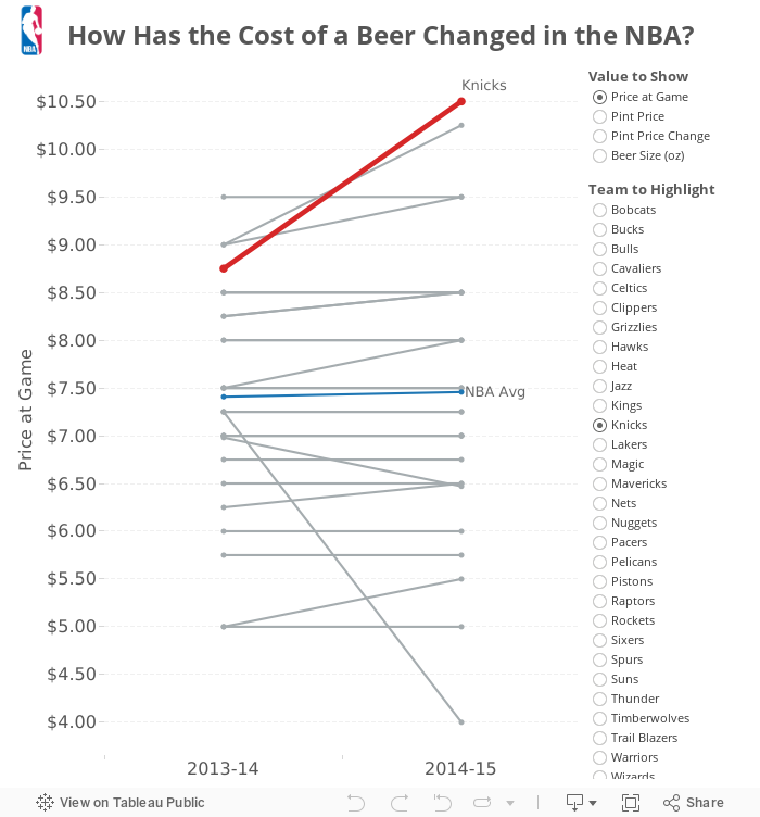
How Has the Cost of a Beer Changed in the NBA?
bar chart
,
basketball
,
beer
,
Carl Allchin
,
change
,
interactive
,
NBA
,
prices
,
slope graph
,
tableau
No comments
If any of you have had the pleasure of meeting Carl Allchin, you likely knew within about five minutes that he's a huge fan of the NBA, particularly the San Antonio Spurs. Earlier this week, I had some adult beverages with Carl and he told me he was headed to New York to see his beloved Spurs play the lowly Knicks.
And that got me thinking. What will a beer cost Carl at Madison Square Garden? How does that compare to the rest of the league?
I found the data on Business Insider (here and here) and manually entered it into an Excel spreadsheet, which you can download here. The data only includes the cost that you actually pay in the stadium, but different teams serve different size beers. What I've done is created a selector for you to pick the value you are interested in:
This was fun, and didn't take too long. That's the beauty of Tableau: You think of an interesting question, find some data, and create something interesting quickly. Cheers!
You can download the workbook used to create this viz here (requires Tableau 9).
And that got me thinking. What will a beer cost Carl at Madison Square Garden? How does that compare to the rest of the league?
I found the data on Business Insider (here and here) and manually entered it into an Excel spreadsheet, which you can download here. The data only includes the cost that you actually pay in the stadium, but different teams serve different size beers. What I've done is created a selector for you to pick the value you are interested in:
- Price at Game - This is the price that you actually pay in the arena. Note that the Knicks, where Carl will be going, have the most expensive beer in the NBA.
- Pint Price - I took the actual price, divided it by the size and multiplied that by 16 to get the pint price. This normalizes the prices across the league. The Knicks are the second highest price by this metric.
- Pint Price Change - I created this metric because I was interested to see how the price has changed from last season. The Hawks doubled the pint price, while the Knicks have actually reduced the price by 10%.
- Beer Size - I thought it would be interesting to see if the team keep the size of the beer the same each year. They don't.
This was fun, and didn't take too long. That's the beauty of Tableau: You think of an interesting question, find some data, and create something interesting quickly. Cheers!
You can download the workbook used to create this viz here (requires Tableau 9).
August 18, 2009
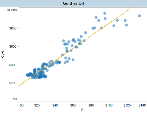
Do oil prices have a direct correlation to the price of gold?
gold
,
oil
,
prices
,
tableau
No comments
I recently read an article in Forbes about tracking oil prices. The theory is that oil prices have a direct correlation to the price of gold. Therefore most of the oil increase is a result of dollar inflation, not supply and demand.

What struck me immediately is the use of the scale to artificially highlight the correlation, a big no no in data visualization. Wanting to test the theory myself, I gathered the data and used Tableau to analyze it. As the article said, there is a strong positive correlation between the prices of gold and oil. Since the price of gold is typically ahead of the price of oil, I wonder if futures traders use this to set the price of oil or at least predict its direction.

As another interesting note, but not a surprising one, oil and gold prices can be correlated pretty strongly vs the consumer price index, which is a measure of inflation.
Download the workbook with the data behind this visualization. Create your own visualizations with Tableau Desktop. Or use free Reader to filter, view and interact with the visualizations.

What struck me immediately is the use of the scale to artificially highlight the correlation, a big no no in data visualization. Wanting to test the theory myself, I gathered the data and used Tableau to analyze it. As the article said, there is a strong positive correlation between the prices of gold and oil. Since the price of gold is typically ahead of the price of oil, I wonder if futures traders use this to set the price of oil or at least predict its direction.
As another interesting note, but not a surprising one, oil and gold prices can be correlated pretty strongly vs the consumer price index, which is a measure of inflation.
Download the workbook with the data behind this visualization. Create your own visualizations with Tableau Desktop. Or use free Reader to filter, view and interact with the visualizations.
Subscribe to:
Posts
(
Atom
)


