February 11, 2019
Makeover Monday: How President Trump Spends His Executive Time

- Trump usually spends the first 5 hours of the day in Executive Time.
- He spends his mornings in the residence, watching TV, reading the papers, and responding to what he sees and reads by phoning aides, members of Congress, friends, administration officials and informal advisers.
- Trump doesn't take an intelligence briefing until 11am or 11:30am, and they only last 30 minutes.
The list, sadly, goes on. The viz they posted that we're making over this week is this simple stacked bar chart.
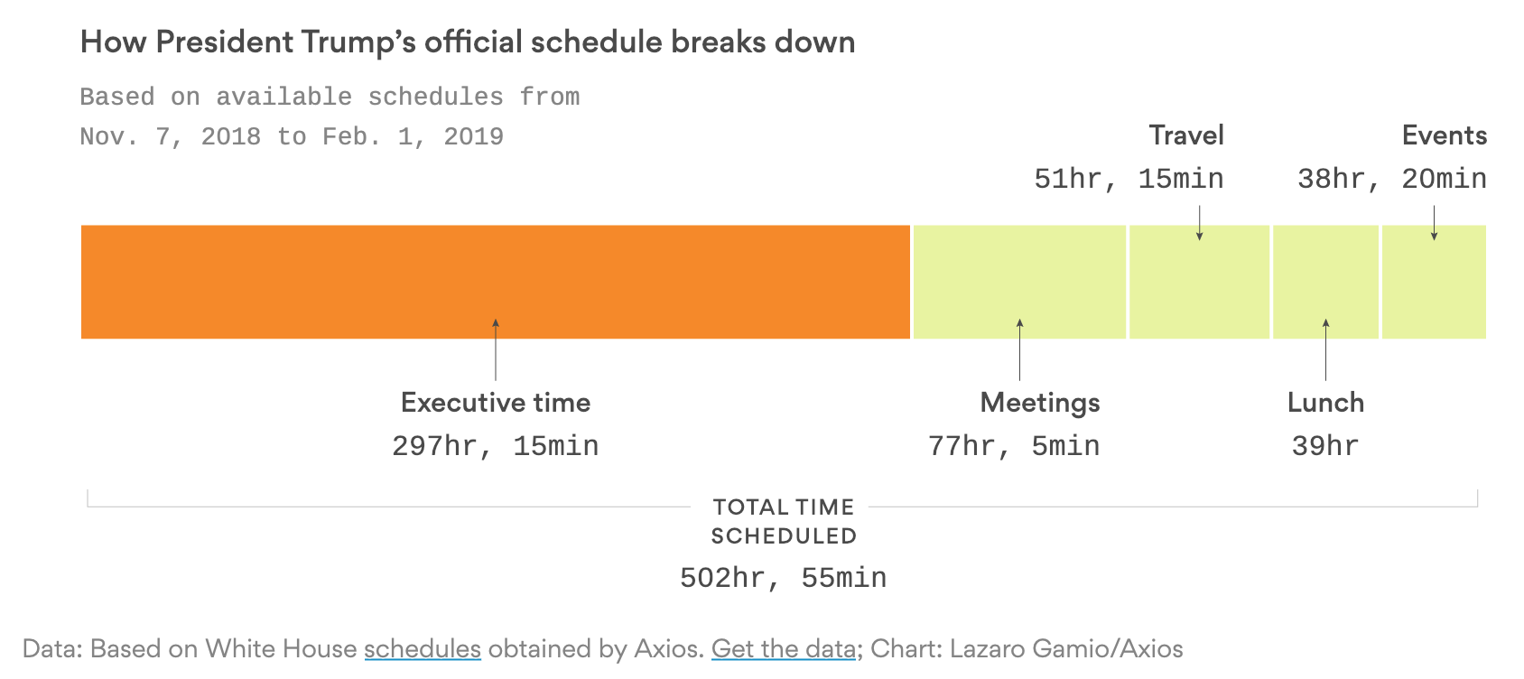
What works well?
- Using a color that stands out over the others to highlight executive time
- The title tells me what the viz is about.
- The subtitle provides context as to the amount of data that the chart summarizes.
- Simple labeling
- Including the total time at the bottom and stretching the lines to the ends of the stacked bar chart
What could be improved?
- It's hard to compare the executive time to all other time. A percentage would be helpful.
- Would the stacked chart be better as a horizontal bar chart with two rows?
What I did
- I wanted to look at the frequency of executive time by hour of day and day of week. Does Trump spend the same amount of executive time each day?
RESULT: The first couple heatmaps looked terrible, but visualizing by weekday looks ok. - Do big numbers help tell the story in the data?
RESULT: Yes, they help summarize the data well, but didn't help my end product. - Are there any trends in the data? That is, is executive time increasing or decreasing? Or has it been consistent?
RESULT: The trends are not very useful.
In the end, I thought visualizing the data as stacked bar charts by weekday looked the best. I built quite a few charts that turned out completely useless. However, there comes a point when something is good enough. That's where I ended up. Click on the image below for the interactive version.
Subscribe to:
Post Comments
(
Atom
)


No comments
Post a Comment