May 14, 2018
Makeover Monday: Which European commuters spend the most time in traffic jams?


What works well?
- Bars are ranked in descending order
- Simple, clear title
- Axis title tells us what the bars represent
- Nice tooltips
- Footnotes that qualify the data
What could be improved?
- The alternating bar colors add no meaning.
- The title has a weird shape to it.
My Goals
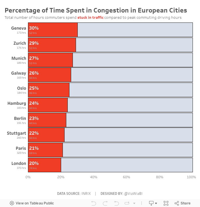
- Change the metric to percent of time spend in congestion during peak hours, which required me to go to the source to get the additional data.
- I took inspiration from Eva's viz, but wanted to show the congestion as a percentage rather than a raw number. I feel this gives move context to the numbers and lets the audience know their likelihood of being stuck in traffic in these cities.
- Create the viz as a single worksheet.
Subscribe to:
Post Comments
(
Atom
)


No comments
Post a Comment