May 27, 2018
Makeover Monday: Europe Is Moving Up the Ranks of the World’s Wealthiest Regions

The viz to makeover this week comes from the World Economic Forum.

What works well?
- Good title and subtitle
- The colors scale, from dark to light, make it relatively easy to see which cities are the most and least expensive.
- It's easy to see that the bottom-left cities is the most expensive and the upper-right is the least expensive (of the list).
- Including footnotes for the data
- Including the source
What could be improved?
- A treemap is used to represent parts-to-whole relationships. This is only a selected set of cities.
- Displaying square meters as parts-to-whole makes no sense at all.
- The sorting of the treemap is strange. It seems the whole chart should be flipped on the y-axis.
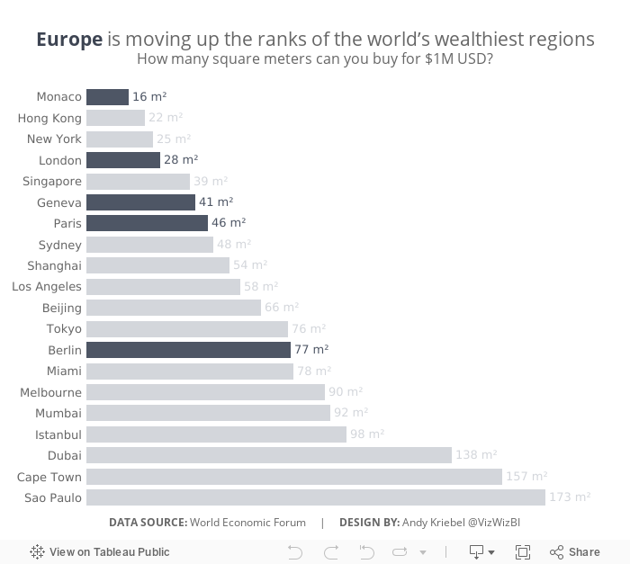
My Goals
- After reading the article that the source refers to, I wanted to look at cities by their regions and focus on Europe.
- Make the ranking of the cities much easier to understand
- Use highlighting to focus the analysis
- Make everything in a single chart (except the mobile version since I can't change the title and caption font size)
With that, here's my simple bar chart showing how European cities are mostly ranked near the top of the list of the World's wealthiest cities.
Subscribe to:
Post Comments
(
Atom
)


No comments
Post a Comment