January 5, 2015
Makeover Monday: Top 20 Industries Hiring Big Data Experience
bar chart
,
big data
,
hiring
,
infogr.am
,
Jeffrey Schaffer
,
jobs
,
Makeover Monday
,
pie chart
,
rank
No comments
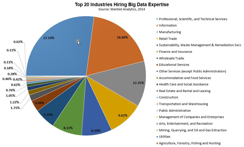
Friend of mine, friend of the blog and genuine good guy Jeffrey Shaffer sent me a link to this Tweet for today's Makeover Monday:
What a mess! Some quick thoughts:
The changes I've made:
What a mess! Some quick thoughts:
- It's a pie chart
- Way too many slices
- Doesn't start at 12 o'clock
- Too much precision on the numbers
- Too many colors (see #2 above)
- The category names are too long
I quickly threw this into infogr.am and change it to a bar chart of the top 5.
The changes I've made:
- Changed the chart type to a bar chart
- Displayed the top 5 and then everything else is grouped together and ranked last
- One decimal place on the numbers is plenty; no decimals would work fine too
- Colored "All Other" differently so that it would be more noticeable that it's not a single item
- Shortened the category names
If infogr.am allowed it, I would also remove the column divider line and remove the axis.
Subscribe to:
Post Comments
(
Atom
)


No comments
Post a Comment